Case 27087
橡皮章旅行实地考察海报
Prompt
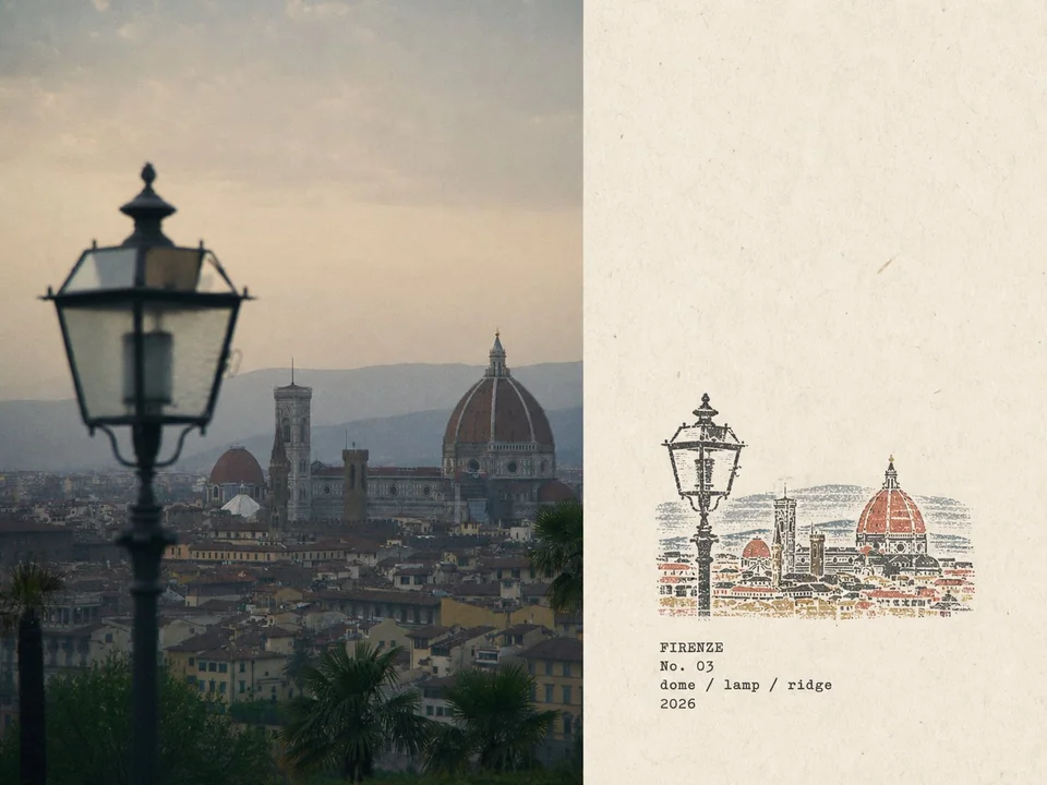
Please create a separate "Rubber Stamp Travel Field Notes Poster" for each photo I upload, outputting each photo individually without collage or multi-image combinations.

Overall, use a 4:3 landscape composition, dividing the frame into left and right regions, but without drawing an obvious dividing line.

The left side takes up about 58% of the frame, faithfully preserving the original photo. Accurately maintain the main subject identity, terrain, architecture, plants, people, spatial relationships, natural lighting and shadows, authentic textures, and the original color atmosphere; apply only restrained art publication-level photo color grading, and add extremely subtle, fine-grained film noise. For layout adaptation, natural cropping is allowed, but do not stretch, distort, shift, replace, or redraw the main subject.

The right side takes up about 42% of the frame, using a warm off-white aged paper as the background. The paper features subtle fibers, natural grain, light usage marks, and a matte texture, while preserving large areas of unprinted paper whitespace, making the blank space an essential part of the layout.

Analyze the original photo and extract the most location-distinctive subject outlines, architectural structures, terrain contours, plant forms, roads, shorelines, or other key visual relationships, compressing them into a small multi-color rubber stamp image.

Do not replicate every single element from the photo item by item. Retain only the minimal information necessary to instantly recognize the original location, subject, and scene relationships. Remove crowds, vehicles, dense windows, repetitive buildings, fragmented vegetation, decorative elements, and irrelevant backgrounds.

The stamp is positioned in the lower-middle of the right-side paper area, occupying only about 30%–38% of the right region's height, with ample whitespace preserved around it. The stamp must not be enlarged into a standard illustration, full landscape painting, or brand logo.

Determine the stamp's organization based on the original photo's composition:

- Iconic architecture: Retain the most distinctive outer contours, roofs, domes, arches, towers, or main structures.
- Mountain settlements: Compress buildings into a few terraced color blocks aligned along the terrain.
- Coastal scenery: Retain mountain contours, settlement layers, shorelines, and sparse intermittent water ripples.
- City panoramas: Retain the main skyline, one iconic building, and one or two layers of distant mountains.
- Natural landscapes: Retain primary mountain forms, trees, shorelines, or road orientations.
- Foreground occlusions: If narratively important in the original photo, retain as foreground stamp outlines.

Extract 2–4 spot inks from the original photo. Prioritize desaturated colors like carbon black, deep green, brick red, ochre yellow, slate blue, or taupe brown, but do not force a fixed palette. Preserve the most distinctive color character from the original photo, allowing only a small area of color for visual emphasis.

Render each color as a separately hand-stamped effect:

Authentic rubber stamp carving texture, hand-engraved marks, uneven line widths, contour notches, fractured edges, dry ink shortages, paper show-through, granular ink, uneven pressure, partial ghosting, and about 1–2 mm of subtle misregistration.

Allow natural misalignment between color layers; edges must not be digitally smoothed. The print should resemble a real carved stamp pressed onto aged paper, not a filtered photo, smooth vector illustration, or line-art logo.

Generate text based on the photo's location, theme, and visual imagery:

Location English name
No. Number
Three short English keywords
Gregorian calendar year

Place the text below or adjacent to the stamp in the whitespace, using a small, restrained, slightly mechanically imperfect typewriter font. The typography should evoke a traveler's field record, not an ad headline. Ensure all text is spelled accurately, without adding irrelevant slogans, brands, or decorative copy.

The overall vibe is like field notes kept by an architect, travel writer, or natural observer: quiet, restrained, tactilely real, regionally specific, with handmade imperfections and a collectible feel. The photo handles the on-site record; the stamp captures the most recognizable fragments of memory.

Avoid: Obvious central dividing lines, circular seals, Chinese red stamps, postage stamp perforations, wax seals, sticker collages, tourist souvenir templates, smooth vector logos, generic city icons, full replication of all architecture, dense detailing, childlike craftiness, cartoon style, 3D rendering, plastic textures, glossy digital gradients, oversaturation, excessive text, decorative clutter, and redrawing or altering the left-side original photo.

请为我上传的每张照片创建一个单独的“橡皮章旅行实地考察海报”,单独输出每张照片,不要进行拼贴或多图组合。

整体采用 4:3 横向构图,将画面分为左右两个区域,但不画明显的分割线。

左侧占据画面约 58%,忠实保留原始照片。准确保持主体身份、地形、建筑、植物、人物、空间关系、自然光影、真实纹理和原始色彩氛围;仅应用克制的艺术出版级照片调色,并添加极其微细的胶片噪点。为了布局适配,允许自然裁剪,但不得拉伸、扭曲、偏移、替换或重绘主体。

右侧占据画面约 42%,使用温暖的米白色陈年纸张作为背景。纸张具有细微的纤维、自然纹理、轻微的使用痕迹和哑光质感,同时保留大面积未打印的纸张留白,使空白成为布局的重要组成部分。

分析原始照片并提取最具地域特色的主体轮廓、建筑结构、地形轮廓、植物形态、道路、海岸线或其他关键视觉关系,将它们压缩成一个小型的多色橡皮章图像。

不要逐项复制照片中的每一个元素。仅保留即时识别原始位置、主体和场景关系所必需的最低限度信息。移除人群、车辆、密集的窗户、重复的建筑物、破碎的植被、装饰元素和无关背景。

印章位于右侧纸张区域的中下方,仅占据右侧区域高度的约 30%–38%,周围保留充足的留白。印章必须不得放大成标准的插图、完整的风景画或品牌标志。

根据原始照片的构图决定印章的组织方式:

- 标志性建筑:保留最独特的轮廓、屋顶、圆顶、拱门、塔楼或主体结构。
- 山地聚落:将建筑物压缩成沿地形排列的几个阶梯状色块。
- 海滨景色:保留山脉轮廓、聚落层次、海岸线和稀疏断续的水面波纹。
- 城市全景:保留主要天际线、一座标志性建筑和一两层远山。
- 自然景观:保留主要山形、树木、海岸线或道路导向。
- 前景遮挡:如果原始照片中具有叙事重要性,则保留作为前景印章轮廓。

从原始照片中提取 2–4 种专色油墨。优先选择去饱和的颜色,如碳黑、深绿、砖红、赭黄、板岩蓝或灰褐色,但不强求固定色板。保留原始照片中最独特的色彩特征,仅允许小面积色彩用于视觉强调。

将每种颜色渲染为单独的手工盖印效果:

真实的橡皮章刻制纹理、手工雕刻痕迹、线条粗细不均、轮廓缺口、破碎边缘、干墨短缺、透纸感、颗粒状油墨、压力不均、局部重影以及约 1–2 mm 的细微套印不准。

允许颜色层之间自然错位;边缘不得经过数字平滑处理。印刷品应看起来像压在陈年纸张上的真实雕刻印章,而不是滤镜照片、平滑的矢量插图或线条艺术标志。

根据照片的地点、主题和视觉意象生成文本:

地点英文名称
No. 数字
三个简短的英文关键词
公历年份

将文本放置在印章下方或相邻的留白处,使用小型、克制、略带机械缺陷的打字机字体。排版应唤起旅行者实地记录的感觉,而不是广告标题。确保所有文本拼写准确,不添加无关的口号、品牌或装饰性文字。

整体氛围就像建筑师、旅行作家或自然观察者记录的实地笔记:安静、克制、触感真实、具有地域针对性,带有手工制作的瑕疵感和收藏感。照片负责现场记录;印章捕捉最易辨识的记忆片段。

避免:明显的中心分割线、圆形印章、中国红章、邮票齿孔、火漆印章、贴纸拼贴、旅游纪念品模板、平滑的矢量标志、通用的城市图标、完整复制所有建筑、密集的细节、孩子气的拙劣感、卡通风格、3D 渲染、塑料质感、光滑的数字渐变、过度饱和、过多的文本、装饰性杂乱以及重绘或更改左侧原始照片。
Autres prompts
Case 20241
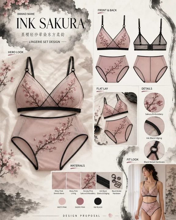
墨樱轻纱:东方美学内衣设计提案视觉看板
水墨风拼贴画东方美学内衣设计樱花刺绣

Case 14508
Portrait rétro en intérieur filmé avec une caméra DV des années 2000
Utilisez l’image jointe comme référence faciale. Préservez avec une grande précision les traits exacts du visage, les proportions faciales et l’harmonie générale du visage. Maintenez l’asymétrie faciale authentique, sans dérive d’embellisse