Case 28185
选择性对焦独立时尚杂志海报
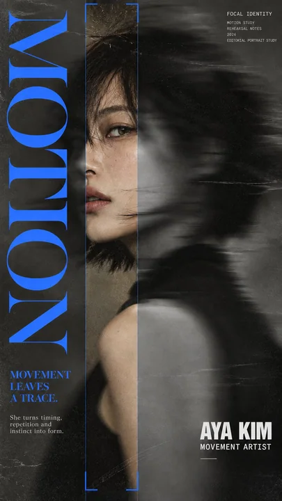
Prompt
【Series Name】: {e.g. FOCAL IDENTITY}
【Main Title】: {e.g. MOTION / OBSERVE / SIGNAL / FRAME}
【Subject】: {age, gender, identity, profession}
【Name】: {name}
【Role】: {profession / creative role}
【Key Line】: {short concept-driven sentence}
【Accent Color】: {yellow / red / cobalt blue / rust orange}
【Focus Method】: {horizontal sharp slice / floating focus window / vertical sharp slice / offset focus frame}
【Aspect Ratio】: 9:16

Create a sophisticated editorial portrait poster built around selective focus. Use a realistic photographic portrait with natural skin texture, pores, subtle imperfections, believable hair, and authentic facial structure. Avoid plastic skin, CGI smoothness, heavy beauty retouching, or generic commercial-model styling.

Keep most of the portrait softly blurred, slightly motion-softened, desaturated, or reduced in detail. Only the selected 【Focus Method】 should return to sharp detail, natural skin tone, and clear texture. The sharp and blurred areas must remain perfectly aligned as the same person and the same photographic moment, with no duplicated eyes, second face, or pasted-photo effect.

Choose one focus structure: a horizontal sharp band across the eyes, a small floating window isolating part of the face, a narrow vertical sharp slice through motion blur, or a larger offset frame that deliberately shifts attention away from the facial center.

Use a restrained neutral palette of charcoal, gray, warm beige, off-white, and natural skin tones. Use 【Accent Color】 as the only strong accent for the focus lines, main title, and a few key details. Keep the visual rule: Neutral Field + One Accent Color.

Use mature magazine-style typography: a high-contrast editorial serif for 【Main Title】, a condensed bold sans serif for 【Name】 and 【Role】, and a small neutral sans serif for secondary information. Include 【Key Line】 as meaningful copy connected to the subject and concept, not random filler text.

Keep the composition asymmetric with generous negative space. Let the portrait, typography, and focus geometry interact naturally. Add subtle film grain, light scan texture, and restrained print texture so the whole poster feels like one finished editorial piece.

The final result should feel like a polished independent fashion, photography, music, or culture magazine poster, with blur and sharpness deliberately controlling where the viewer looks.

Avoid cyberpunk HUDs, excessive UI graphics, neon gradients, gibberish text, logos, watermarks, numbering, sparkle symbols, harsh Gaussian blur, melted facial features, duplicated features, plastic skin, and over-retouching.

【系列名称】:{例如 FOCAL IDENTITY}
【主标题】:{例如 MOTION / OBSERVE / SIGNAL / FRAME}
【主体】:{年龄,性别,身份,职业}
【姓名】:{姓名}
【角色】:{职业 / 创意角色}
【关键台词】:{简短的概念驱动型句子}
【强调色】:{黄色 / 红色 / 钴蓝色 / 铁锈橙}
【聚焦方式】:{水平锐利切片 / 浮动对焦窗口 / 垂直锐利切片 / 偏移对焦框}
【纵横比】:9:16

创作一张围绕选择性对焦构建的高级社论肖像海报。使用具有自然皮肤纹理、毛孔、细微瑕疵、真实头发和真实面部结构的真实摄影肖像。避免塑料皮肤、CGI般的平滑、沉重的美容修饰或通用的商业模特风格。

让肖像的大部分保持柔和模糊、轻微的运动柔化、去饱和或细节减少。只有选定的【聚焦方式】应恢复到锐利的细节、自然的肤色和清晰的纹理。锐利和模糊的区域必须保持完美对齐,表现为同一个人和同一个摄影瞬间,没有重复的眼睛、第二张脸或粘贴照片的效果。

选择一种聚焦结构:横跨双眼的水平锐利带,隔离脸部一部分的小型浮动窗口,穿过运动模糊的窄垂直锐利切片,或者是有意将注意力从面部中心移开的大型偏移框。

使用受限的中性色调,包括炭黑色、灰色、暖米色、米白色和自然肤色。使用【强调色】作为聚焦线、主标题和少数关键细节的唯一强烈点缀。遵循视觉规则:中性底色 + 一种强调色。

使用成熟的杂志风格排版:【主标题】使用高对比度的社论衬线体,【姓名】和【角色】使用紧缩粗体无衬线体,次要信息使用小型中性无衬线体。将【关键台词】作为与主体和概念相关的有意义文案加入,而不是随机的填充文字。

保持构图不对称,留有大量的负空间。让肖像、排版和聚焦几何形状自然互动。添加细微的胶片颗粒、轻微的扫描纹理和克制的印刷纹理,使整张海报感觉像一件完成的社论作品。

最终结果应感觉像一张精美的独立时尚、摄影、音乐或文化杂志海报,通过模糊和锐利有意识地控制观众的视线。

避免赛博朋克HUD、过多的UI图形、霓虹渐变、胡言乱语的文字、徽标、水印、编号、闪烁符号、强烈的高斯模糊、融化的面部特征、重复的特征、塑料皮肤和过度修饰。Autres prompts
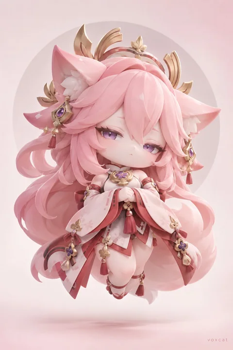
Case 28177
暗黑幻想怪萌吉祥物3D雕塑海报
[Character], neo-kawaii mascot design × dark fantasy fashion character × soft 3D sculpture aesthetic × premium surreal advertising poster. Retain [Character] core identification: hairstyle, head contour, eye features, character primary col
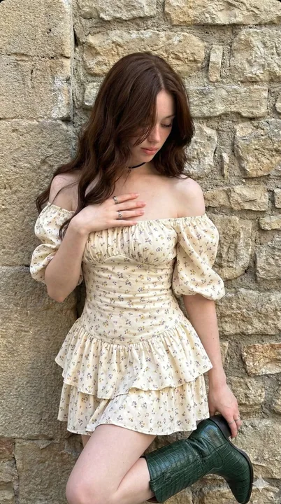
Case 23374
石墙光影下的波西米亚碎花裙少女
{ "prompt_details": { "subject": { "type": "Young woman", "appearance": { "hair": "Long, dark chestnut brown, loose waves, falling over face, messy aesthetic", "skin": "Fair complexion, smooth texture, natural finish", "face": "Looking down
超写实田园风波西米亚碎花裙情绪片