Case 24684
星巴克高端品牌海报艺术指导提示词
Prompt
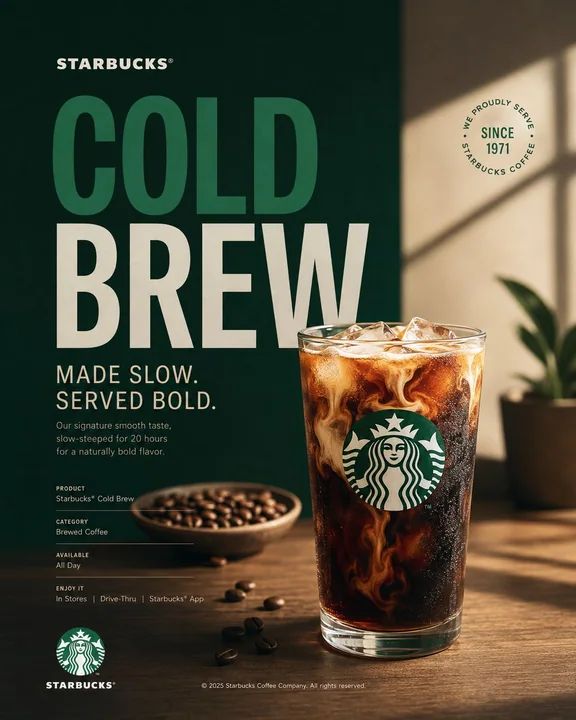
Act as a Senior Brand Art Director, Editorial Poster Designer, and award-level Visual Identity Designer creating a premium vertical promotional poster for Starbucks. The final artwork must feel like a professionally art-directed advertising campaign and a Behance-featured graphic design project — sophisticated, concept-driven, commercially believable, visually restrained, and executed with exceptional typography, photography, composition, and brand consistency.

The poster must be deeply rooted in Starbucks’ real brand identity — its documented colors, typography character, Siren identity, coffee culture, packaging language, campaign history, product presentation, and contemporary visual expression.

IMPORTANT LIMITATION: Do not attempt to generate real identifiable people by name. Use a realistic fictional figure only when a human presence strengthens the concept. The figure must look natural, contemporary, and completely consistent with Starbucks’ visual world.

⸻

PHASE 0: BRAND INTELLIGENCE — STRICT BRANDBOOK ACCURACY

Perform a complete Starbucks brand decode from current public Starbucks brand materials, Creative Expression resources, documented campaigns, and established visual identity.

COLOR SYSTEM — ZERO APPROXIMATION: retrieve Starbucks’ documented brand colors and identify the exact primary background color, primary headline color, secondary information color, and controlled accent colors appropriate to the selected promotional concept.

Use Starbucks Green #006241 as the dominant brand color where appropriate, with White #FFFFFF and Black #000000 as core supporting colors. Do not automatically force green as the entire background — determine the most appropriate Starbucks campaign color relationship for the specific promotional concept.

The color system must feel intentional and premium. Avoid adding arbitrary colors simply to make the poster visually attractive.

TYPOGRAPHY CHARACTER — PRECISE VISUAL DESCRIPTION: use Starbucks’ documented typographic character. Large display typography should feel sophisticated, contemporary, confident, editorial, and highly legible. Combine expressive display typography with restrained functional typography where appropriate.

Typography must feel integrated into the composition rather than placed on top of it.

CAMPAIGN LANGUAGE — REAL BRAND LANGUAGE ONLY: use documented Starbucks campaign language, product language, or an authentic product name. Never invent a fake Starbucks slogan and present it as an official campaign slogan.

For promotional communication, prioritize real product names, documented campaign phrases, or concise product-focused messaging.

BRAND FACTS: use only documented Starbucks information for founding year, origin, product names, campaign names, dates, coffeehouse history, and brand milestones.

No invented statistics. No fabricated campaign names. No fictional historical claims.

⸻

PHASE 1: PROMOTIONAL POSTER ARCHITECTURE

Single vertical rectangle — aspect ratio 4:5.

NO SPLIT SCREEN.

NO HARD VERTICAL DIVISION.

NO LEFT GRAPHIC ZONE + RIGHT PHOTO ZONE.

NO TWO-PANEL COMPOSITION.

The entire poster must function as ONE unified visual composition.

Use a carefully art-directed combination of:

hero product photography,
editorial lifestyle photography,
large typography,
brand color fields,
negative space,
graphic shapes,
subtle visual framing,
micro-typography,
product details,
and Starbucks brand elements.

The hero product must be the primary visual focus.

Create a strong visual hierarchy where the viewer immediately understands:

WHAT IS BEING PROMOTED → WHY IT IS DESIRABLE → WHO THE BRAND IS → WHAT ACTION TO TAKE.

The composition should feel deliberately designed from a blank artboard rather than assembled from stock assets.

Use asymmetric composition where appropriate, but maintain visual balance.

Create substantial negative space around the hero object and typography.

⸻

PHASE 2: HERO PROMOTIONAL SUBJECT

Select ONE primary Starbucks product as the hero.

Examples:

Starbucks Latte
Caffè Mocha
Caramel Macchiato
Cold Brew
Frappuccino
Pumpkin Spice Latte
Starbucks Reserve coffee
seasonal beverage
limited-time beverage
coffee and pastry pairing

The selected product must be physically accurate to Starbucks’ real product language.

Render the beverage with extremely realistic material properties:

natural coffee crema,
realistic milk foam,
accurate liquid translucency,
subtle condensation,
authentic ice,
realistic paper or ceramic material,
natural reflections,
physically believable highlights,
subtle steam where appropriate,
accurate Starbucks cup proportions,
authentic packaging details.

The product must look photographed rather than generated.

Do not create excessive liquid splashes, floating ingredients, impossible coffee pours, exaggerated steam, artificial smoke, or surreal food manipulation unless specifically required by the campaign concept.

The hero product should occupy approximately 35–55% of the visual attention of the entire poster.

⸻

PHASE 3: CONCEPTUAL PROMOTIONAL ART DIRECTION

Develop a clear advertising concept around the product rather than simply placing the product in the center.

The visual concept should communicate one primary idea such as:

MORNING RITUAL
COFFEE CRAFT
SEASONAL ARRIVAL
SLOW MOMENT
CITY COFFEE CULTURE
FRESHLY BREWED
AFTERNOON RESET
COFFEEHOUSE CONNECTION
SEASONAL INDULGENCE
ORIGIN & CRAFT

Choose ONE concept and execute it consistently.

The concept should be understandable within one second but contain enough visual sophistication to reward closer viewing.

Use environmental storytelling only when it strengthens the product.

For example:

a warm morning window,
a refined coffeehouse table,
a Seattle-inspired urban environment,
a contemporary Starbucks interior,
a quiet reading moment,
a workday pause,
a seasonal outdoor setting,
or an atmospheric coffee ritual.

Avoid generic café stock photography.

⸻

PHASE 4: HEADLINE TYPOGRAPHY

Use real Starbucks campaign language, documented product terminology, or authentic promotional wording.

The headline should be short.

Prefer 2–5 words rather than a long advertising sentence.

Examples of STRUCTURAL treatment:

THE COFFEE
YOU CRAVE

YOUR
MORNING
RITUAL

COLD
BREW
SEASON

or an authentic documented campaign/product phrase when appropriate.

Typography must become a major visual element.

Use oversized display typography with strong editorial hierarchy.

Allow typography to interact naturally with the product:

behind the product,
partially obscured by the product,
wrapped around the composition,
positioned vertically,
stacked tightly,
cropped at the edge,
or aligned with the geometry of the hero object.

Do not use the old split-screen typography bridge.

Typography must belong to the same physical visual world as the photography.

Flat color only.

No drop shadows.

No glow.

No bevel.

No fake 3D typography.

No unnecessary effects.

⸻

PHASE 5: PRODUCT + TYPOGRAPHY INTEGRATION

This is the critical Behance-quality design principle.

Typography, photography, product, and graphic elements must feel intentionally composed together.

Do not create:

“photo + text above it + logo at bottom.”

Instead create a complete visual system.

Use:

precise alignment,
optical spacing,
overlapping layers,
cropping,
scale contrast,
typographic rhythm,
negative space,
controlled asymmetry,
visual tension,
and deliberate focal hierarchy.

The headline should visually respond to the shape of the Starbucks product.

For example, a tall Frappuccino may create a vertical typographic structure.

A wide coffee cup may create horizontal type movement.

A circular pastry may become a secondary geometric anchor.

The composition should look designed by a senior art director rather than generated from a template.

⸻

PHASE 6: INFORMATIONAL MICRO-TYPOGRAPHY

Use restrained supporting information.

Include only information that strengthens the promotional purpose.

Possible structure:

PRODUCT
[REAL STARBUCKS PRODUCT NAME]

CATEGORY
[DOCUMENTED PRODUCT CATEGORY]

AVAILABLE
[DOCUMENTED AVAILABILITY INFORMATION]

CTA
[AUTHENTIC PROMOTIONAL ACTION]

Use small typography with generous tracking.

Keep micro-copy visually subordinate to the hero headline.

Do not overcrowd the poster with paragraphs.

Every informational element must have a clear reason to exist.

⸻

PHASE 7: BRAND SIGNATURE + LOGO PLACEMENT

Place the Starbucks Siren or official Starbucks wordmark with restraint.

The logo should never compete with the hero product or headline.

Use authentic proportions.

No distortion.

No stretching.

No fake redesign.

No unnecessary logo repetition.

Preferred placement:

bottom center,
bottom left,
top corner,
or integrated subtly into the product packaging.

The logo should feel like the final signature of the composition.

⸻

PHASE 8: PHOTOGRAPHY + MATERIAL RENDERING

Create premium commercial photography rather than generic stock imagery.

Camera language:

high-end commercial product photography,
editorial lifestyle photography,
medium-format visual character,
controlled depth of field,
precise focus,
natural optical rendering,
subtle filmic tonal response.

Lighting:

soft directional daylight,
controlled studio key light,
natural window light,
warm coffeehouse illumination,
or sophisticated seasonal lighting depending on the concept.

The product must have physically believable materials.

Paper must look like paper.

Plastic must look like plastic.

Ceramic must look like ceramic.

Coffee must look like liquid coffee.

Milk foam must have natural micro-texture.

Ice must have realistic translucency.

Condensation must follow gravity and surface temperature.

No plastic CGI appearance.

No excessive HDR.

No artificial sharpness.

No surreal reflections.

No impossible shadows.

⸻

PHASE 9: COMPOSITION PRINCIPLES

The composition must have a clear visual hierarchy:

1. HERO PRODUCT
2. HEADLINE
3. SUPPORTING VISUAL ELEMENT
4. BRAND SIGNATURE
5. MICRO-TYPOGRAPHY

Use strong negative space.

Use one dominant focal point.

Use one secondary focal point.

Avoid visual clutter.

Avoid symmetrical “catalog advertisement” composition unless the concept specifically requires it.

Create intentional tension through scale.

The hero product may be oversized.

Typography may be oversized.

Certain elements may intentionally crop outside the frame.

The poster should feel dynamic while remaining controlled.

Every object must contribute to the visual story.

⸻

PHASE 10: BEHANCE-FEATURED QUALITY

The final image must look like a highly curated professional design project that could be featured on Behance under:

Brand Identity
Art Direction
Advertising
Editorial Design
Campaign Design
Packaging
Creative Direction

The design should demonstrate:

exceptional typography,
strong art direction,
clear conceptual thinking,
premium photography,
brand consistency,
visual hierarchy,
precise spacing,
excellent material rendering,
professional color control,
and sophisticated composition.

Avoid the appearance of:

AI-generated advertising,
generic Instagram templates,
stock photography,
Canva layouts,
over-designed posters,
random gradients,
cheap mockups,
generic coffee advertisements,
excessive effects,
or template-based compositions.

The final result should feel like a real campaign created by a multidisciplinary creative studio for Starbucks.

⸻

PHASE 11: TECH SPECS

Aspect ratio: 4:5 vertical.

Single unified composition.

NO SPLIT SCREEN.

NO VERTICAL DIVISION.

NO TWO-PANEL DESIGN.

Premium commercial photography.

Ultra-realistic product rendering.

Crisp anti-aliased typography.

Accurate Starbucks visual identity.

Authentic Starbucks product presentation.

Controlled brand color palette.

Sophisticated negative space.

High-end editorial composition.

Natural material rendering.

No fake slogans.

No invented brand facts.

No identifiable real people.

No celebrity likeness.

No distorted Starbucks branding.

No excessive effects.

No unnecessary decorative elements.

The final poster should feel simultaneously like a real Starbucks promotional campaign, premium editorial advertising, and a meticulously art-directed Behance case-study hero image.

The design must prioritize concept, product desirability, typography, brand recognition, and visual sophistication over visual complexity.

担任高级品牌艺术总监、编辑海报设计师和获奖级的视觉识别设计师,为星巴克创作一张高端的竖版宣传海报。最终的作品必须感觉像是一场经过专业艺术指导的广告活动,以及一个 Behance 精选平面设计项目——精致、概念驱动、商业上可信、视觉克制,并以卓越的排版、摄影、构图和品牌一致性执行。

海报必须深深根植于星巴克的真实品牌形象——其记录的颜色、排版特征、塞壬形象、咖啡文化、包装语言、活动历史、产品呈现以及当代视觉表达。

重要限制:不要尝试生成真实的有名有姓的人。只有在人类的存在能增强概念时,才使用现实的虚拟人物。人物必须看起来自然、现代,并与星巴克的视觉世界完全一致。

⸻

阶段 0:品牌情报——严格的品牌手册准确性

从当前的公开星巴克品牌材料、创意表达资源、记录的活动和确立的视觉识别中执行完整的星巴克品牌解码。

色彩系统——零近似值:检索星巴克记录的品牌颜色,并确定适合所选宣传概念的精确主背景色、主标题颜色、次要信息颜色和受控的点缀色。

在适当的地方使用星巴克绿色 #006241 作为主导品牌色,白色 #FFFFFF 和黑色 #000000 作为核心辅助色。不要自动强制将绿色作为整个背景——为特定的宣传概念确定最合适的星巴克活动颜色关系。

色彩系统必须让人感到是有意为之且高端的。避免仅仅为了让海报在视觉上吸引人而添加随意的颜色。

排版特征——精确的视觉描述:使用星巴克记录的排版特征。大型展示性排版应显得精致、当代、自信、社论化且高度易读。在适当的情况下,将表现力的展示排版与克制的实用排版相结合。

排版必须感觉融入了构图中,而不是放置在构图之上。

宣传语言——仅限真实品牌语言:使用记录的星巴克宣传语言、产品语言或真实的产品名称。绝不要发明虚假的星巴克口号并将其作为官方活动口号展示。

对于宣传沟通,优先使用真实的产品名称、记录的活动短语或简洁的以产品为中心的信息。

品牌事实:仅使用记录的星巴克信息,包括创立年份、起源、产品名称、活动名称、日期、咖啡馆历史和品牌里程碑。

不使用虚构的统计数据。不使用编造的活动名称。不使用虚构的历史主张。

⸻

阶段 1:宣传海报架构

单个垂直矩形——纵横比 4:5。

无分屏。

无硬性垂直分割。

无左侧图形区 + 右侧照片区。

无双面板构图。

整个海报必须作为一个统一的视觉构图发挥作用。

使用精心艺术指导的组合:

核心产品摄影、
编辑类生活方式摄影、
大号排版、
品牌色块、
负空间、
图形形状、
微妙的视觉框架、
微型排版、
产品细节、
以及星巴克品牌元素。

核心产品必须是主要的视觉焦点。

创建一个强大的视觉层级,让观众立即理解:

正在推广什么 → 为什么它值得拥有 → 品牌是谁 → 采取什么行动。

构图应该感觉像是从空白画布上刻意设计的,而不是从库存素材中组装的。

在适当的地方使用不对称构图,但保持视觉平衡。

在核心对象和排版周围创造大量的负空间。

⸻

阶段 2:核心宣传主体

选择一种主要的星巴克产品作为核心。

例如:

星巴克拿铁
摩卡咖啡
焦糖玛奇朵
冷萃咖啡
星冰乐
南瓜丝绒拿铁
星巴克甄选咖啡
季节性饮品
限时饮品
咖啡与糕点搭配

所选产品必须在物理上准确符合星巴克的真实产品语言。

渲染饮品时应具有极其真实的材料属性:

自然的咖啡油脂(crema)、
真实的牛奶泡沫、
准确的液体半透明度、
微妙的冷凝水珠、
真实的冰块、
真实的纸张或陶瓷材质、
自然的反射、
物理上可信的高光、
适当的微妙蒸汽、
准确的星巴克杯子比例、
真实的包装细节。

产品看起来应该是拍摄的,而不是生成的。

除非宣传概念特别要求,否则不要制造过度的液体溅洒、漂浮的成分、不可能的咖啡倾倒、夸张的蒸汽、人造烟雾或超现实的食物操控。

核心产品应占据整个海报视觉注意力的约 35–55%。

⸻

阶段 3:概念宣传艺术指导

围绕产品开发一个清晰的广告概念,而不是简单地将产品放在中心。

视觉概念应传达一个主要想法,例如:

早间仪式
咖啡工艺
季节到来
慢时光
城市咖啡文化
现磨现萃
午后重启
咖啡馆连接
季节性享受
产地与工艺

选择一个概念并始终如一地执行。

该概念应能在一秒钟内被理解,但又要包含足够的视觉复杂性以值得细看。

仅在能增强产品表现力时使用环境叙事。

例如:

温暖的晨窗、
精致的咖啡馆桌子、
西雅图风格的城市环境、
当代的星巴克室内设计、
安静的阅读时刻、
工作日的休息、
季节性的户外环境、
或是有氛围的咖啡仪式。

避免使用平庸的咖啡馆库存摄影。

⸻

阶段 4:标题排版

使用真实的星巴克宣传语言、记录的产品术语或真实的宣传措辞。

标题应简短。

倾向于 2-5 个单词,而不是冗长的广告句子。

结构处理示例:

THE COFFEE
YOU CRAVE

YOUR
MORNING
RITUAL

COLD
BREW
SEASON

或在适当情况下使用真实的记录活动/产品短语。

排版必须成为主要的视觉元素。

使用具有强大编辑层级的大号展示排版。

允许排版与产品自然互动:

在产品后面、
被产品部分遮挡、
环绕构图、
垂直放置、
紧密堆叠、
在边缘裁剪、
或与核心对象的几何形状对齐。

不要使用旧的分屏式排版桥接。

排版必须属于与摄影相同的物理视觉世界。

仅限纯色。

无投影。

无发光。

无斜面。

无虚假 3D 排版。

无不必要的特效。

⸻

阶段 5:产品 + 排版整合

这是体现 Behance 级别品质设计的关键原则。

排版、摄影、产品和图形元素必须感觉是有意组合在一起的。

不要创建:

“照片 + 上方的文字 + 底部标志”。

相反,要创建一个完整的视觉系统。

使用:

精确的对齐、
视觉间距、
重叠层、
裁剪、
比例对比、
排版节奏、
负空间、
受控的不对称、
视觉张力、
和刻意的焦点层级。

标题应在视觉上呼应星巴克产品的形状。

例如,高耸的星冰乐可能会产生垂直的排版结构。

宽阔的咖啡杯可能会产生水平的排版移动。

圆形的糕点可能会成为次要的几何锚点。

构图应该看起来是由高级艺术总监设计的,而不是从模板生成的。

⸻

阶段 6:信息性微型排版

使用克制的辅助信息。

仅包含能增强宣传目的的信息。

可能的结构:

PRODUCT(产品)
[真实的星巴克产品名称]

CATEGORY(类别)
[记录的产品类别]

AVAILABLE(供应情况)
[记录的供应信息]

CTA(行动呼吁)
[真实的宣传行动]

使用带有宽松字间距(tracking)的小号排版。

使微缩文本在视觉上从属于核心标题。

不要用段落使海报过于拥挤。

每个信息元素必须有明确的存在理由。

⸻

阶段 7:品牌签名 + 标志放置

克制地放置星巴克塞壬(Siren)或官方星巴克字标。

标志绝不能与核心产品或标题竞争。

使用真实的比例。

无扭曲。

无拉伸。

无虚假重新设计。

无不必要的标志重复。

首选位置:

底部居中、
左下角、
顶部角落、
或巧妙地集成到产品包装中。

标志应该感觉像是构图的最终签名。

⸻

阶段 8:摄影 + 材质渲染

创作高端商业摄影,而非平庸的库存图像。

镜头语言:

高端商业产品摄影、
编辑类生活方式摄影、
中画幅视觉特征、
受控的景深、
精确的对焦、
自然的光学渲染、
微妙的电影胶片色调响应。

灯光:

柔和的有方向性的日光、
受控的影棚主光、
自然的窗光、
温暖的咖啡馆照明、
或根据概念而定的精致季节性灯光。

产品必须具有物理上可信的材质。

纸张必须看起来像纸张。

塑料必须看起来像塑料。

陶瓷必须看起来像陶瓷。

咖啡必须看起来像液体咖啡。

牛奶泡沫必须具有自然的微观纹理。

冰块必须具有真实的半透明度。

冷凝水珠必须遵循重力和表面温度。

无塑料感的 CGI 外观。

无过度的 HDR。

无人工锐化。

无超现实的反射。

无不可能的阴影。

⸻

阶段 9:构图原则

构图必须有清晰的视觉层级:

1. 核心产品
2. 标题
3. 辅助视觉元素
4. 品牌签名
5. 微型排版

使用强大的负空间。

使用一个主导焦点。

使用一个次要焦点。

避免视觉杂乱。

除非概念特别要求,否则避免对称的“目录广告”构图。

通过比例创造有意的张力。

核心产品可以超大。

排版可以超大。

某些元素可以有意地裁剪到框外。

海报应在保持受控的同时显得动感。

每个物体必须为视觉故事做出贡献。

⸻

阶段 10:Behance 精选品质

最终图像必须看起来像是一个高度策划的专业设计项目,可以被 Behance 的以下类别精选:

品牌识别(Brand Identity)
艺术指导(Art Direction)
广告(Advertising)
编辑设计(Editorial Design)
活动设计(Campaign Design)
包装(Packaging)
创意指导(Creative Direction)

设计应展示:

卓越的排版、
强大的艺术指导、
清晰的概念思维、
高端摄影、
品牌一致性、
视觉层级、
精确的间距、
出色的材质渲染、
专业的颜色控制、
以及精致的构图。

避免出现以下情况:

AI 生成的广告感、
平庸的 Instagram 模板、
库存摄影感、
Canva 布局、
过度设计的海报、
随意的渐变、
廉价的模型、
普通的咖啡广告、
过多的特效、
或基于模板的构图。

最终结果应该感觉像是由一个多学科创意工作室为星巴克创作的真实活动。

⸻

阶段 11:技术规格

纵横比:4:5 垂直。

单一统一构图。

无分屏。

无垂直分割。

无双面板设计。

高端商业摄影。

超写实产品渲染。

清晰的抗锯齿排版。

准确的星巴克视觉识别。

真实的星巴克产品呈现。

受控的品牌调色板。

精致的负空间。

高端编辑类构图。

自然材质渲染。

无虚假口号。

无发明的品牌事实。

无身份可辨识的真实人物。

无名人的肖像。

无扭曲的星巴克品牌标识。

无过多的特效。

无不必要的装饰元素。

最终海报应同时感觉像是一个真实的星巴克宣传活动、高端编辑广告,以及一个经过精心艺术指导的 Behance 案例研究核心图像。

设计必须优先考虑概念、产品吸引力、排版、品牌认可度和视觉精致感,而非视觉复杂性。
Autres prompts

Case 23
Style isométrique de conception graphique
Une illustration numérique isométrique plate de [décrivez le sujet : par exemple, un espace de travail moderne, un bloc de ville, un groupe d'icônes d'applications, une boutique de sport], lignes propres et formes géométriques, couleurs pas
illustrationminimalistUI设计infographic
Case 25544
高端艺术刊物分层排版海报
Create a high-end independent editorial poster in a strict 3:4 vertical aspect ratio. Divide the canvas horizontally into two exactly equal 50/50 sections, designed as one cohesive art-publication cover. TOP HALF - EDITORIAL PHOTOGRAPH Cr