Case 27211
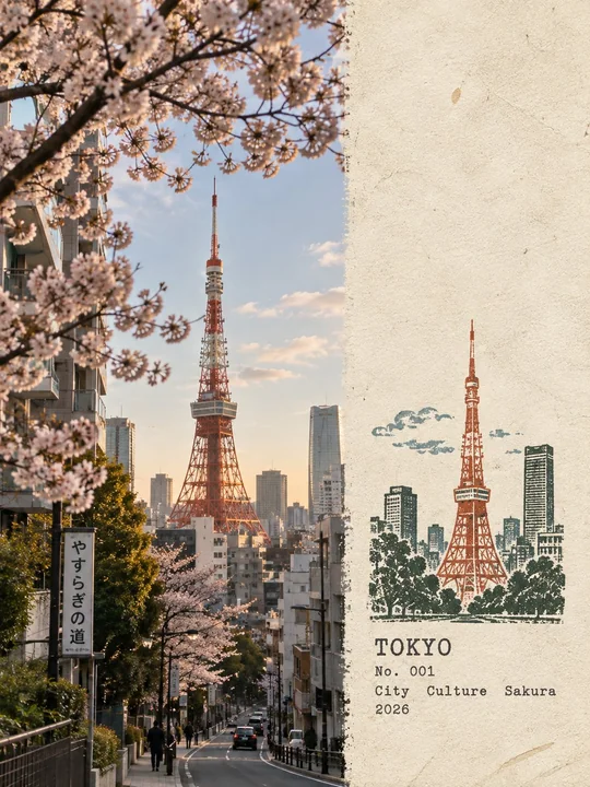
建筑师风格旅游实地考察笔记海报
Prompt
Create one individual “Travel Field Notes” poster for each uploaded photo, never combining multiple photos into a collage. Use a 3:4 portrait composition with the original photograph occupying roughly 58% of the frame and a warm, slightly aged paper field filling the remaining 42%, blending naturally without a visible dividing line. Keep the photograph highly realistic and faithful to the source, preserving the subject, architecture, landscape, vegetation, people, proportions, perspective, lighting, shadows, textures, and original atmosphere, with only subtle editorial color correction and fine film grain; never redraw, replace, distort, or reposition important elements. On the paper side, leave generous empty space and create a compact location-specific rubber stamp inspired only by the most recognizable visual features of the photograph, such as a landmark silhouette, roofline, skyline, mountain contour, shoreline, road direction, trees, or other defining forms. Simplify the scene rather than reproducing everything, removing crowds, cars, repetitive buildings, tiny windows, clutter, and insignificant details. Keep the stamp relatively small, around 30–38% of the paper section’s height, and place it toward the lower-middle area with plenty of breathing room. Build the stamp from 2–4 muted spot colors naturally sampled from the original scene, such as charcoal, forest green, faded brick, ochre, slate blue, or earthy brown, using authentic carved-rubber printing characteristics including rough engraved marks, irregular edges, uneven pressure, broken ink coverage, paper show-through, granular pigment, tiny imperfections, ghosting, and subtle layer misregistration. The result should feel physically stamped onto real fibrous paper rather than digitally illustrated. Add restrained typewriter-style field-note typography near the stamp containing the location’s English name, a small numbered entry, exactly three concise English keywords describing the place, and the current Gregorian year, with accurate spelling and no slogans or unnecessary decoration. The final aesthetic should resemble a quiet archival travel record made by an architect, explorer, or observant traveler: tactile, understated, authentic, collectible, and strongly connected to the actual location. Avoid obvious panel borders, hard dividing lines, circular seals, postage perforations, wax seals, souvenir-card layouts, generic icons, polished vector graphics, cartoon styling, 3D effects, glossy gradients, excessive saturation, dense illustration, decorative clutter, or any alteration of the original photograph.

为每张上传的照片创建一张单独的“旅游实地笔记”海报,绝不将多张照片组合成拼贴画。使用 3:4 的纵向构图,原始照片占据画面的约 58%,温暖且略显陈旧的纸张区域填充剩余的 42%,自然融合且没有明显的分割线。保持照片的高度写实并忠于来源,保留主体、建筑、景观、植被、人物、比例、透视、光效、阴影、纹理和原始氛围,仅进行细微的编辑色彩校正和细腻的胶片颗粒感;绝不重画、替换、扭曲或重新定位重要元素。在纸张一侧,留出宽敞的空白区域,并创建一个紧凑的特定地点的橡胶印章,其灵感仅来自照片中最具辨识度的视觉特征,例如地标剪影、屋顶线、天际线、山脉轮廓、海岸线、道路方向、树木或其他定义形状。简化场景而不是复制所有内容,移除人群、汽车、重复的建筑物、微小的窗户、杂物和微不足道的细节。保持印章相对较小,大约占纸张部分高度的 30–38%,并将其放置在具有充足呼吸空间的下部中间区域。使用 2–4 种从原始场景中自然采样的柔和专色来构建印章,例如炭黑色、森林绿、褪色砖红、赭石色、石板蓝或大地棕,使用真实的刻制橡胶印刷特性,包括粗糙的雕刻痕迹、不规则的边缘、压力不均、油墨覆盖断裂、纸张透出、颗粒状颜料、微小瑕疵、重影和细微的图层对齐偏差。结果应该感觉像是物理加盖在真实的纤维纸上,而不是数字插画。在印章附近添加克制的打字机风格实地笔记排版,包含地点的英文名称、一个小编号的条目、准确的三个描述该地点的简明英文关键词以及当前的公历年份,拼写准确,且没有标语或不必要的装饰。最终的美学应类似于由建筑师、探险家或细心的旅行者制作的安静的档案旅行记录:触感真实、朴素、正宗、具有收藏价值,并且与实际地点紧密联系。避免明显的面板边界、硬分割线、圆形印章、邮票穿孔、蜡封、纪念卡布局、通用图标、抛光的矢量图形、卡通风格、 3D 效果、光泽渐变、过度饱和、密集的插画、装饰性杂物或对原始照片的任何改动。
Autres prompts
Case 21314
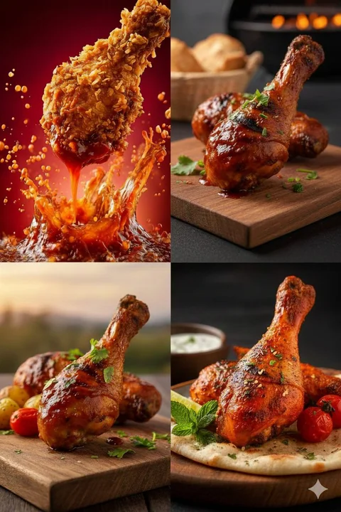
金黄酥脆鸡腿蘸酱汁飞溅的瞬间
{ "project_title": "High-Definition Culinary Photography: Chicken Drumsticks Series", "image_analysis": { "total_variants": 4, "image_reference": "1000579475.jpg", "detailed_descriptions": [ { "style": "Extra Crispy Splash Art", "visual_foc
微距美食高清诱惑鸡腿

Case 20426
甜美世界杯足球宝贝粉白梦幻写真
甜美少女氛围感真实摄影世界杯足球宝贝