Case 26000
旅行日记复古插画风格双面板图像生成
Prompt
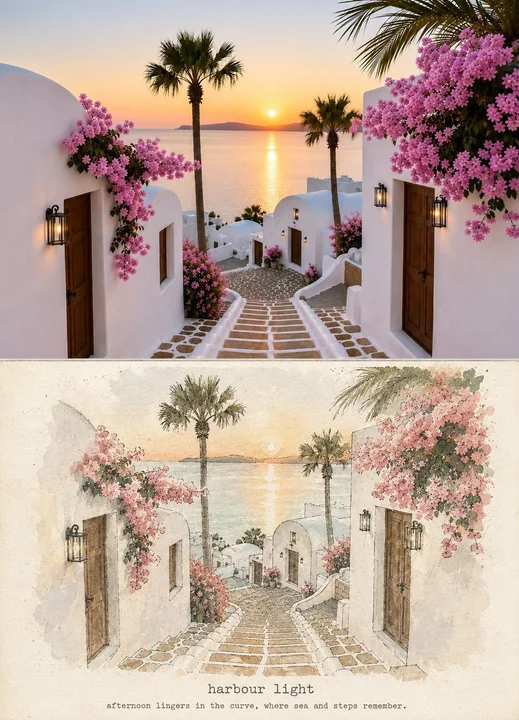
Use the uploaded reference photograph as the exact visual source. Create one single vertical 4:5 image containing two clearly separated panels stacked vertically.

TOP PANEL — ORIGINAL: Keep the uploaded photograph completely unchanged and recognizable. Do not repaint, crop, stylize, alter colors, or modify any people, buildings, sea, umbrellas, stairs, plants, or composition. This is the original reference.

BOTTOM PANEL — ARTISTIC RESULT: Reimagine the exact same scene from the top panel as an original minimalist editorial travel-journal art print. Preserve the same viewpoint, architecture, waterfront, curved promenade, sea, stairs, umbrellas, pedestrians, plants, proportions, and overall composition so the connection between both panels is immediately obvious. Do not invent a different location or rearrange the scene.

Transform only the visual treatment into a sophisticated handmade illustration: delicate imperfect ink contours, simplified elegant shapes, soft watercolor washes, subtle screen-print texture, faded pigments, dry-brush marks, slight ink-registration imperfections, natural paper grain, and lightly weathered vintage-print texture.

Use a restrained palette of dusty ocean blue, muted sea-green, warm sand, creamy ivory, soft stone gray, and small faded terracotta accents. Preserve the important colors and character of the original scene while giving them a refined vintage travel-poster treatment.

Place the bottom artwork on warm ivory handmade paper with generous breathing room and subtle tactile fibers. Keep the architecture clearly recognizable and maintain the original visual balance. Add gentle afternoon light and quiet coastal nostalgia.

Near the lower portion of the BOTTOM PANEL, add elegant understated typewriter-inspired typography:

“harbour light”

Beneath it, much smaller:

“afternoon lingers in the curve, where sea and steps remember.”

Add a very subtle thin divider between the two panels. Make the entire image look like a carefully photographed before-and-after page from a premium independent travel-art journal.

Important: The TOP must remain the untouched original photograph. The BOTTOM must be the artistic reinterpretation of that exact photograph. Both panels must show the same scene from the same viewpoint. No photorealistic recreation in the bottom, no major composition changes, no new architecture, no excessive detail, no glossy digital effects, no oversaturated colors.

使用上传的参考照片作为确切的视觉来源。创建一个垂直的 4:5 比例图像,包含两个垂直堆叠且清晰分离的面板。

顶部面板 —— 原图:保持上传的照片完全不改变且可辨认。不要重新绘制、裁剪、风格化、更改颜色或修改任何人物、建筑、大海、阳伞、楼梯、植物或构图。这是原始参考。

底部面板 —— 艺术效果:将顶部面板中的完全相同的场景重新想象为原创的极简主义社论旅行日记艺术版画。保留相同的视角、建筑、海滨、弧形漫步道、大海、楼梯、阳伞、行人、植物、比例和整体构图,以便两个面板之间的联系一目了然。不要发明不同的位置或重新排列场景。

仅将视觉处理转化为精致的手工插画:细腻且不完美的墨水轮廓、简化的优雅形状、柔和的水彩晕染、细微的丝网印刷纹理、褪色的颜料、干笔刷痕迹、轻微的套印不准缺陷、自然纸张纹理以及轻微风化的复古印刷质感。

使用克制的色调,包括灰蓝色、柔和的海绿色、暖沙色、奶油象牙色、柔和的石灰色和少量的褪色赤土色调。保留原始场景的重要颜色和特征,同时赋予它们精致的复古旅行海报处理。

将底部艺术作品放置在带有充足留白和微妙触感纤维的暖象牙色手工纸上。保持建筑清晰可辨并维持原始的视觉平衡。加入柔和的午后光线和宁静的海岸怀旧感。

在底部面板的较低部分附近,添加优雅且低调的受打字机启发的排版:

“harbour light”

在其下方,字体小得多:

“afternoon lingers in the curve, where sea and steps remember.”

在两个面板之间添加一条非常细微的细分割线。让整个图像看起来像是来自一本高级独立旅行艺术杂志的、经过精心拍摄的前后对比页面。

重要提示:顶部必须保持未经触碰的原始照片。底部必须是对该确切照片的艺术重新诠释。两个面板必须显示相同视角的相同场景。底部不要进行写实重建,不要进行重大构图更改,不要出现新建筑,不要有过多细节,不要有光泽数字效果,不要有过度饱和的颜色。
More prompts
Case 28690
A low-angle shot from the top of the stairs, backlit, capturing the silhouette
Standing at the top of the stairs looking down at the camera, arms crossed, chin slightly raised; the camera shoots from bottom to top, backlight outlining the legs and waistline.
Case 13571
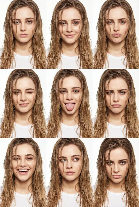
纯白极简九宫格湿发少女的百变时尚表情
{ "type": "image_to_image", "prompt": "Keep the same face and identity. Vertical high-fashion beauty collage arranged in a 3x3 grid of close-up portraits against a clean, seamless pure white studio background. Bright, even front-facing stud
时尚大片九宫格湿发质感纯白极简百变表情