Case 26056
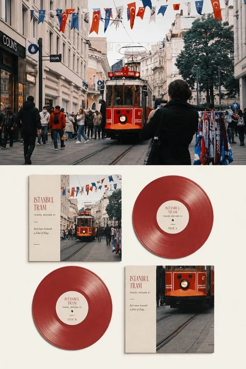
ملصق أرشيف بصري لألبومات الفينيل مستوحى من تصوير السفر
Prompt
يرجى تحويل كل صورة سفر أرفعها إلى ملصق أرشيف بصري مستقل لرقم سفر فاخر، دون دمج عدة صور، مع إخراج كل صورة على حدة.

اعتماد تكوين عام رأسي بنسبة 3:4، يكوّن تبايناً واضحاً ومرئياً بين الصورة الأصلية والترجمة البصرية للرقم. يشغل الجزء العلوي حوالي 45%–50% من الإطار، والجزء السفلي حوالي 50%–55%، مع استخدام حد أفقي واضح ومقيّد بين الجزأين، دون ضبابية أو تدرج ناعم أو اختراق متبادل. أخرج واجهة الملصق الأمامية فقط، دون توليد بيئات عرض مثل سطح المكتب أو الجدار أو العرض باليد أو أي نماذج محاكاة أخرى.

يحافظ الجزء العلوي على الصورة الأصلية بإخلاص. حافظ بدقة على هوية العناصر الرئيسية وعددها، ووضعية الأشخاص أو المركبات، وهيكل المباني والتضاريس، وزاوية المراقبة، والعلاقات المكانية، والملمس الحقيقي، والإضاءة والظلال الطبيعية، وأجواء اللون الأصلية. قم فقط بتلوين تصويري فاخر خفيف ومعالجة حبيبات فيلم رقيقة جداً، لمنح الصورة جودة مجلات السفر والنشرات الموسيقية المستقلة ومعارض التصوير.

لتكييف الصورة مع الإطار، يمكن تمديد السماء أو الأرض أو سطح الماء أو البيئة المحيطة بشكل طبيعي، لكن يجب ألا يتم تمديد أو تشويه أو عكس أو تحريك أو استبدال أو إعادة رسم العناصر الرئيسية. يجب أن يبقى الجزء العلوي عملاً تصويرياً حقيقياً يمكن التعرف عليه بوضوح، دون أن يتحول إلى رسم توضيحي أو غلاف رقم أو خلفية ضبابية.

يترجم الجزء السفلي نفس صورة السفر إلى نظام بصري أنيق لجمع الأرقام على سطح ورق غير مطلي بلون أبيض دافئ أو عاجي فاتح.

اعتماد ثابت لعرض متعرج 2×2 يتكون من أربعة عناصر:

أعلى اليسار: الغلاف الأمامي؛
أعلى اليمين: قرص فينيل ملون للوجه A؛
أسفل اليسار: قرص فينيل ملون للوجه B؛
أسفل اليمين: الغلاف الخلفي.

يجب أن تكون للعناصر الأربعة علاقات حجم واضحة وشبكة تحرير مستقرة، لكن دون أن تُرتب ككتالوج منتجات صلب. تكون أحجام الغلافين الأمامي والخلفي متقاربة، وتبقى أحجام الأقراص ولونها وشفافيتها وهيكل أخاديد متسقة، مع عرض الوجهين A وB من نفس الرقم على التوالي. لا تضيف قرصاً ثالثاً، ولا تدمج الغلافين الأمامي والخلفي في عنصر واحد.

يجب أن يستخدم الغلاف الأمامي مباشرةً قصاً حقيقياً مميزاً من الصورة الأصلية. حافظ على المباني الأساسية والأشخاص والمركبات والتضاريس والنباتات والسماء وسطح الماء أو العناصر الرئيسية الأخرى في الصورة، بحيث يمكن مطابقتها مع الصورة الأصلية في الأعلى بلمحة بصر.

يستخدم الغلاف الخلفي قصاً فعالاً آخر من نفس الصورة الأصلية، أو يعيد اختيار نقطة تركيز بصرية لنفس المشهد. يمكن أن يتردد مع الغلاف الأمامي من حيث المسافة، أو الكل مقابل الجزء، أو العنصر مقابل البيئة، لكن يجب ألا يعيد رسم الصورة أو يستبدل الموقع أو يدمج مناظر مشابهة أو يخترع محتوى غير موجود في الصورة الأصلية.

يُسمح بإزالة المعلومات الثانوية من خلال القص وتغييرات المقياس والمساحات البيضاء، لكن هوية العناصر الرئيسية وعددها واتجاهها وهيكل المباني والعلاقات التضاريسية والألوان المميزة في الغلاف يجب أن تكون مخلصة للصورة الأصلية. لا يمكن استخدام رسومات أرقام عامة أو أنماط مجردة غير مرتبطة بالصورة لاستبدال صور السفر الحقيقية.

يعتمد الغلافان الأمامي والخلفي تصميماً يجمع بين الصور والمساحات البيضاء التحريرية. يمكن قص الصورة ووضعها على جانب الغلاف، مع الاحتفاظ بنحو 25%–40% من سطح الورق الفاتح على الجانب الآخر للعناوين والأرقام والجمل القصيرة. يجب أن تكون للأغلفة سماكة ورق واقعية، وحواف قص، وألياف ورق غير مطلي، وتآكل طفيف، وانحرافات طباعة صغيرة، وظلال قصيرة طبيعية.

تستخدم الأقراصان نفس اللون التمثيلي المستخرج من الصورة الأصلية كلون أساسي، ويمكن أن يظهر تأثيراً شبه شفاف قليلاً أو مدخناً أو مطفأً أو لؤلؤياً ناعماً. اعبر عن أخاديد الأقراص الواقعية والدقيقة والثقوب المركزية والملصقات المركزية وسماكة الحواف، لكن تجنب CGI البلاستيكي واللمعان الزائد.

يجب أن تستخدم الملصقات المركزية للوجهين A وB نفس نظام الخط والعنوان والترقيم، مع كتابة تسمية الوجه فقط كـ "SIDE A" و "SIDE B" على التوالي. يجب أن تنتمي الأقراصان بوضوح إلى نفس مجموعة الأرقام، دون أي عدم اتساق في اللون أو الحجم أو لغة التصميم.

يتم استخراج مخطط الألوان العام بالكامل من الصورة الأصلية. اختر لوناً واحداً من الصورة هو الأكثر تمثيلاً وأفضل ما يعكس طابع الموقع كلون أساسي للرقم، ثم أكمل تصميم الغلاف بدرجات من نفس اللون والألوان المتجاورة ومنطقة صغيرة واحدة من لون التأكيد. لخّص الألوان المعقدة ونقّها ونعّمها إلى لوحة ألوان محدودة، مع الحفاظ على العلاقة بين الدفء والبرودة في المشهد الأصلي، دون تطبيق قوالب ألوان أقراص فينيل ثابتة.

أضف كمية صغيرة من النص الإنجليزي الواضح والقابل للقراءة على الغلاف والملصق المركزي للرقم. بناءً على الموقع الحقيقي والقابل للتأكيد، والعنصر، والطقس، والإجراء، أو الأجواء في الصورة، استخرج عنواناً رئيسياً من 1–3 كلمات إنجليزية، وأضف بنية النص التالية:

العنوان الرئيسي: يُحدد كلمة بكلمة بناءً على محتوى الصورة؛
الرقم التسلسلي: "TRAVEL RECORD 01"، يُرقم بالتتابع لعدة صور؛
تسمية الوجه: "SIDE A" و "SIDE B"؛
جملة الملاحظة: سطر واحد من 5–12 كلمة إنجليزية، يصف الضوء أو اللون أو الإجراء أو العلاقة المكانية المرئية فعلياً في الصورة.

يجب تحديد النص كلمة بكلمة قبل التوليد. عند عدم إمكانية تأكيد الموقع، استخدم المشهد أو الموضوع العاطفي، دون اختراع مدن أو أسماء مبانٍ أو تواريخ أو إحداثيات أو فنانين أو معلومات إصدار.

يستخدم الخط خطاً مائلاً رفيعاً دقيقاً مع خط بدون مائل صغير مقيّد. يجب أن يكون العنوان الرئيسي قابلاً للقراءة بوضوح في معاينة الدردشة العادية، ويمكن أن يكون الرقم التسلسلي وجملة الملاحظة أصغر، لكن لا يمكن تصغيرهما إلى خطوط رمادية زخرفية. يجب أن يبدو النص وكأنه مطبوع حقاً على ورق الغلاف والملصق المركزي للرقم، مع السماح بتسرب حبر طفيف وامتصاص الورق للحبر وانحرافات محاذاة الطباعة.

تشغل العناصر الأربعة في الجزء السفلي حوالي 62%–78% من المساحة، مع الاحتفاظ بسطح ورقي أبيض دافئ متصل وكامل على المحيط. يجب أن تكون هناك مسافة كافية بين العناصر الأربعة، وألا تحجب الصور الرئيسية أو الملصقات المركزية للأرقام أو النصوص. يجب أن تشارك المساحات البيضاء في التكوين، مما يمنح مجموعة الأرقام شعوراً بأنها معروضة ومجمعة بعناية.

يُشير النمط العام إلى أغلفة أرقام فاخرة، ونشرات موسيقية مستقلة، وأرشيفات تصوير سفر، وتصميم تحريري قابل للجمع. دع الألوان والإيقاعات والمناظر في الصورة تُترجم إلى مجموعة أرقام سفر يمكن النظر إليها مراراً وتكراراً، بدلاً من لصق الصورة ببساطة على قالب رقم.

تجنب: غياب الصورة الأصلية في الأعلى، تصغير الصورة الأصلية إلى صورة مصغرة زخرفية، استخدام مواقع مختلفة للأعلى والأسفل، إعادة رسم الغلاف كرسمة توضيحية، مناظر خيالية، تغيير المباني، قرص ثالث، عدم اتساق بين الوجهين A وB، أقراص تحجب الأغلفة، قوالب أقراص سوداء ثابتة، أسطح مكتب بمنظور، نماذج محاكاة منتجات تجارة إلكترونية، عرض باليد، ثلاثي الأبعاد بلاستيكي لامع، فنانين خياليين، شركات أرقام خيالية، شعارات علامات تجارية، عناوين مواقع، رموز QR، قوائم مسارات غير قابلة للقراءة، نصوص مشوهة، أسماء مؤلفين، حسابات، وعلامات مائية.
مطالب أخرى
Case 28736
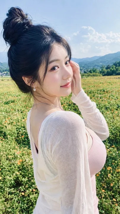
لقطة عفوية لامرأة شرق آسيوية تنظر إلى الوراء في حقل أزهار خارجي
لقطة واقعية للغاية لحياة خارجية، بتكوين عمودي بنسبة 9:16، يلتقط الكاميرا زاوية جانبية مائلة طبيعية من الخلف الأيسر للموضوع، حيث يظهر في الإطار وضعية نصفية جانبية خلفية لامرأة آسيوية شرقية شابة في أواخر العشرينات أو أوائل الثلاثينات من عمرها
Case 2
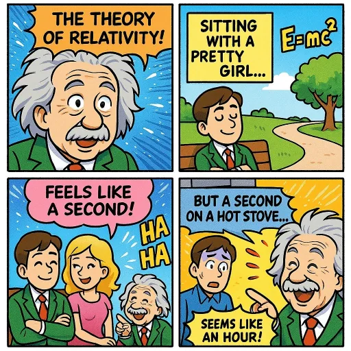
مقطع كاريكاتوري (نظرية النسبية)
صنع صفحة ملونة من المانجا تصف نظرية النسبية. أضف بعض الفكاهة
creative

Case 3