Case 24627
旅行城市立体书照片转绘海报
Prompt
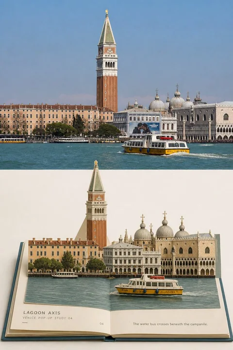
Please turn each travel photo I upload into an independent **TRAVEL POP-UP CITY BOOK | 旅行城市立体书** high-end travel photo transformation poster.

Output each photo separately; multi-photo collages are prohibited.

The overall composition uses a 3:4 vertical layout, consisting of two areas: "Real Original Photo" and "Physical Pop-up Book Transformation." By default, the top and bottom each occupy about 50%, separated by a straight, clear horizontal boundary with no feathering, mixing, or paper structures crossing the boundary line.

## Top: Real Original Photo

Faithfully use the original photo at the top.

Accurately maintain the photo's:

- Location identity and core buildings
- Direction of rivers, canals, roads, or squares
- Outlines of bridges, towers, domes, and major buildings
- Left-to-right order and front-to-back occlusion between buildings
- Positions and directions of boats, vehicles, and a few people
- Topographic height, observation perspective, and spatial depth
- Real materials, natural light and shadow, and original color atmosphere

The top must clearly be presented as a real photographic work, rather than a re-generated realistic illustration.

Perform only slight and restrained color grading suitable for travel magazines, art publications, and photography exhibitions, and add a very thin, almost imperceptible film grain.

To adapt to the vertical frame, the sky, water, roads, and surrounding environment can be naturally cropped or extended, but buildings, bridges, boats, and figures must not be stretched, distorted, mirrored, moved, replaced, or redesigned.

## Bottom: Physical Hardcover Pop-up Book

The bottom uses a pure, warm-white empty space.

In the center of the empty space, place a fully opened, flat-lying collector-grade hardcover pop-up book. The pop-up book typically occupies 65%—85% of the width of the transformation area, with continuous and clean white space preserved around it.

Adopt a slightly frontal, slight top-down perspective so the viewer can simultaneously see:

- Hardcover cover
- Central spine and binding groove
- Left and right pages
- Stacked page edges
- Cover wrapping edges
- Paper thickness
- A three-dimensional scene rising from the pages

The cover color is extracted from the deepest and most stable colors in the original photo, such as deep blue, ink green, charcoal gray, ochre brown, or dark red.

The book block uses warm ivory white thick paper.

It must look like a physical pop-up book that can indeed be closed, rather than a common paper carving base, flat illustration, or architectural model.

## City Distillation

Select 3—8 elements from the original photo that best prove the identity of the location, such as:

- Core buildings or landmarks
- Rivers, canals, roads, or squares
- Recognizable towers, roofs, or domes
- Bridges or arches
- Waterfront buildings
- Boats, vehicles, or a few people
- A set of architectural layers that establish foreground-background relationships

Maintain the left-to-right order, architectural height, traffic direction, front-to-back occlusion, and observation angle from the original photo.

Actively delete:

- Dense window panes
- Repetitive roofs
- Complex signs
- Large numbers of tourists
- Fine vegetation
- Small ripples on the water
- Irrelevant street facilities
- Architectural details that do not help identify the location

Do not add landmarks, character costumes, cultural symbols, or a second city not present in the photo just to make the pop-up book look rich.

## Pop-up Book Layering

According to the photo structure, organize the same location into a paper art structure with clear foreground, middle, and background layers.

### Low-layer Pages

Rivers, canals, roads, squares, or the ground unfold along the central spine, becoming the low-layer paper surface connecting the left and right pages.

The water surface can be represented by a continuous piece of gray-blue, blue-green, or deep-green printed paper, which must cross the spine and continue the spatial direction of the original photo.

### Middle-layer Structures

Main building groups, waterfront facades, bridges, trees, or street blocks rise from the middle-layer pages.

Buildings do not need to copy all windows; keep only:

- Main outlines
- Roof directions
- Key openings
- Facade proportions
- A few representative window panes
- The location's most recognizable colors

### Back-layer Structures

Towers, bell towers, domes, castles, mountains, or the highest landmarks are placed in the back layer and become the highest vertical structures of the entire pop-up book.

High-layer structures must have reasonable fold lines, support pieces, or connection tabs, and must not look like suspended models.

### Front-layer Structures

Boats, vehicles, people, railings, or other scale references can become independent foreground fold pieces, rising from the pages closer to the viewer.

They should not form a second visual center but need to help establish the location's scale and spatial depth.

## Paper Art Mechanisms

Clearly express real, credible paper art construction:

- mountain folds
- valley folds
- scored fold lines
- die-cut edges
- paper slots
- insertion tabs
- connecting tongues
- hidden support pieces
- triangular rear braces
- layered cardstock
- central page hinge
- visible page thickness
- exposed paper fibers
- matte printed ink
- slight handmade registration errors

Bridges can span across the left and right pages and be supported by architectural paper layers or hidden support pieces on both sides.

Towers can be erected using a central vertical fold, slots, and rear triangular support pieces.

Boats, vehicles, and people can be connected to the pages using independent small fold pieces.

There should be clear front-to-back hierarchy and contact shadows between buildings, but shadows must be slight, real, and consistent with paper thickness.

Do not use huge suspended structures that cannot be realistically folded or cannot close the book.

## Colors

Extract colors entirely from the original photo and compress and soften complex colors into a limited printed paper palette.

Prioritize preserving:

- Identification colors of buildings and landmarks
- Roof colors
- Water colors
- Vegetation colors
- Neutral stone colors
- An accent color for a boat, door/window, or vehicle

Use neighboring colors such as warm ivory white, gray-blue, earth red, olive green, ochre brown, and stone gray to unify the rest.

All colors should appear as matte printed paper, dyed cardstock, or slightly aged ink, rather than plastic, resin, or smooth 3D materials.

Avoid high-saturation children's toy colors, neon colors, and fixed palettes unrelated to the photo.

## Small Text System

Add a small amount of English text related to the location structure on the edges of the blank pages.

Each usually contains:

1. A structural title of 1—3 English words
2. A line for the location and series number
3. An observation sentence of 6—14 English words

For example:

`CANAL FOLD`
`VENICE POP-UP STUDY 01`
`The water becomes the hinge between two rows of walls.`

Or:

`RIALTO ARCH`
`VENICE POP-UP STUDY 02`
`The bridge rises while the gondola slips below.`

Titles should describe spatial structures actually existing in the photo, such as:

- `CANAL FOLD`
- `BRIDGE LAYER`
- `LAGOON AXIS`
- `TOWER RISE`
- `WATERFRONT PAGE`
- `CITY HINGE`

When the location is reliable, write:

`VENICE POP-UP STUDY 01`

When the location cannot be reliably confirmed, use:

`CITY POP-UP STUDY 01`

Observation sentences only describe buildings, water bodies, boats, roads, directions, or spatial relationships actually present in the photo, and do not fabricate character stories, dates, coordinates, or building names.

Text must look like a native part of the pop-up book:

- Small serif, narrow sans-serif, or simple type
- Graphite gray, deep blue-gray, or ink the same color as the cover
- Slight letterpress, debossing, or paper ink absorption effects
- Arranged along page edges, the spine, or the low-layer water axis
- Clearly legible, but not as large titles

The total text area does not exceed 5% of the page area.

At most, add one page number, one short horizontal line, or one very small binding field.

Do not add author names, accounts, signatures, logos, QR codes, websites, fictional brands, or garbled code.

## Overall Vibe

The final image is like a travel chapter in a collector-grade architectural paper art book:

The real photo records how the city looked at the time,
The open book refolds canals, roads, bridges, and buildings into a space that can be preserved.

High-end, quiet, precise, gentle, with the temperament of architectural firm publications, art book fairs, independent travel magazines, and paper art collectibles.

## Forced Avoidance

Avoid:

missing original-photo comparison,
multiple-photo collage,
flat illustration printed on open pages,
ordinary paper collage,
single-layer paper silhouette,
origami terrain,
paper-clay model,
plastic 3D,
resin miniature,
realistic architectural model,
children’s toy book,
invented landmark,
mixed cities,
different location on each page,
incorrect building order,
missing central spine,
missing page edges,
missing fold lines,
impossible floating structure,
book filling the entire lower field,
no surrounding negative space,
desk props,
hands,
bookshelf,
room mockup,
large typography,
fake place names,
author name,
signature,
logo,
QR code,
watermark,
nonsense text.

请将我上传的每一张旅行照片分别制作成一张独立的
**TRAVEL POP-UP CITY BOOK|旅行城市立体书**
高级旅行照片转绘海报。

每张照片单独输出,禁止多图拼贴。

整体采用3:4竖版构图,由“真实原片”和“实体立体书转绘”两个区域组成。默认上下各占约50%,使用笔直、清楚的水平边界分隔,不羽化、不混合,也不让纸艺结构跨越分界线。

## 上方:真实原片

上方忠实使用原始照片。

准确保持照片中的:

- 地点身份和核心建筑
- 河流、运河、道路或广场方向
- 桥梁、塔楼、穹顶和主要建筑轮廓
- 建筑之间的左右次序与前后遮挡
- 船只、车辆和少量人物的位置与方向
- 地形高低、观察视角与空间纵深
- 真实材质、自然光影与原有色彩氛围

上方必须清楚表现为真实摄影作品,而不是重新生成的写实插画。

仅进行轻微而克制的旅行杂志、艺术出版物和摄影展览调色,并加入极薄、几乎不可察觉的胶片颗粒。

为适配竖版画幅,可以自然裁切或延展天空、水面、道路和周边环境,但不得拉伸、扭曲、镜像、移动、替换或重新设计建筑、桥梁、船只和人物。

## 下方:实体精装立体书

下方使用纯净的暖白色空场。

在空场中央放置一本完整打开、平放的收藏级精装立体书。立体书通常占转绘区域宽度的65%—85%,四周保留连续而干净的留白。

采用略带正面感的轻微俯视角,使观者能够同时看到:

- 精装封面
- 中央书脊与装订沟槽
- 左右两页
- 成叠页口
- 封面包边
- 纸张厚度
- 从书页中竖起的立体场景

封面颜色从原始照片最深、最稳定的颜色中提取,例如深蓝、墨绿、炭灰、赭褐或暗红。

书芯使用温暖象牙白厚纸。

必须让它看起来确实是一本可以被合上的实体立体书,而不是普通纸雕底座、平面插画或建筑模型。

## 城市提炼

从原始照片中选取最能够证明地点身份的3—8个元素,例如:

- 核心建筑或地标
- 河流、运河、道路或广场
- 具有辨识度的塔楼、屋顶或穹顶
- 桥梁或拱门
- 沿岸建筑
- 船只、车辆或少量人物
- 一组能够建立前后景关系的建筑层次

维持原照片中的左右次序、建筑高低、交通方向、前后遮挡和观察角度。

主动删除:

- 密集窗格
- 重复屋顶
- 复杂招牌
- 大量游客
- 细碎植被
- 水面小波纹
- 无关街道设施
- 无法帮助辨认地点的建筑细节

不得为了让立体书显得丰富而加入照片中不存在的地标、人物服饰、文化符号或第二座城市。

## 立体书分层

根据照片结构,将同一地点组织为具有明确前中后景的纸艺结构。

### 低层书页

河流、运河、道路、广场或地面沿中央书脊展开,成为连接左右页的低层纸面。

水面可以使用一块连续的灰蓝、蓝绿或深绿色印刷纸表现,必须跨越书脊并延续原照片中的空间方向。

### 中层结构

主要建筑群、沿岸立面、桥梁、树木或街区从中层书页竖起。

建筑不必复制所有窗户,只保留:

- 主要轮廓
- 屋顶方向
- 关键开口
- 立面比例
- 少量代表性窗格
- 地点最具有识别度的颜色

### 后层结构

塔楼、钟楼、穹顶、城堡、山体或最高地标放在后层,并成为整本立体书最高的竖向结构。

高层结构必须有合理折线、支撑片或连接舌片,不得像悬空模型。

### 前层结构

船只、车辆、人物、栏杆或其他尺度参照物可以成为独立前景折片,从靠近观者的书页中竖起。

它们不能形成第二视觉中心,但需要帮助建立地点尺度与空间纵深。

## 纸艺机关

清楚表现真实、可信的纸艺构造:

- mountain folds
- valley folds
- scored fold lines
- die-cut edges
- paper slots
- insertion tabs
- connecting tongues
- hidden support pieces
- triangular rear braces
- layered cardstock
- central page hinge
- visible page thickness
- exposed paper fibers
- matte printed ink
- slight handmade registration errors

桥梁可以跨越左右两页,并由两侧建筑纸层或隐藏支撑片承托。

塔楼可以使用中央竖折、插槽和后方三角支撑片竖起。

船只、车辆和人物可以使用独立的小型折片与页片连接。

建筑之间应存在明确的前后层级和接触阴影,但阴影必须轻微、真实并符合纸张厚度。

不得使用无法真实折叠或无法合书的巨大悬空结构。

## 色彩

完全从原始照片中提取颜色,并将复杂色彩压缩、柔化为有限的印刷纸色盘。

优先保留:

- 建筑与地标的识别色
- 屋顶颜色
- 水体颜色
- 植被颜色
- 石材中性色
- 一处船只、门窗或交通工具的强调色

其余使用暖象牙白、灰蓝、土红、橄榄绿、赭褐、石材灰等邻近色统一。

所有颜色应呈现为哑光印刷纸、染色卡纸或轻微旧化油墨,而不是塑料、树脂或光滑3D材质。

避免高饱和儿童玩具色、霓虹色和与照片无关的固定色盘。

## 小字系统

在空白书页边缘加入少量与地点结构有关的英文小字。

每张通常包含:

1. 一个1—3个英文单词的结构标题
2. 一行地点与系列编号
3. 一句6—14个英文单词的观察短句

例如:

`CANAL FOLD`
`VENICE POP-UP STUDY 01`
`The water becomes the hinge between two rows of walls.`

或:

`RIALTO ARCH`
`VENICE POP-UP STUDY 02`
`The bridge rises while the gondola slips below.`

标题应该描述照片中真实存在的空间结构,例如:

- `CANAL FOLD`
- `BRIDGE LAYER`
- `LAGOON AXIS`
- `TOWER RISE`
- `WATERFRONT PAGE`
- `CITY HINGE`

地点可靠时,可以写:

`VENICE POP-UP STUDY 01`

地点无法可靠确认时,使用:

`CITY POP-UP STUDY 01`

观察短句只描述照片中真实存在的建筑、水体、船只、道路、方向或空间关系,不虚构人物故事、日期、坐标和建筑名称。

文字必须像立体书原生的一部分:

- 小号衬线、窄体无衬线或朴素铅字
- 石墨灰、深蓝灰或封面同色油墨
- 轻微凸印、凹压、活版印刷或纸张吸墨效果
- 沿页边、书脊或低层水面轴线排布
- 清楚可读,但不做大型标题

文字总面积不超过书页面积的5%。

最多加入一个页码、一条短横线或一个极小装订字段。

不得加入作者名、账号、签名、Logo、二维码、网址、虚构品牌和乱码。

## 整体气质

最终画面像一本收藏级建筑纸艺书中的旅行章节:

真实照片记录城市当时的样子,
打开的书把运河、道路、桥梁和建筑重新折叠成可以被保存的空间。

高级、安静、精密、温柔,具有建筑事务所出版物、艺术书展、独立旅行杂志与纸艺收藏品的气质。

## 强制避免

避免:

missing original-photo comparison,
multiple-photo collage,
flat illustration printed on open pages,
ordinary paper collage,
single-layer paper silhouette,
origami terrain,
paper-clay model,
plastic 3D,
resin miniature,
realistic architectural model,
children’s toy book,
invented landmark,
mixed cities,
different location on each page,
incorrect building order,
missing central spine,
missing page edges,
missing fold lines,
impossible floating structure,
book filling the entire lower field,
no surrounding negative space,
desk props,
hands,
bookshelf,
room mockup,
large typography,
fake place names,
author name,
signature,
logo,
QR code,
watermark,
nonsense text.
مطالب أخرى

Case 23912
复古石墙前的慵懒午后自然光影人像
{ "prompt_structure": { "subject": { "appearance": "Young woman with a natural, alluring look. Lightly tanned skin with visible natural skin texture. Dark brown hair styled in a messy, casual high bun with wispy bangs framing the face.", "f
纯欲风超写实人像胶片感度假风
Case 2700
VIDEO
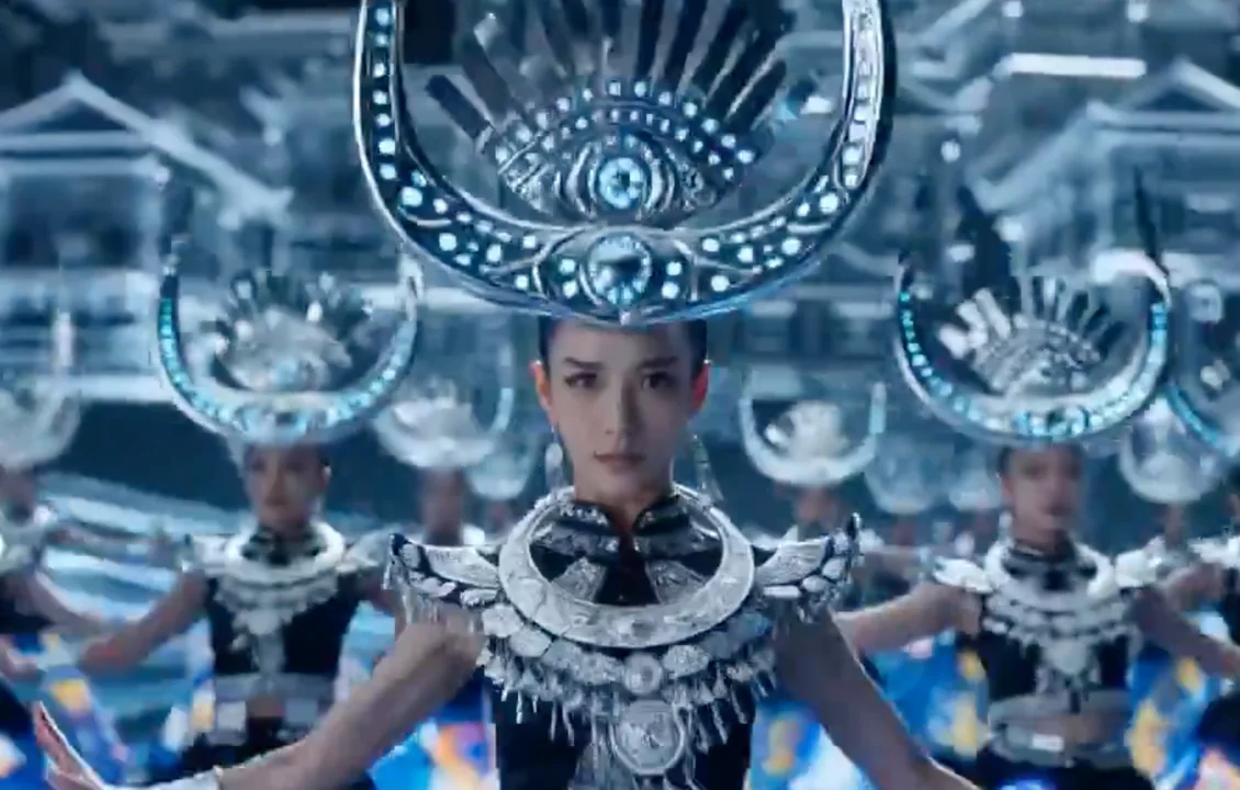
سيبر أرض المياو: القمة السائلة من الكروم الفضي وهالوسينايا النيون
إعداد فيديو مستوى فيلم فائق الدقة، دقة 8K، جمالية سيبرانية أثنية. حركة العدسة (الهزة الإيقاعية والكاليديسكوب): تهتز العدسة (الهزة الكاميرا) وفق إيقاع طبول إلكترونية من لو شينغ. في منتصف المشهد تستخدم تأثير الكاليديسكوب، حيث تُكرر اللامعات ا