Case 2097
极致清爽热量剖面信息图
信息图俯拍热量解剖数据
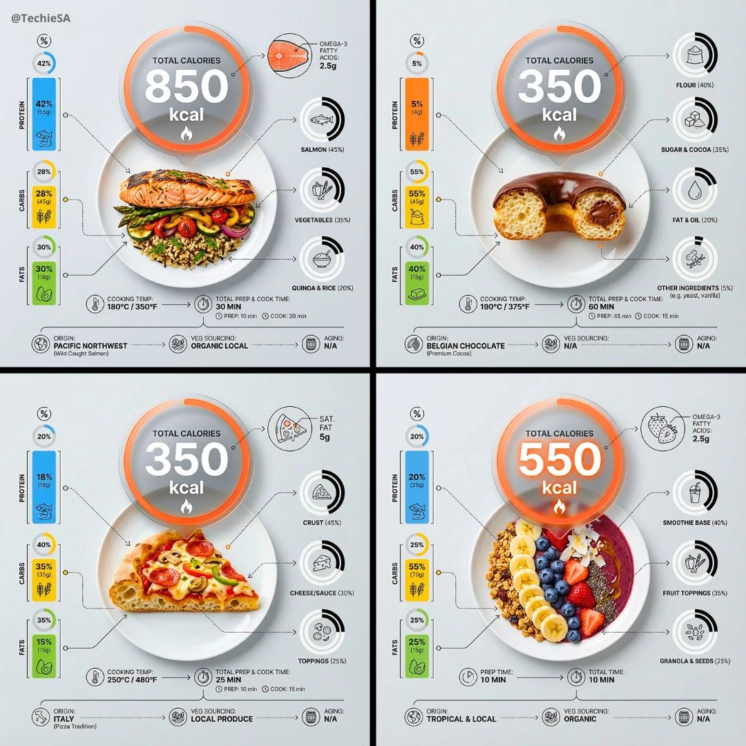
Prompt
Ultra-clean top-down (90° flat lay) infographic composition. A perfectly centered white ceramic plate sits on a seamless light background. On the plate: [FOOD], shown in a precise cross-section or layered cutaway, revealing internal ingredients, textures, and structure with extreme clarity. PRIMARY FOCAL POINT (HERO ELEMENT): Above the plate, occupying a large portion of the upper canvas, place an oversized floating infographic bubble displaying: TOTAL CALORIES [XXXX kcal] The calorie bubble is significantly larger than any other element, instantly readable at thumbnail size. Design it with strong visual contrast: bold sans-serif typography, thick outline or semi-transparent glassmorphism, subtle glow or drop shadow, and clean UI styling. This is the first thing the eye sees. SECONDARY ELEMENTS: Surrounding the plate, fill the remaining space with a dense, high-information infographic system: – Nutritional breakdown charts (protein, carbs, fats) – Ingredient percentage bars and rings – Cooking or preparation temperatures and times – Origin, aging, or production icons – Measurement scales, micro-diagrams, data badges Use thin vector connectors, dotted lines, arrows, pictograms, and radial charts clearly linking data to specific food components. Visual hierarchy rules: Calorie bubble = dominant Plate + food = secondary anchor Surrounding data = tertiary but dense and readable Design language: premium editorial infographic, Apple UI × National Geographic food science, extremely clean, structured, and modern. Color palette: natural food colors, monochrome infographic UI, one accent color reserved exclusively for the calorie bubble. Lighting: soft studio lighting, zero clutter, flat background for maximum contrast. Output: 1080×1080, ultra-crisp, social-feed optimized, no watermark.

超洁净俯拍(90°平铺)信息图表构图。一个完美居中的白色陶瓷盘置于无缝浅色背景上。盘中:[FOOD],以精确的横截面或分层剖面展示,极致清晰地揭示内部食材、质地与结构。主要焦点(英雄元素):在盘子上方,占据画布上部大片区域,放置一个超大悬浮信息图气泡,显示:总热量[XXXX kcal]。热量气泡显著大于任何其他元素,缩略图尺寸即可瞬间阅读。采用强烈视觉对比设计:粗体无衬线字体、粗轮廓或半透明玻璃拟态、微妙光晕或投影,干净UI风格。这是第一眼所见。次要元素:围绕盘子,在剩余空间填充密集的高信息密度信息图系统:– 营养成分分解图表(蛋白质、碳水、脂肪)– 食材百分比条与环– 烹饪或准备温度与时间– 产地、熟成或生产图标– 测量刻度、微示意图、数据徽章使用细矢量连接线、虚线、箭头、图示,以及径向图表,清晰将数据链接至具体食物成分。视觉层级规则:热量气泡=主导盘子+食物=次要锚点周边数据=第三但密集可读设计语言:高端编辑信息图,Apple UI×国家地理食物科学,极致干净、结构化、现代。色彩方案:自然食物色、单色信息图UI,一种强调色仅留给热量气泡。灯光:柔和工作室光,零杂乱,平面背景实现最大对比。输出:1080×1080,超清晰,社媒 feed 优化,无水印。
More prompts
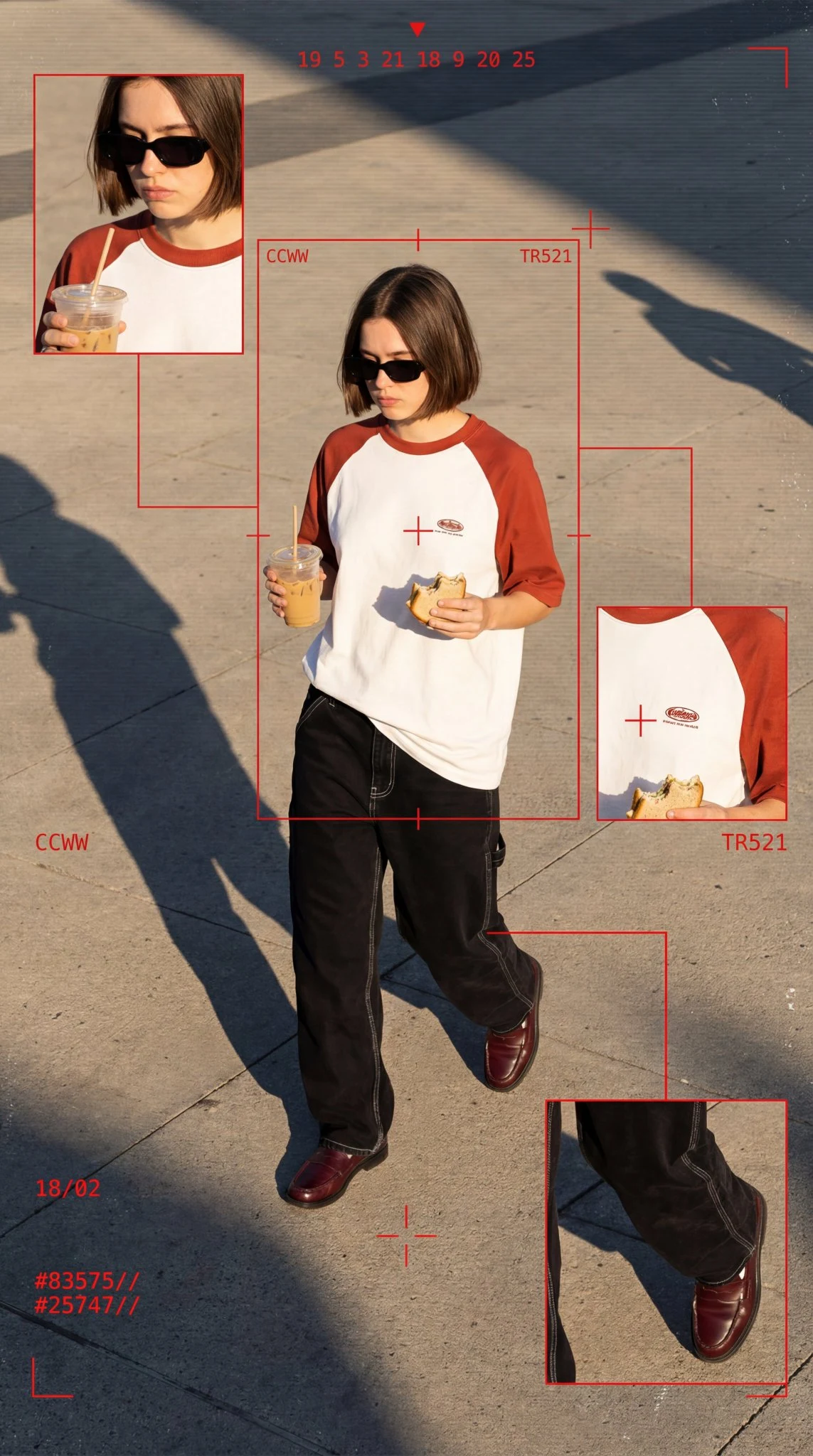
Case 796
A set of cyberpunk-style fashion photoshoot
A cyber-grunge surveillance fashion editorial featuring a cool, edgy young woman in her early 20s with a short chin-length bob haircut, straight with slight texture and casual bangs, partially obscured by thick black sunglasses and holding
landscapenaturephotographyvehiclefashionsci-fidata-vizUI素材branding
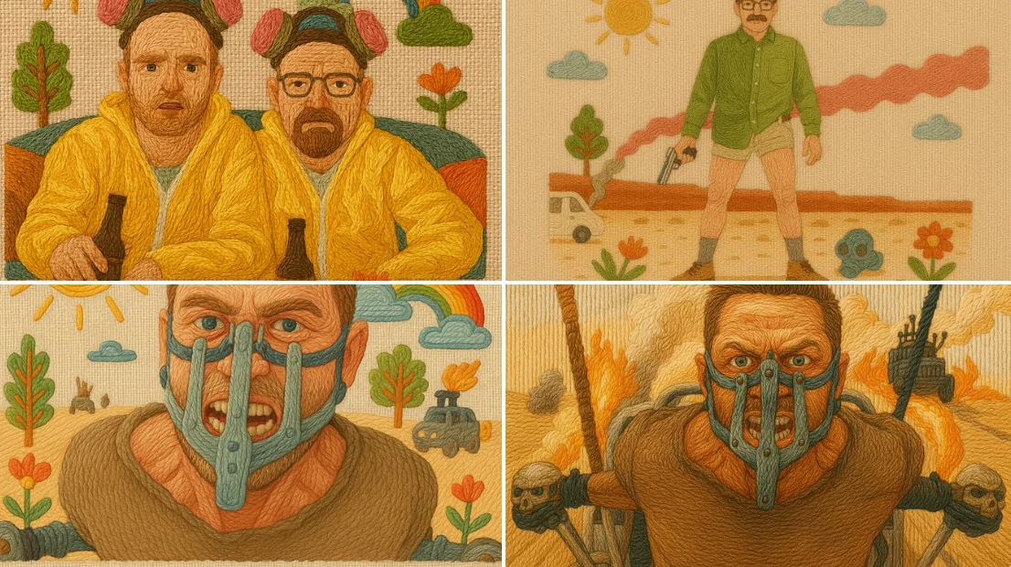
Case 8
Embroidery illustration style
A handcrafted illustration that simulates traditional embroidery using colorful threads on linen fabric. All elements are "stitched" with visible yarn textures, using techniques like satin stitch, backstitch, and French knots. Raised contou