Case 27237
垂直分栏摄影与3D纸雕海报
Prompt
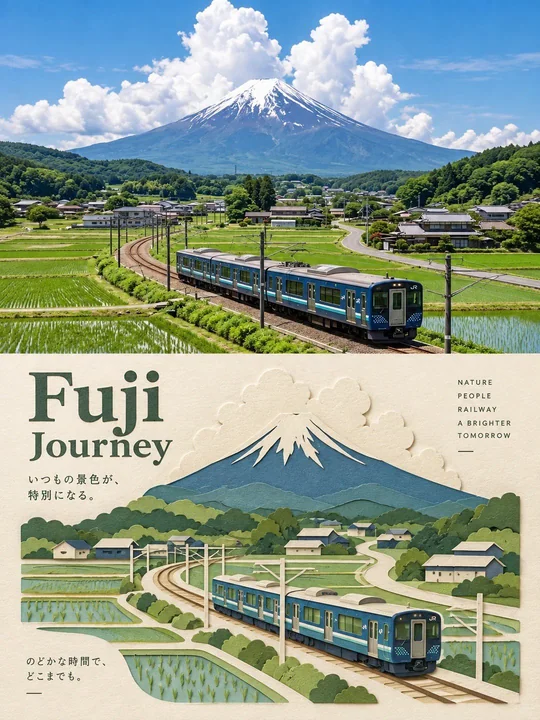
A vertical, split-panel travel poster featuring a photographic view on top and a 3D layered paper-craft illustration of the exact same scene on the bottom.

Top Panel (Realistic Photography): A wide-angle, highly detailed, vibrant photograph of [INSERT LOCATION/SCENERY, e.g., a serene Swiss alpine valley with a modern blue train, a golden autumn forest, or a coastal village]. The lighting is [INSERT LIGHTING STYLE, e.g., warm golden hour light / crisp morning sunlight / bright daytime]. The composition shows [INSERT MAIN SUBJECT/ACTION, e.g., a train curving on tracks / a traveler walking with sheep / a boat sailing].

Bottom Panel (Paper-Craft Art): An intricate, multi-layered 3D paper-cut illustration re-creating the exact scene from the photo above. Hand-crafted dimensional paper layers create depth, with visible textured paper edges and shadows. Elements like the background mountains, trees, architecture, and subjects are constructed from distinct colored paper cutouts. The background paper behind the illustration is a warm, textured off-white cream color.

Typography & Layout: Clean, minimalist travel poster design. Elegant dark serif typography for the main title: "[INSERT TITLE, e.g., Alpine Journey]". Smaller sans-serif text aligned to the right or side: "[INSERT SUBTITLES, e.g., SCENIC ROUTE / NATURE / A BRIGHTER TOMORROW]". Minimalist minimalist captions and thin alignment lines placed on the cream paper background.

Example of how to fill it out:
Location/Scenery: a misty bamboo forest in Kyoto with a traditional wooden temple

Lighting Style: soft, diffused morning mist lighting

Main Subject: a person in a red kimono walking along a stone pathway

Title: Bamboo Peace

Subtitles: KYOTO FOREST / ANCIENT PATH / SERENITY

This structure ensures any modern AI image generator understands the split layout, the distinct contrast between the realism on top and the tactile paper-cut art on the bottom, and the specific aesthetic placement of travel typography.

一张垂直、分栏的旅游海报,顶部展示摄影视图,底部展示完全相同场景的3D分层纸雕插画。

顶部面板(写实摄影):一张广角、高度细节、色彩鲜艳的照片,拍摄的是[插入地点/风景,例如:一个带有现代蓝色火车的宁静瑞士阿尔卑斯山谷,一片金色的秋天森林,或是一个沿海村庄]。光线是[插入光照风格,例如:温暖的金辉时刻光线 / 清爽的晨曦阳光 / 明亮的白天]。构图显示了[插入主要主体/动作,例如:一列在轨道上转弯的火车 / 一位带着羊群行走的旅行者 / 一艘航行的船]。

底部面板(纸雕艺术):一种复杂、多层的3D剪纸插画,重新创作了上方照片中的完全相同场景。手工制作的维度纸层创造了深度,带有可见的纹理纸边缘和阴影。山脉背景、树木、建筑和主体等元素由截然不同的彩色剪纸制成。插画背后的背景纸是温暖的、有纹理的乳白色。

排版与布局:干净、极简的旅游海报设计。主标题采用优雅的深色衬线字体:"[插入标题,例如:高山之旅]"。较小的无衬线文本对齐在右侧或侧边:"[插入副标题,例如:景观路线 / 自然 / 更美好的明天]"。极简的说明文字和细长的对齐线放置在乳白色纸张背景上。

如何填充的示例:
地点/风景:京都薄雾缭绕的竹林与一座传统的木质寺庙

光照风格:柔和、弥漫的晨雾光线

主要主体:一个穿着红色和服的人沿着石径行走

标题:竹之宁静

副标题:京都森林 / 古径 / 宁静

这种结构确保任何现代AI图像生成器都能理解分割布局、顶部写实主义与底部触感剪纸艺术之间的鲜明对比,以及旅游排版的特定美学放置。
更多提示词
Case 2
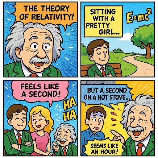
四格漫画(相对论)
制作一页色彩丰富的漫画,描述相对论的理论。加入一些幽默元素。
creative
Case 11752
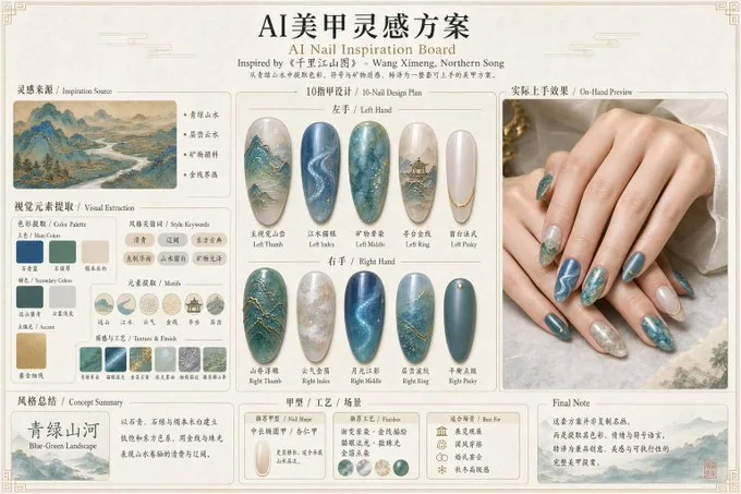
AI美甲灵感方案
请根据用户输入的【主题】或上传的【参考图片】,创作一张横向 4:3 的高完成度「AI美甲灵感方案」。 【输入规则】 如果用户提供的是文字主题,请根据主题进行抽象提炼。 如果用户提供的是参考图片: - Image A 是灵感参考图,是本次美甲方案的核心灵感来源; - 如果用户还提供了手部照片,则 Image B 为手部参考图,用于辅助生成更贴近肤色与手型的实际上手效果; - 如果没有手部照片,请生成一组自然、真实、审美在线的通用女性双手上手效果图。 ------------
Case 24
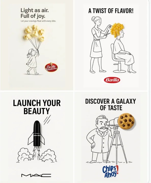
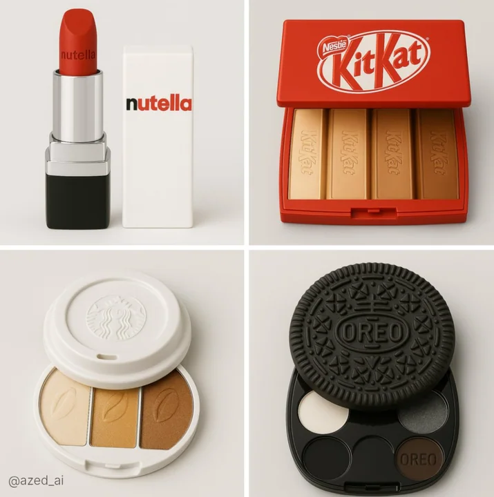
新兴市场中的美容化妆品品牌
一款受[食品品牌]启发的[产品]的产品摄影图,放置在柔和的浅灰色背景前。产品清晰对焦,采用柔光灯光照明。包装设计包含官方[食品品牌]标志,并体现品牌的颜色和风格。产品外观 sleek、 glossy 且逼真,细节精致,呈现优雅。画面中不出现任何食物,仅展示化妆品产品。只包含化妆品单品。现代审美,奢华美妆品牌形象