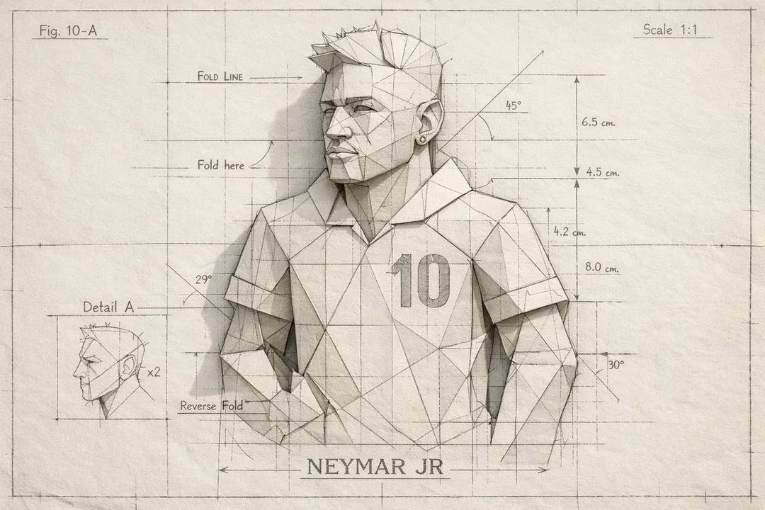
Case 15370
复古丝网印刷风格城市旅游海报
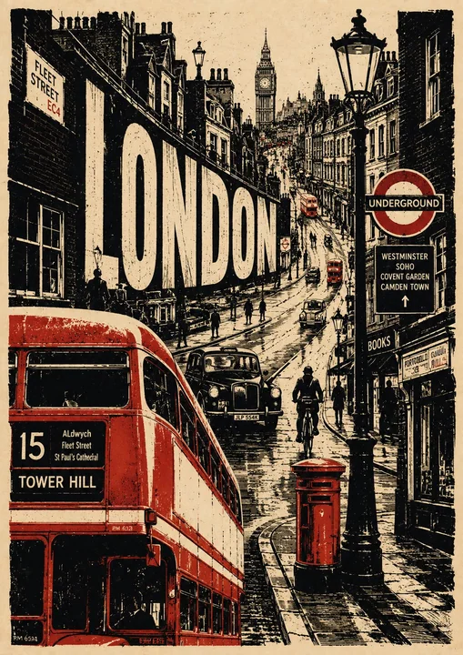
Prompt
Create a premium 4:5 vertical vintage travel poster for [CITY], [COUNTRY], inspired by classic screen-printing, linocut illustration, retro editorial graphics, and handmade European travel posters.

Build a completely original composition that captures the personality of [CITY] rather than simply arranging famous landmarks.

Use a warm aged cream paper background with visible paper fibers, subtle stains, distressed ink, rough printing edges, and authentic handmade texture.

VISUAL CONCEPT

Create one strong central visual story representing [CITY].

Integrate 2–4 recognizable landmarks or architectural elements naturally into the environment, along with everyday details that make the city feel alive:

local transportation
characteristic streets and buildings
cafés and shops
street signs
local food or objects
pedestrians and cyclists
trees and surrounding landscape
culturally distinctive details

Avoid making the landmarks look like floating stickers or a checklist. Everything should feel like it belongs to one continuous scene.

COLOR PALETTE

Use a sophisticated limited palette:

warm ivory + charcoal/black + one signature accent color associated with [CITY].

Keep the accent color selective and powerful rather than covering the entire artwork.

TYPOGRAPHY

Integrate large, bold, hand-printed typography into the composition:

[CITY]

Add a small secondary phrase that reflects the city’s character:

[SHORT CITY PHRASE]

Typography should feel imperfect, screen-printed, slightly distressed, and organically integrated into the artwork.

ART STYLE

vintage linocut
handmade screen print
retro travel-poster illustration
rough ink texture
distressed halftone grain
imperfect registration
hand-cut edges
strong silhouettes
expressive perspective
subtle paper imperfections
sophisticated negative space
editorial art-book aesthetic

Make the artwork feel like a rare collectible travel print, combining nostalgia with contemporary graphic design.

IMPORTANT

Do not simply reproduce a traditional tourist poster.

Do not use a generic landmark collage, photorealism, glossy 3D rendering, excessive colors, gradients, or overly clean digital graphics.

The final composition should be bold, artistic, slightly unexpected, highly recognizable, culturally authentic, and visually sophisticated, with [CITY]’s unique identity immediately apparent.

为[城市], [国家]创作一张优质的 4:5 垂直比例复古旅行海报,灵感源自经典丝网印刷、麻胶版画插图、复古社论图形和手工制作的欧洲旅行海报。

构建一个完全原创的构图,捕捉[城市]的个性,而不是简单地排列著名地标。

使用带有可见纸张纤维、细微污渍、磨损墨迹、粗糙印刷边缘和真实手工质感的温暖老化奶油色纸张背景。

视觉概念

创作一个代表[城市]的强有力的核心视觉故事。

将 2–4 个可识别的地标或建筑元素自然地融入环境中,以及让城市充满活力的日常细节:

当地交通
特色街道和建筑
咖啡馆和商店
街道标志
当地食物或物品
行人和骑自行车的人
树木和周围景观
具有文化特色的细节

避免让地标看起来像漂浮的贴纸或清单。一切都应该感觉属于一个连续的场景。

调色板

使用精致的限量调色板:

暖象牙色 + 炭黑色/黑色 + 一种与[城市]相关的标志性点缀色。

保持点缀色的选择性和力量感,而不是覆盖整个作品。

排版

将大号、加粗、手工印刷的排版融入构图中:

[城市]

添加一个反映城市特色的简短次要短语:

[城市简短短语]

排版应具有不完美感、丝网印刷感、轻微磨损感,并有机地融入艺术作品中。

艺术风格

复古麻胶版画
手工丝网印刷
复古旅行海报插图
粗糙墨迹纹理
做旧半色调颗粒
套印不准
手工切割边缘
强烈的剪影
富有表现力的透视
细微的纸张缺陷
精致的负空间
社论艺术书美学

让艺术作品感觉像一件稀有的收藏级旅行印刷品,将怀旧感与当代图形设计相结合。

重要事项

不要简单地复制传统的旅游海报。

不要使用通用的地标拼贴、写实摄影、光泽的 3D 渲染、过多的颜色、渐变或过于干净的数字图形。

最终的构图应该是大胆的、艺术性的、略带出人意料的、高度可识别的、具有文化真实性的且视觉上精致的,[城市]的独特身份应一目了然。
مطالب أخرى
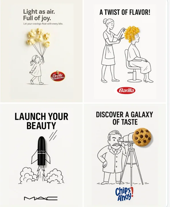
Case 12
إعلان إبداعي
إعلان أنيق ومبدع مُثبت على خلفية بيضاء نظيفة. يتم دمج كائن حقيقي [كائن حقيقي] داخل رسمة مخطوطة بحبر أسود يدوي، باستخدام خطوط مفتوحة ومرحة. تتفاعل فكرة الرسمة [فكرة الرسمة] مع الكائن بطريقة ذكية ومبتكرة. أضف نصًا [نص الإعلان] أسود غامق في ال
minimalist品牌Logobranding

Case 28053
咖啡店吧台东亚美女撒粉商业写真
Subject: Coffee shop bar counter sprinkling powder on drinks Main Subject: Vertical orientation, a stunning 23-year-old East Asian beauty standing inside the bar, occupying about 60% of the frame, viewed from a side-rear angle. Her left ha