Case 2860
复古电影主题雕刻风格邮票
复古极简电影邮票雕刻
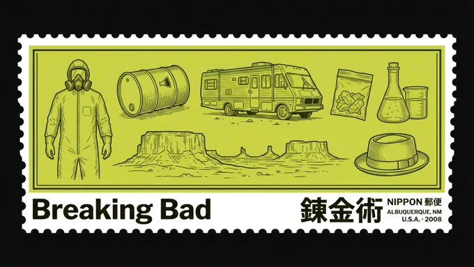
Prompt
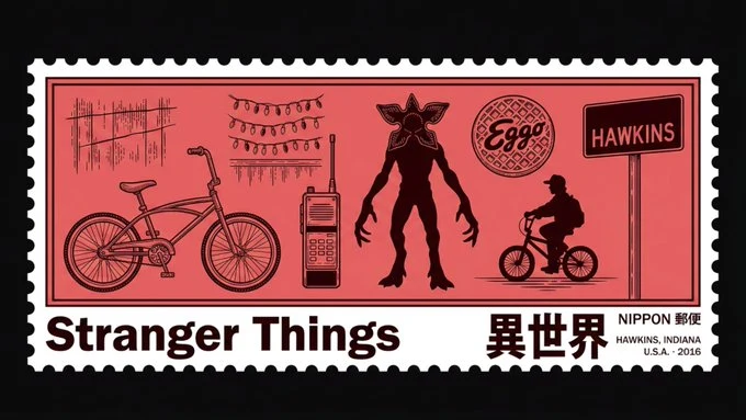
A single vintage postage stamp displayed on a flat matte black background (#0a0a0a), centered in a 16:9 canvas with small black borders visible on all sides. The stamp itself is an ultrawide horizontal rectangle at approximately 3:1 aspect ratio. The stamp has serrated/perforated zigzag edges on all four sides, like a real postage stamp, with clean white perforation teeth.
The movie this stamp is based on is [SERIES]. Every visual and textual element of this stamp must be automatically derived from and tailored to this movie — including illustration subjects, kanji, location, year, and country.
The stamp’s background fill color is [COLOR] — muted, desaturated, dusty, vintage-toned, completely flat. No gradients, no shading. The illustration engraving lines must be a significantly darker shade of [COLOR], dark enough to stand out clearly and crisply against the background at high contrast.
Inside the stamp, the entire surface is filled with monochrome dark illustrations etched into the background like fine engraving. The illustrations must depict 5–8 of the most universally iconic and recognizable objects, characters, vehicles, symbols, and locations from [SERIES] — chosen specifically because anyone who has seen the film would instantly recognize them. All arranged loosely across the full width of the stamp with generous spacing. Detailed technical engraving style — only outlines and fine internal linework, no fills, high contrast against the background.
The stamp has a thin dark inner border line just inside the perforations, framing all content. Below this inner border line, there is a flat white horizontal strip spanning the full bottom width of the stamp, sitting inside the perforated edge. In the bottom-left of this white strip: the movie title in large heavy bold grotesque sans-serif font (similar to Franklin Gothic), in solid black. In the bottom-right of this white strip: the most accurate and natural Japanese kanji translation of the title or central theme of the movie in large bold black text, with small text above it reading “NIPPON 郵便”, and two lines of tiny black text below it — the first line showing the most iconic or recognizable location from the movie in all caps, and the second line showing the country where the movie was produced followed by a · and the year the movie was released — all right-aligned.
Flat graphic design, vintage retro

一枚复古邮票展示在平坦的哑光黑色背景(#0a0a0a)上,在 16:9 的画布中居中,四周可见细小的黑色边框。邮票本身是一个超宽的横向矩形,纵横比约为 3:1。邮票四边有锯齿状/齿孔边缘,就像真正的邮票一样,带有干净的白色齿孔。
这枚邮票基于的电影是 [系列]。邮票的每一个视觉和文本元素都必须自动源自该电影并为其量身定制——包括插图主体、汉字、地点、年份和国家。
邮票的背景填充颜色是 [颜色]——柔和、去饱和、充满灰尘感、复古色调,完全平坦。无渐变,无阴影。插图雕刻线条必须是 [颜色] 的明显更深的色调,深到足以在高对比度下清晰锐利地突出于背景之上。
在邮票内部,整个表面充满了单色深色插图,像精细的雕刻一样蚀刻在背景中。插图必须描绘 [系列] 中 5-8 个最普遍标志性且易于识别的物体、角色、车辆、符号和地点——专门选择那些任何看过电影的人都能立即识别的元素。全部宽松地排列在邮票的全宽范围内,间距宽敞。详细的工艺雕刻风格——仅轮廓和精细的内部线条,无填充,与背景形成高对比度。
邮票在齿孔内侧有一条细深的内边框线,框住所有内容。在这条内边框线下方,有一条扁平的白色横条,横跨邮票的整个底部宽度,位于齿孔边缘内侧。在白色横条的左下角:电影标题采用大号粗体怪诞无衬线字体(类似于 Franklin Gothic),纯黑色。在白色横条的右下角:电影标题或中心主题最准确、最自然的日文汉字翻译,采用大号粗体黑色文本,上方有小字写着“NIPPON 郵便”,下方有两行微小的黑色文本——第一行以大写字母显示电影中最具标志或最易识别的地点,第二行显示电影制作国家,后跟一个 · 和电影发行年份——全部右对齐。
扁平平面设计,复古怀旧
More prompts
Case 14868
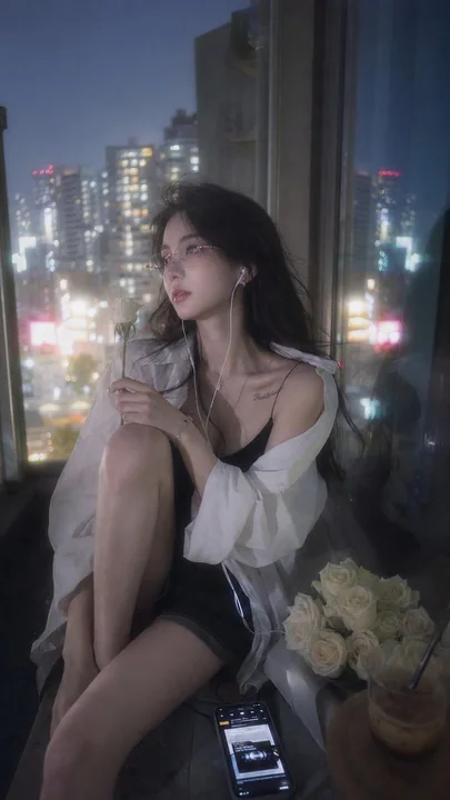
Ricoh GR-style Tokyo balcony blue hour girl portrait photography
Photorealistic Japanese idol fashion portrait, cinematic Japanese photobook aesthetic, premium lifestyle campaign photography, Ricoh GR III HDF. A stunningly beautiful Chinese internet celebrity in her mid-20s with long silky black hair, s
Case 18
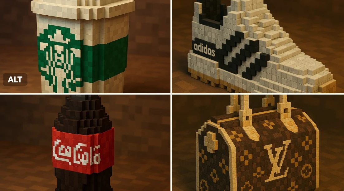
Brand Minecraft Style
"A Minecraft-style voxel recreation of a [BRAND NAME] [OBJECT], built entirely from pixelated cubes — detailed voxel modeling, signature brand colors and logo, blocky textures, clean lighting, stylized yet recognizable, 3D render, high reso
naturegamingpixelbranding