Case 27064
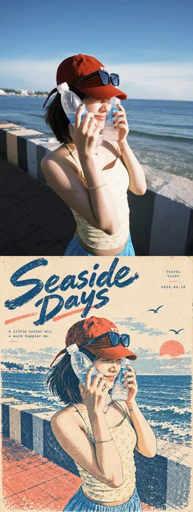
复古孔版印刷风格旅行日记艺术海报
复古风海报设计孔版印刷插画感纪实性
Prompt
Use the single uploaded photograph as the sole content source. Transform it into one finished vintage travel-diary art poster. Output only the transformed poster—do not include the original photograph, a before-and-after comparison, split layout, collage, mockup, or explanatory text. Preserve the source aspect ratio unless the user explicitly requests another format. Faithfully preserve the photograph’s principal subject, identity cues, age category, facial structure, hairstyle, expression, gaze direction, pose, clothing, accessories, handheld objects, interaction, viewpoint, and essential scene narrative. Preserve important environmental elements that establish the place or story, such as water, boats, streets, buildings, snow, trees, railings, vehicles, or distant figures. Simplify incidental clutter without changing the meaning of the moment. Do not add, remove, duplicate, or replace important people or objects. Redraw the image as a refined mid-century editorial illustration printed with a limited-color risograph and vintage screen-print process. Use warm ivory, lightly aged, fibrous uncoated paper as the base. Build the artwork primarily with deep Prussian blue or faded navy ink, dusty coral or muted salmon ink, and no more than one optional subdued accent color sampled from the source. Let the exposed paper provide highlights and skin illumination. Avoid full-color photographic rendering and smooth digital gradients. Translate faces, hair, clothing, and scenery into expressive navy contour lines, etched hatching, broken dry-brush marks, coarse halftone dots, stippling, flat ink blocks, and selectively preserved paper-white areas. Keep the subject recognizable while slightly simplifying anatomy into an elegant hand-drawn editorial character. Render eyes, nose, lips, jawline, hair movement, and distinctive clothing details with economical but accurate linework. Preserve complex textures—such as knitted scarves, striped shirts, snow, waves, and reflections—through rhythmic hatching, grainy ink patterns, and distressed color fields rather than photorealistic detail. Use authentic analog print imperfections throughout: uneven ink density, worn edges, subtle speckling, paper grain showing through solid areas, distressed halftones, occasional broken contours, slight blue-and-coral registration offsets, and small areas where the ink appears rubbed or faded. Keep these imperfections controlled and intentional. The result must resemble a carefully designed archival risograph or screen-printed poster, not a generic digital filter, watercolor painting, comic panel, vector graphic, or pencil sketch. Adapt the source composition into a balanced editorial poster. Keep the principal subject dominant and recognizable, usually occupying the center or right side when the original layout allows it. Preserve the essential background as simplified layered silhouettes and textured shapes. Create clean negative space for typography without covering the face, hands, or important story elements. Small symbolic accents—such as a sun disc, birds, snowflakes, waves, or short horizontal rules—may be added only when they match the source setting. Do not introduce unrelated decorative objects. Add a restrained diary-style typography system using the following optional fields: “[TITLE]”, “[SUBTITLE]”, “[DATE]”, and “[CAPTION]”. Reproduce any user-supplied field exactly, including spelling, capitalization, punctuation, language, and spacing. Place the title in the largest natural area of negative space using expressive hand-lettered brush script or an elegant editorial serif, depending on the mood. Set the subtitle, date, issue number, and caption in very small letter-spaced serif or typewriter-style text near the outer margins. Keep all supporting copy secondary to the illustration. Use deep navy ink for typography, with coral only for tiny accents. If the user leaves a text field blank or omits all text, automatically create concise copy appropriate to the uploaded image: generate a two-to-five-word poetic English title, one short atmospheric sentence of no more than twelve words, and use the current date only if a date is desired by the layout. Do not invent specific locations, names, historical facts, or events that cannot be determined from the photograph. Use no more than one large title, one brief caption, one date or issue line, and two tiny decorative rules. Ensure every visible character is correctly spelled and fully legible; if reliable typography cannot be produced, omit the uncertain supporting text rather than rendering gibberish. Maintain a spacious, nostalgic, literary mood with strong visual hierarchy, understated emotion, muted ink colors, tactile paper texture, and the appearance of a collectible independent magazine cover or personal travel journal print. Avoid photorealism, glossy paper, neon colors, excessive colors, smooth airbrushing, clean vector outlines, modern advertising gradients, heavy 3D effects, generic anime styling, malformed faces or hands, changed clothing, invented landmarks, dense text blocks, random letters, logos, signatures, watermarks, borders, and frames. Output only the completed vintage risograph diary poster.

Use the single uploaded photograph as the sole content source. Transform it into one finished vintage travel-diary art poster. Output only the transformed poster—do not include the original photograph, a before-and-after comparison, split layout, collage, mockup, or explanatory text. Preserve the source aspect ratio unless the user explicitly requests another format.

Faithfully preserve the photograph’s principal subject, identity cues, age category, facial structure, hairstyle, expression, gaze direction, pose, clothing, accessories, handheld objects, interaction, viewpoint, and essential scene narrative. Preserve important environmental elements that establish the place or story, such as water, boats, streets, buildings, snow, trees, railings, vehicles, or distant figures. Simplify incidental clutter without changing the meaning of the moment. Do not add, remove, duplicate, or replace important people or objects.

Redraw the image as a refined mid-century editorial illustration printed with a limited-color risograph and vintage screen-print process. Use warm ivory, lightly aged, fibrous uncoated paper as the base. Build the artwork primarily with deep Prussian blue or faded navy ink, dusty coral or muted salmon ink, and no more than one optional subdued accent color sampled from the source. Let the exposed paper provide highlights and skin illumination. Avoid full-color photographic rendering and smooth digital gradients.

Translate faces, hair, clothing, and scenery into expressive navy contour lines, etched hatching, broken dry-brush marks, coarse halftone dots, stippling, flat ink blocks, and selectively preserved paper-white areas. Keep the subject recognizable while slightly simplifying anatomy into an elegant hand-drawn editorial character. Render eyes, nose, lips, jawline, hair movement, and distinctive clothing details with economical but accurate linework. Preserve complex textures—such as knitted scarves, striped shirts, snow, waves, and reflections—through rhythmic hatching, grainy ink patterns, and distressed color fields rather than photorealistic detail.

Use authentic analog print imperfections throughout: uneven ink density, worn edges, subtle speckling, paper grain showing through solid areas, distressed halftones, occasional broken contours, slight blue-and-coral registration offsets, and small areas where the ink appears rubbed or faded. Keep these imperfections controlled and intentional. The result must resemble a carefully designed archival risograph or screen-printed poster, not a generic digital filter, watercolor painting, comic panel, vector graphic, or pencil sketch.

Adapt the source composition into a balanced editorial poster. Keep the principal subject dominant and recognizable, usually occupying the center or right side when the original layout allows it. Preserve the essential background as simplified layered silhouettes and textured shapes. Create clean negative space for typography without covering the face, hands, or important story elements. Small symbolic accents—such as a sun disc, birds, snowflakes, waves, or short horizontal rules—may be added only when they match the source setting. Do not introduce unrelated decorative objects.

Add a restrained diary-style typography system using the following optional fields: “[TITLE]”, “[SUBTITLE]”, “[DATE]”, and “[CAPTION]”. Reproduce any user-supplied field exactly, including spelling, capitalization, punctuation, language, and spacing. Place the title in the largest natural area of negative space using expressive hand-lettered brush script or an elegant editorial serif, depending on the mood. Set the subtitle, date, issue number, and caption in very small letter-spaced serif or typewriter-style text near the outer margins. Keep all supporting copy secondary to the illustration. Use deep navy ink for typography, with coral only for tiny accents.

If the user leaves a text field blank or omits all text, automatically create concise copy appropriate to the uploaded image: generate a two-to-five-word poetic English title, one short atmospheric sentence of no more than twelve words, and use the current date only if a date is desired by the layout. Do not invent specific locations, names, historical facts, or events that cannot be determined from the photograph. Use no more than one large title, one brief caption, one date or issue line, and two tiny decorative rules. Ensure every visible character is correctly spelled and fully legible; if reliable typography cannot be produced, omit the uncertain supporting text rather than rendering gibberish.

Maintain a spacious, nostalgic, literary mood with strong visual hierarchy, understated emotion, muted ink colors, tactile paper texture, and the appearance of a collectible independent magazine cover or personal travel journal print. Avoid photorealism, glossy paper, neon colors, excessive colors, smooth airbrushing, clean vector outlines, modern advertising gradients, heavy 3D effects, generic anime styling, malformed faces or hands, changed clothing, invented landmarks, dense text blocks, random letters, logos, signatures, watermarks, borders, and frames. Output only the completed vintage risograph diary poster.
مطالب أخرى

Case 14047
فتاة آسيوية بملامح طبيعية وعابرة للطبيعة في صورة فوتوغرافية في الفصل الدراسي
التصوير الفوتوغرافي الفائق الواقعية، فتاة آسيوية في حوالي 20 عامًا، طابع نقي وحلو، شعر أسود طويل طبيعي قليلاً مموج، تمويج هواء، بشرة فاتحة ناعمة، ابتسامة مشرقة تكشف عن أسنان بيضاء منتظمة، عيون لطيفة ومحفزة. الشخصية جالسة على كرسي فصل، جسمها
Case 27062
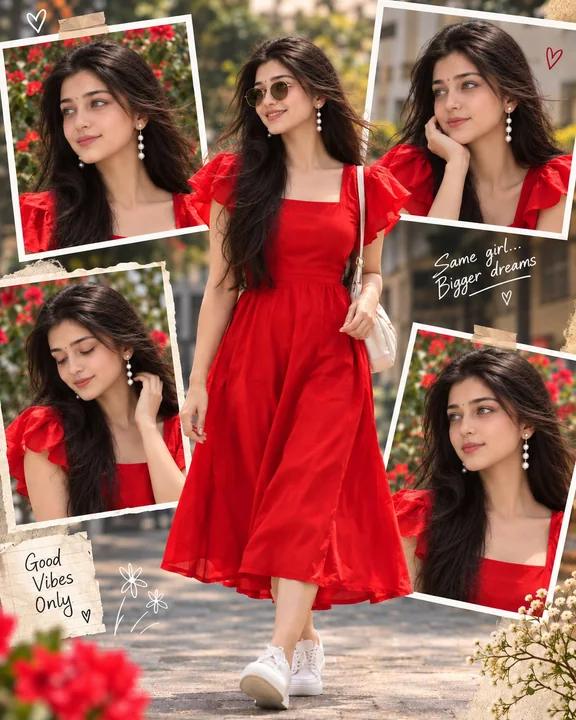
保持原始构图的精准人脸替换提示词
Use the uploaded TARGET IMAGE as the exact master image and the uploaded REFERENCE IMAGE only for the girl’s facial identity. Replace the face/identity of the girl in the TARGET IMAGE with the face from the REFERENCE IMAGE. Apply the same