Case 21493
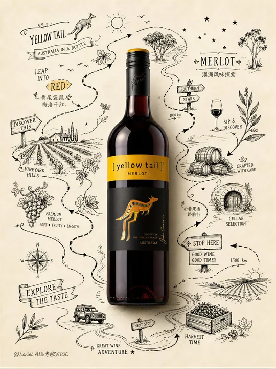
黄尾袋鼠梅洛红酒写实瓶身手绘探险海报
Prompt
Create an ultra-premium advertising poster for Yellow Tail Merlot red wine, built around a strong contrast between one highly realistic wine bottle and a surrounding world of lively hand-drawn exploration-route line art. The image should feel clean, adventurous, graphic, playful, premium, and highly brand-specific, like a collectible illustrated wine poster on textured paper.

Main composition:
Place one realistic bottle of Yellow Tail Merlot exactly at the center as the absolute hero object. The bottle must be highly realistic and unmistakably Yellow Tail: deep merlot-red wine glow, crisp label, iconic yellow kangaroo mark clearly visible, elegant foil capsule, glossy glass reflections, realistic shadow, and premium wine-bottle rendering. The bottle must be the only fully realistic object in the image.

Background:
Use a very clean warm ivory or pale cream textured paper background with generous negative space. The paper should feel premium and lightly tactile, like an artist’s poster sheet. Keep the background open and uncluttered.

Core visual system:
Around the bottle, create a hand-drawn black-ink exploration route that wraps and travels around the bottle like a map-based adventure path. The line art should not behave like a decorative frame or random doodles. It must feel like a drawn route map unfolding around the bottle, with winding paths, directional arrows, signposts, handwritten labels, route marks, tiny icons, and small illustrated discoveries placed along the journey.

Exploration-route storytelling:
Make the bottle feel like the key landmark in the middle of an Australian wine adventure map. Along the route, integrate small hand-drawn symbols and discoveries related to Yellow Tail and Australian Merlot identity:
leaping kangaroo icon,
vineyard hills,
grape clusters,
eucalyptus sprigs,
sun symbols,
wine barrels,
harvest crate,
country road marks,
southern stars,
tiny birds,
wine glass icon,
open plains,
small cellar sketch,
route arrows,
distance marks,
handwritten place notes,
little exploration badges,
“stop here” or “discover this” style sign graphics.
The drawings should feel lively, curious, slightly playful, and full of discovery.

Layout behavior:
The route should move around the bottle in a dynamic way, as if circling and guiding the eye across the page. Some parts can curve behind the bottle, some can run beside it, some can create mini stops around top left, right side, lower side, and bottom areas. The composition should feel like a hand-drawn travel/adventure map centered on the bottle. Do not make the line art symmetrical or evenly distributed. Let it feel exploratory and organic.

Style:
The line art should be crisp black ink with a premium hand-drawn identity feel, combining route-map graphics, handwritten signage, and light illustrative storytelling. Add a subtle Art Nouveau influence only in the flowing vine curves and rhythmic line movement, but keep the overall feeling modern, clean, and brand-driven.

Color system:
warm ivory paper background,
deep merlot red bottle,
black ink route illustration,
small Yellow Tail signature yellow accents,
tiny touches of vineyard green only if necessary.
Keep the palette highly restrained so the bottle remains the most saturated and realistic focal point.

Typography:
Integrate typography into the route-map world rather than using a standard ad layout. Use small elegant hand-drawn or poster-style phrases woven into the exploration route, such as:
“YELLOW TAIL”
“MERLOT”
“LEAP INTO RED”
“EXPLORE THE TASTE”
“AUSTRALIA IN A BOTTLE”
These text fragments should feel like route labels, signposts, or little discovery notes around the bottle.

Optional subtle Chinese text can be integrated in a similarly restrained way:
“黄尾袋鼠 梅洛干红”
“澳洲风味探索”
“沿着果香一路前行”
Keep Chinese minimal, refined, and secondary.

Mood:
clean, graphic, adventurous, Australian, lively, route-based, exploratory, premium, collectible, high-contrast, hand-drawn, fresh, intelligent, brand-driven.

Rendering:
hyper-detailed realistic wine bottle, crisp black ink route drawing, premium textured paper background, elegant negative space, subtle paper shadows, luxury campaign poster quality, 8k, visually unforgettable.

Negative prompt:
random doodles, decorative border frame, symmetrical line-art frame, photorealistic landscape background, crowded illustration, too many colors, weak bottle focus, generic wine ad, childish cartoon style, low detail, blurry label, cluttered text, flat composition

Create an ultra-premium advertising poster for Yellow Tail Merlot red wine, built around a strong contrast between one highly realistic wine bottle and a surrounding world of lively hand-drawn exploration-route line art. The image should feel clean, adventurous, graphic, playful, premium, and highly brand-specific, like a collectible illustrated wine poster on textured paper.

Main composition:
Place one realistic bottle of Yellow Tail Merlot exactly at the center as the absolute hero object. The bottle must be highly realistic and unmistakably Yellow Tail: deep merlot-red wine glow, crisp label, iconic yellow kangaroo mark clearly visible, elegant foil capsule, glossy glass reflections, realistic shadow, and premium wine-bottle rendering. The bottle must be the only fully realistic object in the image.

Background:
Use a very clean warm ivory or pale cream textured paper background with generous negative space. The paper should feel premium and lightly tactile, like an artist’s poster sheet. Keep the background open and uncluttered.

Core visual system:
Around the bottle, create a hand-drawn black-ink exploration route that wraps and travels around the bottle like a map-based adventure path. The line art should not behave like a decorative frame or random doodles. It must feel like a drawn route map unfolding around the bottle, with winding paths, directional arrows, signposts, handwritten labels, route marks, tiny icons, and small illustrated discoveries placed along the journey.

Exploration-route storytelling:
Make the bottle feel like the key landmark in the middle of an Australian wine adventure map. Along the route, integrate small hand-drawn symbols and discoveries related to Yellow Tail and Australian Merlot identity:
leaping kangaroo icon,
vineyard hills,
grape clusters,
eucalyptus sprigs,
sun symbols,
wine barrels,
harvest crate,
country road marks,
southern stars,
tiny birds,
wine glass icon,
open plains,
small cellar sketch,
route arrows,
distance marks,
handwritten place notes,
little exploration badges,
“stop here” or “discover this” style sign graphics.
The drawings should feel lively, curious, slightly playful, and full of discovery.

Layout behavior:
The route should move around the bottle in a dynamic way, as if circling and guiding the eye across the page. Some parts can curve behind the bottle, some can run beside it, some can create mini stops around top left, right side, lower side, and bottom areas. The composition should feel like a hand-drawn travel/adventure map centered on the bottle. Do not make the line art symmetrical or evenly distributed. Let it feel exploratory and organic.

Style:
The line art should be crisp black ink with a premium hand-drawn identity feel, combining route-map graphics, handwritten signage, and light illustrative storytelling. Add a subtle Art Nouveau influence only in the flowing vine curves and rhythmic line movement, but keep the overall feeling modern, clean, and brand-driven.

Color system:
warm ivory paper background,
deep merlot red bottle,
black ink route illustration,
small Yellow Tail signature yellow accents,
tiny touches of vineyard green only if necessary.
Keep the palette highly restrained so the bottle remains the most saturated and realistic focal point.

Typography:
Integrate typography into the route-map world rather than using a standard ad layout. Use small elegant hand-drawn or poster-style phrases woven into the exploration route, such as:
“YELLOW TAIL”
“MERLOT”
“LEAP INTO RED”
“EXPLORE THE TASTE”
“AUSTRALIA IN A BOTTLE”
These text fragments should feel like route labels, signposts, or little discovery notes around the bottle.

Optional subtle Chinese text can be integrated in a similarly restrained way:
“黄尾袋鼠 梅洛干红”
“澳洲风味探索”
“沿着果香一路前行”
Keep Chinese minimal, refined, and secondary.

Mood:
clean, graphic, adventurous, Australian, lively, route-based, exploratory, premium, collectible, high-contrast, hand-drawn, fresh, intelligent, brand-driven.

Rendering:
hyper-detailed realistic wine bottle, crisp black ink route drawing, premium textured paper background, elegant negative space, subtle paper shadows, luxury campaign poster quality, 8k, visually unforgettable.

Negative prompt:
random doodles, decorative border frame, symmetrical line-art frame, photorealistic landscape background, crowded illustration, too many colors, weak bottle focus, generic wine ad, childish cartoon style, low detail, blurry label, cluttered text, flat composition
更多提示词
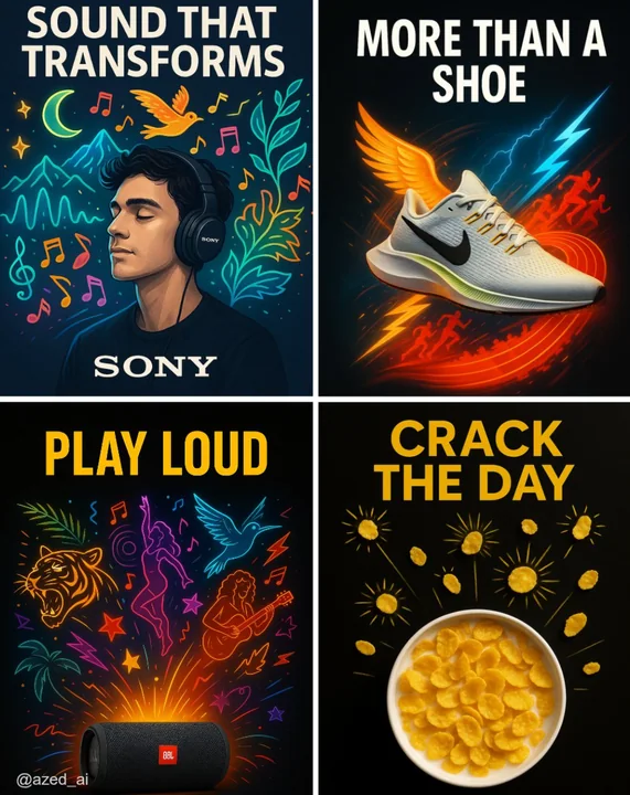
Case 14
创意广告
以干净、深色或高对比度背景为衬托的高影响力广告。[产品]位于画面中央,照明锐利且细节丰富。其周围是超现实、风格化的视觉元素插图向外迸发(如音乐家、跑步者、卷曲线条、太阳光芒),采用鲜艳的色彩搭配和霓虹效果。顶部有大写粗体的广告文案“[TEXT]”,底部为品牌标志,现代感十足的广告设计。
illustrationproductneonbranding
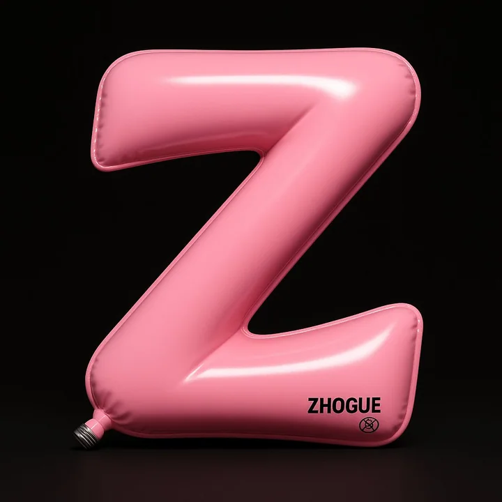
Case 22
定制气球
一件高度写实的3D装置艺术:字母Z被设计成充气球囊造型,整体形态如同流畅弯曲的“Z”字路径,由两段斜线和一个折角构成,边缘略微卷翘,充满柔软的气压感。 视角为正面稍仰视角(约10°)的正交投影,主体置于画面正中央,占据几乎全部画幅,背景为纯黑色,形成类似剧院聚光灯的聚焦舞台效果。 材质为高弹性亮面PVC,表面涂有高光清漆。主色为柔亮粉色(#FF96AC),阴影部分渐变为淡紫粉色,表面同时具备镜面高光和柔和漫反射,呈现丝滑、饱满、有张力的视觉质感。 左下角可见一个金属螺旋
minimalisttypographytoy3D渲染