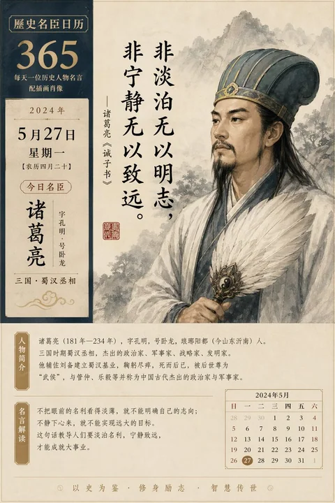
Case 26357
东亚博物馆出版物风格海报设计
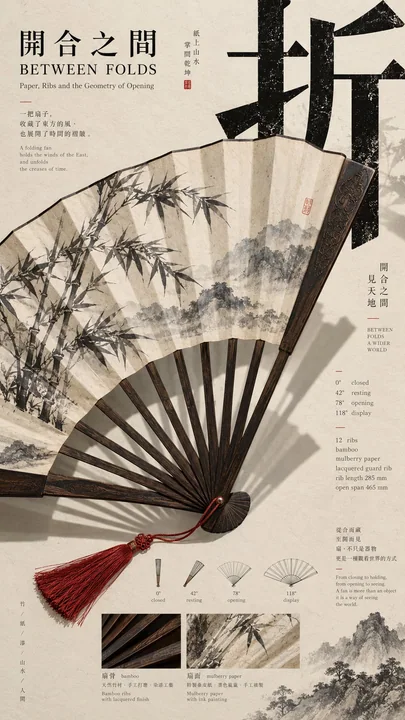
Prompt
[Theme]:
[Main Visual Subject]:
[Chinese Core Character]:
[Chinese Title]:
[English Title]:
[Subject Characteristics]: Unfolding / Hanging / Curling / Layering / Vibrating / Projection / Reflection / Other
[Archival Information]: Structure / Material / Dimensions / Process / Local Sample / Other
[Theme Color]:
[Aspect Ratio]: 9:16

Generate a vertical poster with a mature East Asian Editorial Design, Museum Poster, and cultural publication texture.

Adopt a "non-balanced three-part composition," letting the screen respectively carry the main visual, title text, and auxiliary archival information, but do not divide it equally into three areas, and do not have obvious columns.

First analyze the most recognizable real physical or material characteristics of the [Main Visual Subject], and then let this characteristic directly determine the composition. For example, unfolding generates radiation, cloth hanging and curling forms depth, material sections reveal internal layers, and string vibrations form continuous trajectories. Do not mechanically apply cases; redistribute the most suitable visual movement according to the current object.

The subject must occupy a large visual weight and span at least two regions. Connect the main visual, Typography, and information areas through occlusion, interweaving, projection, curling, sections, extensions, vibrations, or other real spatial relationships, rather than placing the three parts separately.

Set a striking [Chinese Core Character], using modern high-contrast Songti / Mincho typeface, making the text itself part of the composition. Allow the subject to pass through the text, text to undergo black-white inversion after crossing different materials, shadows to cover text, or structural lines to enter the negative space of the character, but always ensure the core character is clearly readable.

Overall, use warm ivory uncoated art paper as the base, paired with ink black text and one primary [Theme Color]. Try to keep only one strong emphasis color per work. The paper has a slight fiber and matte printing texture, keeping it clean without severe aging.

Add [Archival Information] truly related to the theme, such as material, structural section, production process, dimensions, motion state, local macro, or time record. Use Grotesk / Monospace for small information and Serif for English titles. All text should serve the theme of the work, without using template placeholders like Design Study, Visual System, Vol., Case, etc.

Information density is kept medium to high, but do not spread it evenly. The main visual forms a high-density area, and the structure and archives form a medium-density area, while retaining about 20%–30% effective white space to form a clear dense-sparse rhythm.

Final reading order: First see the huge subject and core Chinese; second discover the spatial or motion relationship formed by the subject crossing regions; third understand the structure, material, or production process; fourth read the work title and archival details.

The same series has a unified paper, font system, information hierarchy, and editorial temperament, but each piece is redesigned according to different [Subject Characteristics] for the three-part direction, visual momentum, and cross-region methods, rather than template reskinning.

Avoid: even three columns, PPT feel, ordinary product photography, full-page images with titles, random small text, meaningless English, tech HUD, excessive aging, Logo, QR code, numbering, and copyright markings.

【主题】:
【主视觉对象】:
【中文核心字】:
【中文标题】:
【英文标题】:
【主体特性】:展开 / 垂落 / 翻卷 / 分层 / 振动 / 投影 / 反射 / 其他
【档案信息】:结构 / 材料 / 尺寸 / 过程 / 局部样本 / 其他
【主题色】:
【画面比例】:9:16

生成一张具有成熟 East Asian Editorial Design、Museum Poster 与文化出版物质感的竖版海报。

采用“非均衡三分构图”,让画面分别承担主视觉、标题文字和辅助档案信息,但不要平均切成三个区域,也不要出现明显分栏。

先分析【主视觉对象】最有辨识度的真实物理或材质特性,再让这种特性直接决定构图。例如展开产生放射、布料垂落与翻卷形成纵深、材料切面揭示内部层次、琴弦振动形成连续轨迹。不要机械套用案例,应根据当前对象重新寻找最合适的视觉动作。

主体必须占据较大的视觉权重,并跨越至少两个区域。通过遮挡、穿插、投影、翻卷、剖面、延伸、振动或其他真实空间关系,把主视觉、Typography 与信息区连接起来,而不是把三部分分别摆放。

设置一个醒目的【中文核心字】,使用现代高对比宋体 / 明朝体,使文字本身成为构图的一部分。允许主体穿过文字、文字跨越不同材质后发生黑白反转、影子覆盖文字或结构线进入字形负空间,但始终保证核心字清晰可读。

整体使用暖象牙色未涂布艺术纸作为基底,搭配墨黑文字和一个主要【主题色】。每张作品尽量只保留一个强强调色,纸张具有轻微纤维与哑光印刷质感,保持干净,不做严重旧化。

加入与主题真实相关的【档案信息】,例如材料、结构剖面、制作过程、尺寸、运动状态、局部微距或时间记录。小信息使用 Grotesk / Monospace,英文标题使用 Serif。所有文字都应服务作品主题,不使用 Design Study、Visual System、Vol.、Case 等模板占位词。

信息密度保持中高,但不要平均铺满。主视觉形成高密区,结构与档案形成中密区,同时保留约 20%–30% 有效留白,形成明显的密疏节奏。

最终阅读顺序:第一眼看到巨大主体与核心中文;第二眼发现主体跨区形成的空间或运动关系;第三眼理解结构、材料或制作过程;第四眼阅读作品标题和档案细节。

同系列统一纸张、字体体系、信息层级与编辑气质,但每张根据不同【主体特性】重新设计三分方向、视觉动势和跨区方式,不做模板换皮。

避免:平均三栏、PPT 感、普通产品摆拍、满版图片加标题、随机小字、无意义英文、科技 HUD、过度做旧、Logo、二维码、编号和版权标识。
Autres prompts
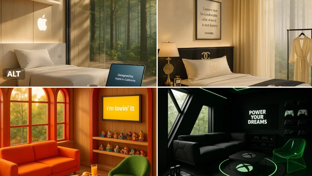
Case 15
Cabane dans les arbres
Un matin calme dans un refuge de luxe en cabane perchée créé par [BRAND NAME] — la lumière dorée traverse les fenêtres encadrées des couleurs emblématiques de la marque. Une zone de séjournement confortable présente des meubles ludiques et
natureproductbranding
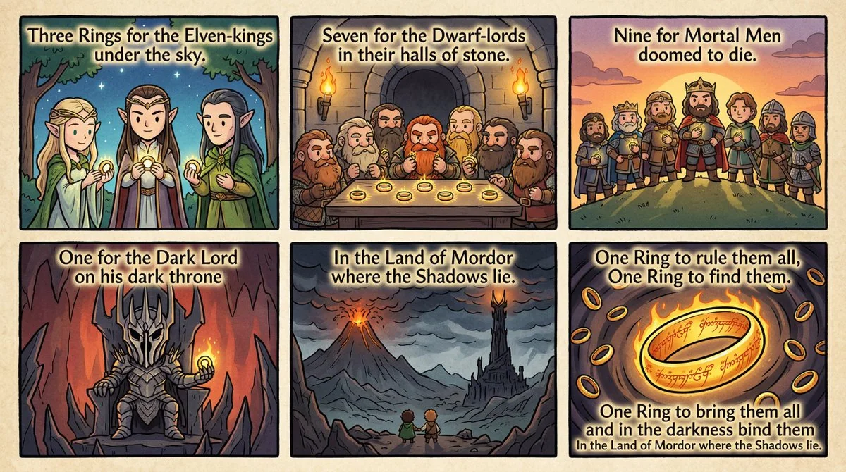
Case 8433
Manga en celluloïde de la poésie du Anneau des Pouvoirs de la Naissance
Créez une bande dessinée cartoon en style cel-shaded mignon, avec des textures, qui représente le poème de l'Anneau des Pouvoirs d'Elrond des LotR.
赛璐璐萌系指环王魔戒