Case 24617
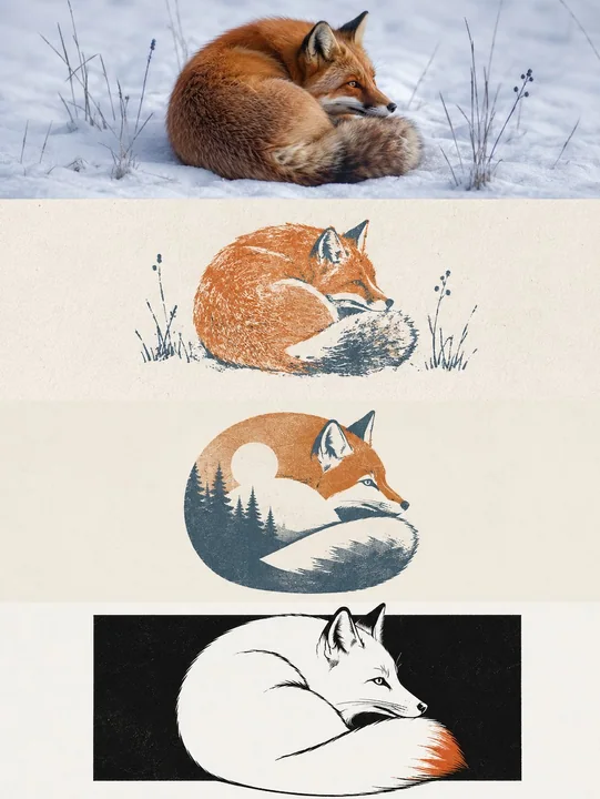
四层递进式多风格视觉海报生成
Prompt
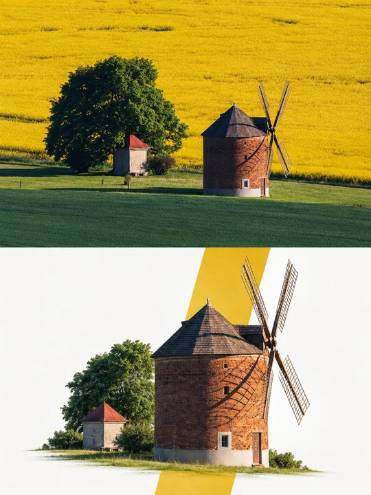
Please make each photo I upload into a separate independent high-end design poster, no multi-photo stitching, each photo output individually.

The overall composition uses a 3:4 vertical layout. The screen is strictly divided from top to bottom into four equal horizontal areas, the height of each area must accurately occupy 25% of the overall screen, the ratio of the four layers is strictly 1:1:1:1, no ratio deviation allowed. The areas transition seamlessly, without dividing lines or white space gaps. "No white space gaps" here only means the seams between layers cannot have gaps; negative space, paper, or solid color backgrounds can still be retained inside each layer according to the corresponding style.

All four layers are based solely on the same uploaded photo as the only basis, presenting the same subject, the same moment, and the same spatial relationship. Strictly maintain the identity of the subject, quantity, key structures, proportions, posture, direction of action, line of sight, observation perspective, perspective, occlusion, left-right position, front-back relationship, and core narrative consistency. The four layers are not four unrelated new compositions, but a continuous style translation of the same image. Since each layer is an extremely flat banner of approximately 3:1, the subject should be organized horizontally, and an appropriate amount of breathing space on the left and right should be reserved; natural horizontal extension or slight cropping of the background is allowed, but the subject must not be vertically stretched, key parts must not be cropped, character relationships must not be changed, or scenes unrelated to the original image must not be created.

The visual center of gravity, subject proportion, and contour landing points of the four layers should be aligned vertically as much as possible, forming a continuous evolution from real photography to the target style. Each layer must completely fill its own 25% area. Do not add layer numbers, dividing lines, borders, collage gaps, watermarks, or logos. Unless a layer style description explicitly requires small amounts of edited text, receipt markings, or handwritten notes, do not generate extra text; even if text is needed, it must be in small quantities, restrained, not obscuring the subject, and avoid garbled characters as much as possible.

Layer 1 | Original Photography

Directly retain the real photographic state of the uploaded photo as the visual benchmark for the style translation of the subsequent three layers. Maintain the identity, quantity, facial features, hairstyle, clothing, structure, proportions, posture, movement, line of sight, interactive relationship, observation perspective, perspective, occlusion, environmental direction, natural light and shadow, and core colors of the original characters or subjects, without performing illustration, materialization, geometrization, or 3D reconstruction.

To adapt to the extremely flat banner of approximately 3:1, only natural extension of the left and right sides of the background consistent with the original scene logic is allowed, or slight cropping that does not damage the subject; the proportion of the subject must not be changed, characters or buildings must not be stretched, and the head, hands, feet, key objects, or important narrative relationships must not be cropped. The image remains natural, real, and clear, avoiding excessive skin smoothing, exaggerated color grading, fictional scenery, and decorations unrelated to the original image.

Layer 2 | Multi-color Rubber Stamp Field Notes

In the approximately 3:1 flat banner area of this layer, translate the real subject of the first layer into "Multi-color Rubber Stamp Field Notes" style. Maintain consistency with the first layer in terms of subject identity, quantity, key structures, posture, left-right position, perspective, spatial relationship, and core narrative, then fully execute the following visual requirements:

Extract the most recognizable subject, contours, posture, spatial relationships, and narrative features from the photo, and reconstruct them into a refined multi-color rubber stamp image. Do not completely copy the photo; instead, remove irrelevant details and retain only the structures, trends, and visual memory points most representative of the original object. Re-summarize through silhouettes, color blocks, carved lines, and a small amount of layering, so that one can recognize the correspondence with the uploaded original image at a glance.

The composition maintains the relationship between small-scale stamp prints and large areas of white space, with positions arranged freely according to the subject's own direction, proportion, and visual center of gravity, which can be eccentric, edge-aligned, or partially cropped, but maintain clear primary and secondary balance and editorial balance. Extract 2–4 of the most recognizable colors from the uploaded original image and convert them into restrained yet spirited spot color inks, establishing layers through overprinting relationships, without using fixed travel color palettes.

The stamp prints retain real hand-carved and stamped textures, including unevenly thick carved lines, broken ink, paper showing through, grainy ink, edge gaps, pressure changes, and slight overprinting misalignment; the background uses warm light-colored paper with subtle fiber textures, avoiding smooth vectors, filter effects, and a sense of children's handicrafts.

The text is like field notes left by a traveler or observer. Refine a short English title from the location, subject, state, or imagery of the photo, and pair it with a No. index, 2–3 keywords, or very short descriptions. Use small typewriter fonts or archival micro-typography, which can be cleverly aligned with the edges, white space, baselines, or partial contours of the stamp print, making the text part of the recording system rather than a commercial title.

The overall presentation is a visual relationship of original imagery × handmade rubber stamp × travel field notes, which is quiet, restrained, simple, exquisite, and collectible. The original image provides the on-site basis, and the stamp print is responsible for leaving the most recognizable parts in the memory, avoiding a souvenir feel, stamp templates, circular seals, sticker collages, cartoon styles, excessive text, and decorative accumulation.

Layer 3 | Gestalt Negative Space Screen Print

In the approximately 3:1 flat banner area of this layer, translate the real subject of the first layer into "Gestalt Negative Space Screen Print" style. Maintain consistency with the first layer in terms of subject identity, quantity, key structures, posture, left-right position, perspective, spatial relationship, and core narrative, then fully execute the following visual requirements:

Extract the most recognizable subject, contours, posture, and narrative relationship from the photo, and reconstruct them into a minimalist Gestalt negative space screen print. Retain the most recognizable outer contour of the subject, while extracting an environment, structure, object, or symbolic image most closely related to it from the original image, allowing the two to merge into a complete graphic through contour interlocking, negative space hollowing, shared boundaries, and figure-ground reversal: at a distance, the subject is recognized first, and only upon closer inspection is another layer of scene or imagery discovered hidden within. Do not simply stack two objects; let the edges of one shape naturally become the boundary of the other.

The composition maintains a single visual anchor, clear silhouettes, and large areas of white space, with positions determined by the subject's own posture, orientation, center of gravity, and contour trends, which can use eccentricity, partial cropping, top-bottom nesting, or edge alignment, creating a clever visual transition between the positive and negative shapes. Auxiliary elements must be extremely minimal, letting the visual interest mainly come from the instantaneous switch between "what is seen" and "what is seen again," rather than complex decorations.

The color scheme adopts a healing, soft, and high-end Morandi pastel system, referring to the low-saturation color logic in dream-like architectural spaces: mist pink, soft apricot, grey-green, sage, light terracotta, cream yellow, mist blue, grey-purple, etc., coordinating with each other, using light-colored paper as the base, and selecting the most spirited color relationships from the original photo for softening and reorganization. Control the overall to 2–4 colors, establishing layers through combined color temperature, brightness difference, and area ratio. Colors are clean, soft, and have a sense of air, avoiding dirty grey, heavy aging, fluorescent colors, and high-contrast commercial palettes.

Retain slight paper fibers, screen printing grains, ink coverage, and overprinting deviations to give the graphics a real print texture, but keep edges sharp and color blocks flat, without using gradients, 3D volume, realistic shadows, or smooth computer-rendered textures.

The text also participates in the Gestalt composition. Refine a short English title from the identity, location, action, emotion, state, or symbolic meaning of the photo, and pair it with a very small amount of location, index, status words, or micro-notes. The text can be arranged along the subject's contour, negative space boundaries, horizontal baselines, or white space axes, or partially embedded in the graphic, cut by contours, or occluded by color blocks, making the text like a part of the print structure rather than a title pasted on later. Keep it overall tiny, restrained, clever, and with a high-end editorial feel.

Overall presentation of minimalist geometry, Gestalt optical illusion, soft Morandi color, screen printing and poetic narrative combination of visual temperament. Whether the subject is a character, animal, plant, building, object, vehicle or natural landscape, it should maintain the double reading experience of "recognizing the subject at a glance and discovering the hidden imagery at second glance", avoiding multiple side-by-side focal points, direct collage, complex illustration, cartoon feeling, business promotion feeling and template feeling. Text preference: English

Layer 4 | Black and White Out-of-Bounds Illustration and Single Point Color

In the approximately 3:1 flat banner area of this layer, translate the real subject of the first layer into "Black and White Out-of-Bounds Illustration and Single Point Color" style. Maintain consistency with the first layer in terms of subject identity, quantity, key structures, posture, left-right position, perspective, spatial relationship, and core narrative, then fully execute the following visual requirements:

Extract the most recognizable subject, contours, posture, and narrative relationship from the photo, and reconstruct them into a minimalist black and white hand-drawn editorial illustration. Use a horizontal or vertical pure black rectangular color field as the main visual field, so that the subject mostly exists within the rectangle, while selecting the most recognizable head, top outline, branches and leaves, roof, limbs, edge of objects or other key structures to naturally break through the rectangle boundary, forming a clear "out-of-bounds" relationship. The subject is not pasted on the black rectangle, but like popping out, passing through or growing out from the black space, making the rectangle both a background and a part of the composition.

The subject retains only the most necessary outer contours, posture and key structures, expressed with black smooth hand-drawn lines + white negative shapes + a small number of gray color blocks. The lines should be simple, smooth, stable, with natural hand-drawn elasticity and rhythm, allowing for a slight manual feel, but not excessively jittery, repeated strokes, fuzzy noise or deliberate infantileization; the whole is closer to a clean and crisp illustrator line draft, rather than rough and casual graffiti. Internal details remain minimalist, using only a small amount of structural lines, expression lines and local shadows to build identification.

The whole is mainly black, white and gray, but it is allowed to add a core local highlighting color as the finishing touch when necessary. This color can only fall on the most critical, narrative or memory local part, such as a part of the subject, a small object, a key surface, an action focus or an emotional signal. The highlighted color area must be very small, the position is precise, and the role is clear, like the only part lit in the screen, used to enhance the memory point and emotional tension, rather than breaking the overall black and white order. Colors should be extracted from the most representative single highlight color in the original image and appropriately purified.

The composition emphasizes the conflict between the geometric order of the black rectangle and the free contour of the subject. The rectangle undertakes a stable and heavy visual base, and the subject creates vitality with asymmetric positions, partial cropping and crossing boundaries; large areas of white paper negative space surround the black area, making black, white and gray form a strong and restrained area relationship. Auxiliary structures can be transformed into a minimum number of straight lines, slopes, platforms, edges or geometric slices, but shall not form a second subject.

The text establishes a lightweight black and white editorial micro-typography system, extracting a short English title from the action, emotion, state or metaphor of the photo, and matching it with 1-3 groups of tiny notes, numbers, state words or short sentences. The text can be close to the edge of the black rectangle, hidden in the negative space, arranged along the crossing direction, or aligned and staggered with the contour of the subject; use black handwritten characters, thin sans-serif or restrained serif fonts, maintain a small scale, and make the text look like the signature and editorial mark left by the illustrator, rather than a commercial title.

Overall presentation of pure white paper × black geometric color domain × smooth hand-drawn lines × subject crossing boundary × single point color emphasis visual temperament, restrained, smart, light, humorous, modern and artistic publishing sense. Avoid color cartoons, complex scenes, smooth vector strokes, realistic light and shadow, 3D texture, pure black silhouette, rough messy lines and template centralized composition.

请将我上传的每一张照片分别制作成一张独立的高级设计海报,不多图拼接,每张照片单独输出。

整体采用 3:4竖版构图。画面从上到下严格四等分为四个横向区域,每个区域高度必须精确占整体画面的25%,四层比例严格为1:1:1:1,不允许出现比例偏差。区域之间无缝衔接,无分隔线、无留白间隙。这里的“无留白间隙”仅指层与层的接缝不能出现空隙;每层内部仍可按照对应风格保留负空间、纸面或纯色背景。

四层全部以同一张上传照片为唯一依据,呈现同一主体、同一瞬间和同一空间关系。严格保持主体身份、数量、关键结构、比例、姿态、动作方向、视线、观察视角、透视、遮挡、左右位置、前后关系与核心叙事一致。四层不是四张互不相关的新构图,而是同一画面的连续风格转译。由于每层均为约3:1的极扁横幅,主体应横向组织,并保留适量左右呼吸空间;允许对背景进行自然横向延展或轻微裁切,但不得纵向拉伸主体、裁掉关键部位、改变人物关系,或另造与原图无关的场景。

四层的视觉重心、主体占比和轮廓落点尽量上下对齐,形成从真实摄影逐步过渡到目标风格的连贯演化。每层都必须完整填满自身25%的区域。不要添加层号、分隔线、边框、拼贴缝隙、水印或Logo。除非某层风格说明明确要求少量编辑文字、票据标记或手写注释,否则不要额外生成文字;即使需要文字,也必须少量、克制、不遮挡主体,并尽量避免乱码。

第一层|原始摄影

直接保留上传照片的真实摄影状态,作为后三层风格转译的视觉基准。保持原始人物或主体的身份、数量、面部特征、发型、服装、结构、比例、姿态、动作、视线、互动关系、观察视角、透视、遮挡、环境方向、自然光影与核心色彩,不进行插画化、材质化、几何化或三维重建。

为了适配约3:1的极扁横幅,只允许对背景左右两侧进行符合原场景逻辑的自然延展,或进行不损伤主体的轻微裁切;不得改变主体比例,不得拉伸人物或建筑,不得裁掉头部、手脚、关键物件或重要叙事关系。画面保持自然、真实、清晰,避免过度磨皮、夸张调色、虚构景物和与原图无关的装饰。

第二层|多色橡皮章田野笔记

在本层约3:1的扁横幅区域中,将第一层的真实主体转译为“多色橡皮章田野笔记”风格。保持与第一层一致的主体身份、数量、关键结构、姿态、左右位置、视角、空间关系与核心叙事,再完整执行以下视觉要求:

从照片中提取最具识别性的主体、轮廓、姿态、空间关系与叙事特征,重构为一枚精炼的多色橡皮章图像。不要完整复制照片,而是删去无关细节,只保留最能代表原物的结构、走势和视觉记忆点,通过剪影、色块、刻线和少量层叠重新概括,使人能够一眼识别与上传的原图之间的对应关系。

构图保持小尺度章印与大面积留白的关系,根据主体自身的方向、比例和视觉重心自由安排位置,可偏心、贴边或局部裁切,但保持清晰主次与编辑式平衡。配色从上传的原图中提取2–4种最具辨识度的颜色,转化为克制而有精神的专色油墨,通过套色关系建立层次,不使用固定旅行色卡。

章印保留真实手工雕刻与盖印质感,包括粗细不均的刻线、断墨、纸张透底、颗粒油墨、边缘缺口、压力变化和轻微套色错位;背景使用温暖浅色纸张与细微纤维纹理,避免平滑矢量、滤镜效果和儿童手工感。

文字像旅行者或观察者留下的田野注释,从照片的地点、主体、状态或意象中提炼一个简短英文标题,并搭配No.编号、2–3个关键词或极短说明。使用小型打字机字体或档案式微排版,可与章印的边缘、留白、基线或局部轮廓巧妙对齐,使文字成为记录系统的一部分,而不是商业标题。

整体呈现原始影像 × 手工橡皮章 × 旅行田野笔记的视觉关系,安静、克制、质朴、精致而具有收藏感。原图提供现场依据,章印负责留下记忆中最值得辨认的部分,避免旅游纪念品感、邮票模板、圆形印章、贴纸拼贴、卡通风格、过多文字和装饰堆积。

第三层|格式塔正负形丝网版画

在本层约3:1的扁横幅区域中,将第一层的真实主体转译为“格式塔正负形丝网版画”风格。保持与第一层一致的主体身份、数量、关键结构、姿态、左右位置、视角、空间关系与核心叙事,再完整执行以下视觉要求:

从照片中提取最具识别性的主体、轮廓、姿态与叙事关系,重构为极简的格式塔正负形丝网版画。保留主体最具有辨识度的外轮廓,同时从原图中提炼一个与其关系最紧密的环境、结构、物件或象征性意象,让二者通过轮廓咬合、负形镂空、边界共用和图底反转融为一个完整图形:远看首先识别主体,近看才发现另一层场景或意象隐藏其中。不要把两个对象简单叠放,而要让一个形状的边缘自然成为另一个形状的边界。

构图保持单一视觉锚点、清晰剪影和大面积留白,根据主体自身姿态、朝向、重心和轮廓走势决定位置,可采用偏心、局部裁切、上下嵌套或边缘对齐,使正形与负形之间形成巧妙视觉转换。辅助元素必须极少,让视觉趣味主要来自“看见什么”与“再次看见什么”的瞬间切换,而不是复杂装饰。

配色采用治愈、柔和而高级的莫兰迪粉彩体系,参考梦境般建筑空间中的低饱和配色逻辑:雾粉、柔杏、灰绿、鼠尾草、淡陶土、奶油黄、雾蓝、灰紫等相互协调,以浅色纸面为底,从原照片中选择最有精神的色彩关系进行柔化与重组。整体控制在2–4种颜色,通过综合色温、明度差和面积比例建立层次,颜色干净、柔和、有空气感,避免脏灰、沉重做旧、荧光色和高反差商业配色。

保留轻微纸张纤维、丝网印刷颗粒、油墨覆盖与套色偏差,使图形具有真实版画触感,但保持边缘清晰、色块平整,不使用渐变、三维体积、写实阴影或光滑电脑渲染质感。

文字同样参与正负形构图。从照片的身份、地点、动作、情绪、状态或象征意义中提炼一个简短英文标题,并搭配极少量地点、编号、状态词或微型注释。文字可沿主体轮廓、负形边界、水平基线或留白轴线排布,也可局部嵌入图形、被轮廓切断或与色块形成遮挡,使文字像版画结构的一部分,而不是后期贴上的标题。整体保持细小、克制、聪明而具有高级编辑感。

整体呈现极简几何、格式塔错视、柔和莫兰迪色、丝网版画与诗意叙事结合的视觉气质。无论主体是人物、动物、植物、建筑、器物、交通工具或自然景观,都应保持“一眼识别主体,第二眼发现隐藏意象”的双重阅读体验,避免多个并列焦点、直接拼贴、复杂插画、卡通感、商业宣传感和模板感。文字偏好:英文

第四层|黑白越界插画与单点彩色

在本层约3:1的扁横幅区域中,将第一层的真实主体转译为“黑白越界插画与单点彩色”风格。保持与第一层一致的主体身份、数量、关键结构、姿态、左右位置、视角、空间关系与核心叙事,再完整执行以下视觉要求:

从照片中提取最具识别性的主体、轮廓、姿态与叙事关系,重构为极简黑白手绘编辑插画。以一个横向或纵向的纯黑矩形色域作为主要视觉场,让主体大部分存在于矩形内部,同时选择最具识别度的头部、顶部轮廓、枝叶、屋顶、肢体、器物边缘或其他关键结构自然突破矩形边界,形成明确的“越界”关系。主体不是贴在黑色矩形上,而像从黑色空间中探出、穿过或生长出来,使矩形既是背景,也是构图的一部分。

主体仅保留最必要的外轮廓、姿态和关键结构,以黑色流畅手绘线 + 白色负形 + 少量灰色块面表现。线条应简洁、顺滑、稳定,有自然手绘弹性和节奏感,允许轻微手工感,但不要过度抖动、重复描边、毛躁噪点或刻意稚拙化;整体更接近干净利落的插画师线稿,而不是粗糙随意的涂鸦。内部细节保持极简,只用少量结构线、表情线和局部阴影建立辨识度。

整体以黑、白、灰为主,但允许在必要时加入一个核心局部的强调彩色,作为点睛之笔。这个彩色只能落在最关键、最有叙事性或最有记忆点的局部,例如主体的某个部位、一个小物件、一块关键表面、一个动作焦点或一个情绪信号。强调色面积必须很小、位置精准、作用明确,像画面中唯一被点亮的部分,用来提升记忆点和情绪张力,而不是打破整体黑白秩序。颜色应从原图中提取最有代表性的单一亮点色,并适度提纯。

构图强调黑色矩形的几何秩序与主体自由轮廓之间的冲突。矩形承担稳定、沉重的视觉基座,主体以不对称位置、局部裁切和越界制造活力;大面积白色纸面留白包围黑色区域,使黑、白、灰形成强烈而克制的面积关系。辅助结构可以转化为极少量直线、斜面、平台、边缘或几何切片,但不得形成第二主体。

文字建立轻巧的黑白编辑式微排版系统,从照片的动作、情绪、状态或隐喻中提炼一个简短英文标题,并搭配1–3组极小注释、编号、状态词或短句。文字可贴近黑色矩形边缘、藏在负形中、顺着越界方向排列,或与主体轮廓形成对齐和错位;使用黑色手写字、细瘦无衬线或克制衬线字体,保持小尺度,让文字像插画师留下的签注和编辑标记,而不是商业标题。

整体呈现纯白纸面 × 黑色几何色域 × 流畅手绘线条 × 主体越界 × 单点彩色强调的视觉气质,克制、聪明、轻巧、幽默、现代且具有艺术出版感。避免彩色卡通、复杂场景、光滑矢量描边、写实明暗、三维质感、纯黑剪影、粗糙乱线和模板式居中构图。
Autres prompts
Case 2533
VIDEO
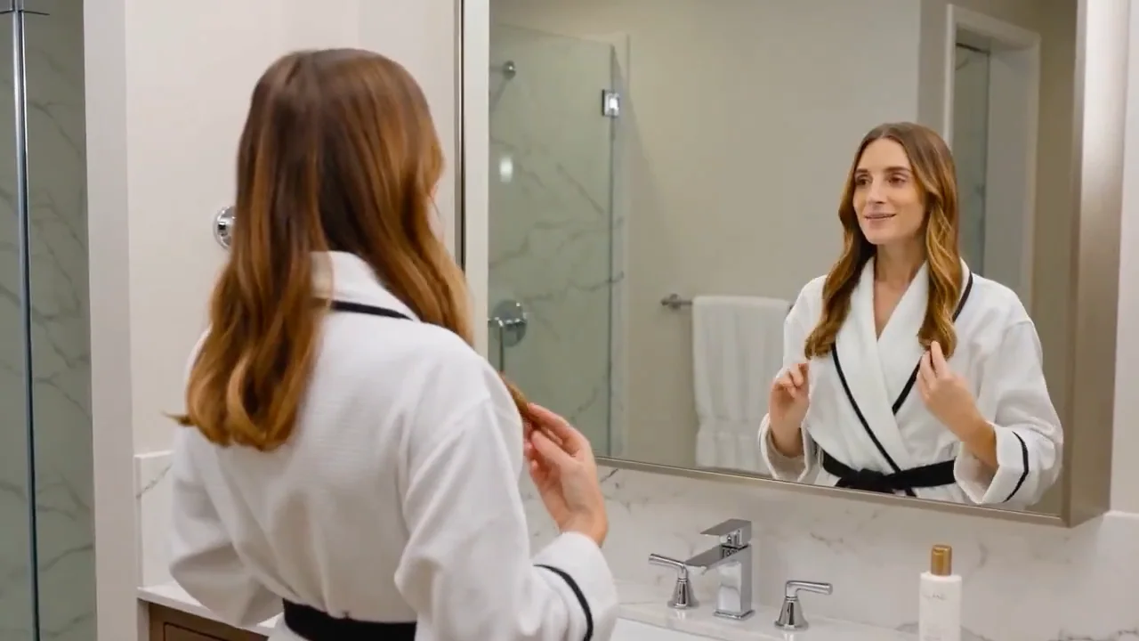
Publicité pour shampooing de qualité supérieure pour les femmes
Une publicité de haute qualité pour un shampooing destiné aux femmes
广告商业洗发水女性高清
Case 28075
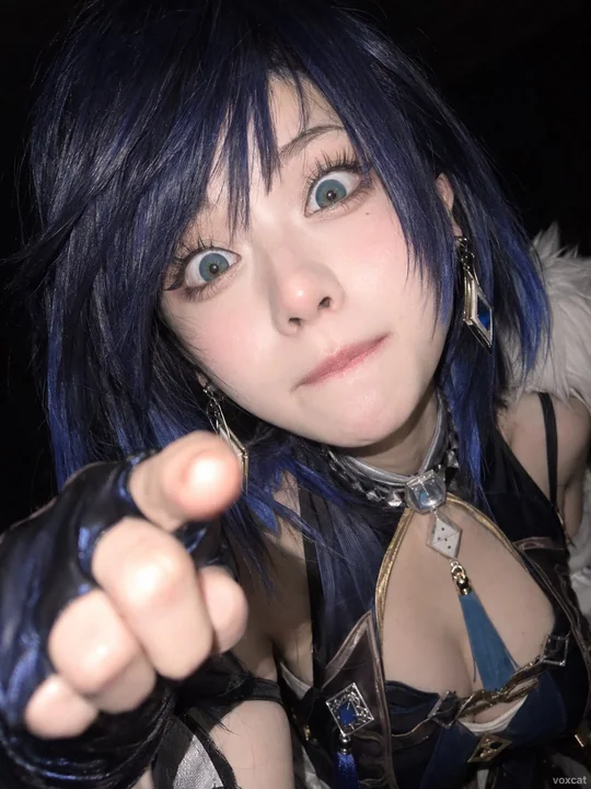
成年真人近距离手机抓拍失控表情
[Character] adult realistic version, close-up mobile phone snapshot, face extremely close to the lens, slight wide-angle perspective, head tilted to one side, half-closed eyes or suddenly wide-open eyes, random out-of-control expressions su