Case 13587
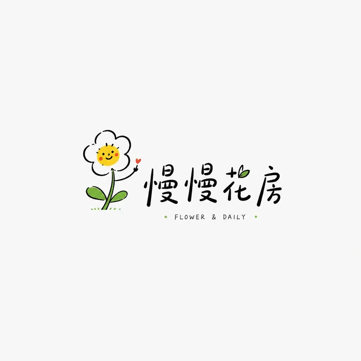
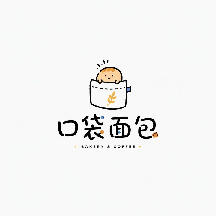
Healing-style hand-drawn fun wordmark logo design
Prompt
Please design a high-completion “Healing Hand-drawn Playful Wordmark Logo” based on the user-entered [Brand Name / Project Name], [Subtitle / Product Name], [Type / Industry], [Brand Positioning], [Core Image], [Character / Graphic Setting], [Emotional Temperament], [Main Color], [Secondary Color], and [Aspect Ratio].

[User Input]
Brand Name / Project Name: [Brand Name / Project Name]
Subtitle / Product Name: [Subtitle / Product Name]
Type / Industry: [Coffee / Bread / Floral / Bookstore / Grocery / B&B / Travel / Cultural and Creative / Home / Selection Store / Children’s Brand / Lifestyle Brand, etc.]
Brand Positioning: [Brand Positioning]
Core Image: [Flower / Bird / Cat / Cloud / Sun / Bread / Book / Hand / Little Monster / Cup / Balloon / Home Small Items, etc.]
Character / Graphic Setting: [A light hand-drawn small character / small object / small graphic / anthropomorphic image]
Emotional Temperament: [Healing, relaxed, gentle, cute, dazing, humorous, slightly romantic, light and quirky, sense of life, etc.]
Main Color: [Main Color]
Secondary Color: [Secondary Color]
Aspect Ratio: [Aspect Ratio]

[Core Goal]
The goal this time is to design a “Healing Hand-drawn Playful Wordmark Logo.” It is not a heavy commercial brand badge, nor a high-saturation trendy toy IP, nor a complex cartoon illustration. Instead, it centers on a lightweight, memorable small hand-drawn graphic, paired with a relaxed brand wordmark and a small amount of English / small annotations, forming a lightweight logo suitable for niche brands, owner-run small shops, lifestyle brands, and cultural and creative brands.

The final effect should be relaxed, clean, breathable, and likable—like a logo that a real independent small shop or lifestyle brand could use directly.

[Design Essence]
The key to this type of logo is not complexity, but emotion, cleverness, and affinity:
1. Establish the first memory point with a small hand-drawn image;
2. Establish brand recognition with a relaxed and natural wordmark;
3. Establish a sense of lightness with plenty of white space;
4. Establish warmth with a small amount of bright color accents;
5. Establish a hand-drawn feel with imperfect but controlled lines;
6. Overall convey a healing, relaxed, niche, and life-oriented brand tone.

[Most Important Principles]
1. Graphics should be simple but must be clever;
2. Text should be relaxed and natural, not like directly typed common system fonts;
3. The whole should have the nature of a logo, not just an illustration;
4. There should be a lot of white space; do not fill the screen;
5. Color matching should be restrained, usually based on black lines paired with 1–2 accent colors;
6. The style should be relaxed but not rough;
7. Not childish, not like children’s graffiti, nor like common emojis;
8. It should have the aesthetic temperament of independent brands, small shops, and owner-operated brands.

[Graphic / Character Requirements]
Please design a light hand-drawn small graphic or character around the [Core Image].

Graphic requirements:
1. Simple outline, relaxed lines;
2. Does not pursue a precise vector feel; slight hand-drawn irregularities are allowed;
3. Expressions or movements must have memory points;
4. The graphic should not be too large and should not overpower the text;
5. It can have a bit of anthropomorphism, humor, or sense of life;
6. Do not draw it as a complex illustration, and do not make it a heavy mascot.

[Wordmark Requirements]
1. The Brand Name / Project Name must be clearly readable;
2. The wordmark should have a light handwritten feel, a relaxed feel, and an independent shop feel;
3. It can be Chinese, English, or a mix of both;
4. Letter spacing, size, and position can vary slightly to create a natural rhythm;
5. Small English words, pinyin, small slogans, years, and symbols can be added;
6. The text cannot be too industrial, too serious, or too heavy;
7. The text should feel designed together with the graphic, rather than typed in afterward.

[Composition Requirements]
The overall composition should be light and breathable:
1. The graphic can be above the wordmark, beside it, interwoven into the text, or form a small interaction with the text;
2. Maintain a large amount of white space;
3. The main body should not be too full; avoid complex backgrounds;
4. A very small number of dots, short lines, arcs, little stars, and small handwritten annotations can be added;
5. The whole should feel like an independent logo, not a collection of posters or stickers.

[Color Requirements]
The overall color should be restrained, fresh, and likable:
1. Usually based on black line art;
2. Paired with 1–2 small-area accent colors;
3. Light yellow, sky blue, grass green, tomato red, light pink, orange, mint green, etc. can be used;
4. Accent colors should be small and precise; do not fill large areas;
5. Avoid heavy gradients, complex shadows, and high-saturation full-page color matching;
6. Colors should feel like a “light touch” rather than forced impact.

[Texture Requirements]
1. Lines should have a hand-drawn feel;
2. Shapes should be slightly naive but controlled;
3. Overall clean;
4. A small amount of irregular strokes is acceptable;
5. Not too precise, not too commercial-template-like;
6. Not excessively rough or messy.

[Style Keywords]
Healing hand-drawn playful wordmark logo, relaxed hand-drawn graphic and text logo, independent shop logo, lifestyle brand logo, light hand-drawn, small image, childlike but not immature, healing, cute, relaxed, white space, small amount of accent colors, handwritten wordmark.

[Acceptance Criteria]
Please ensure the final result satisfies:
1. Simple but clever graphics;
2. Clearly readable brand name;
3. Overall hand-drawn relaxed feel;
4. Sufficient white space;
5. Restrained but memorable color matching;
6. Not childish, not messy, not commercial-template-like;
7. Like a logo that real niche brands can use;
8. Possesses a healing, playful, and lifestyle temperament.

[Output Requirements]
Please finally output a high-completion “Healing Hand-drawn Playful Wordmark Logo.” It must use a light hand-drawn graphic as the core identifier, with a relaxed wordmark as the supporting structure, and form a fresh, cute, healing, and life-oriented brand logo with a small amount of accent colors and a large amount of white space.
More prompts

Case 28053
咖啡店吧台东亚美女撒粉商业写真
Subject: Coffee shop bar counter sprinkling powder on drinks Main Subject: Vertical orientation, a stunning 23-year-old East Asian beauty standing inside the bar, occupying about 60% of the frame, viewed from a side-rear angle. Her left ha
Case 22395
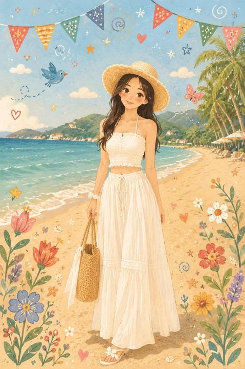
北欧民俗风温暖治愈儿童绘本插画
Transform this photo into a warm, cozy Nordic Folk Flat Illustration style inspired by Scandinavian Folk Art, modern children's storybooks, soft watercolor textures, and cute hand-drawn doodles. Preserve the original person's identity, pose
Case 25686