Case 21386
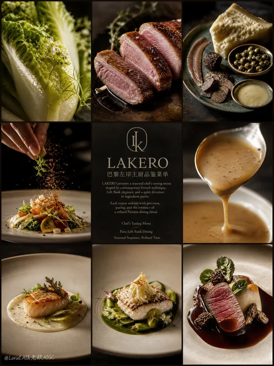
巴黎左岸主厨品鉴菜单九宫格海报
Prompt
Create an ultra-premium 3x3 editorial poster for LAKERO, reimagined as a Paris Left Bank chef’s tasting menu campaign. The image should feel like a Michelin-level French dining identity piece rooted in Left Bank sophistication: intellectual, poetic, intimate, culinary, and quietly luxurious. The overall mood must merge chef-driven gastronomy, seasonal tasting-menu rhythm, and the refined cultural atmosphere of a high-end Parisian rive gauche restaurant.

Use a strict nine-panel grid composition with three columns and three rows, precise borders, elegant spacing, and calm editorial balance. The visual system should feel architectural, restrained, and magazine-worthy, like an haute cuisine tasting menu story told through ingredient studies, plated dishes, chef gestures, and refined typography. The composition must feel unified, graceful, and deeply curated rather than busy or commercial.

The key concept is:
LAKERO as a Paris Left Bank fine-dining destination,
presenting a chef’s seasonal tasting menu shaped by restraint, precision, narrative pacing, and modern French elegance.
The poster should feel like a culinary manifesto for an intimate restaurant where each course is part of a thoughtful progression.
This is not a menu board and not a casual food collage.
It must feel like an elite gastronomic brand campaign.

Design the nine panels as a tasting-menu journey, for example:

Panel 1:
an ultra-close macro of a refined seasonal ingredient, such as baby gem lettuce, white asparagus, delicate herbs, endive, or edible flowers, rendered with visible moisture, fine structure, and poetic sculptural light.

Panel 2:
a close-up of a chef-precise protein preparation, such as duck breast, roasted chicken supreme, butter-poached fish, or veal medallion, showing elegant sear, tenderness, and refined French technique.

Panel 3:
a still life of elevated tasting-menu elements, such as beurre noisette, aged comte, shaved truffle, capers, anchovy fillet, citrus zest, artisan crumb, or cultured butter, arranged with Left Bank editorial restraint.

Panel 4:
a dynamic finishing moment, such as sauce being brushed, garnish being placed, crumbs falling, shaved cheese descending, or herbs being scattered, captured with extreme realism and chef-level precision.

Panel 5:
the central information panel on a deep charcoal, warm black, or Parisian stone-toned background, featuring a bespoke minimalist LAKERO logo and refined tasting-menu introduction typography.

Panel 6:
a luxurious sauce or emulsion close-up, lifted from a spoon or gently poured, with silky viscosity, subtle gloss, and exceptional material realism, expressing culinary refinement and sensual control.

Panel 7:
a complete plated tasting-menu course viewed with elegant negative space, refined porcelain or matte ceramic plateware, precise garnish logic, and Michelin-level compositional discipline.

Panel 8:
another course from the tasting progression, such as a warm starter, composed seasonal salad, vegetable-focused plate, or seafood course, rendered with layered texture and Parisian restraint.

Panel 9:
the final hero course panel, showing the most iconic LAKERO tasting-menu presentation in a fully resolved haute cuisine composition, intimate and luxurious, completing the culinary narrative.

The center panel must establish LAKERO as an intellectually refined Paris Left Bank restaurant brand.
Create an original bespoke LAKERO logo:
minimal,
architectural,
Parisian,
editorial,
timeless,
and internationally premium.
The logo may use a monogram or subtle emblem inspired by French hospitality, menu cards, table ritual, wrought-iron geometry, or the quiet symmetry of Left Bank architecture.
It must feel expensive, cultured, and calm, never trendy or ornamental.

Typography should follow a refined Paris Left Bank editorial system.
Use:
main English title: “LAKERO”
small Chinese subtitle: “巴黎左岸主厨品鉴菜单”
Add elegant English introduction copy such as:
“LAKERO presents a seasonal chef’s tasting menu shaped by contemporary French technique, Left Bank elegance, and a quiet devotion to ingredient purity.
Each course unfolds with precision, pacing, and the intimacy of a refined Parisian dining ritual.”
Optional supporting English lines may include:
“Chef’s Tasting Menu”
“Paris Left Bank Dining”
“Seasonal Sequence, Refined Taste”
Typography must feel literary, couture-editorial, spacious, and quietly authoritative, with beautiful hierarchy and luxury print discipline.
Avoid generic menu fonts, loud graphic display type, or cluttered copy.

The cuisine must be rendered with exceptional realism and chef-driven delicacy:
micro moisture on produce,
fine roasted textures,
silky sauces,
subtle fibers in meat and vegetables,
precise crumb detail,
clean plate rims,
and highly controlled garnish placement.
Every course should feel intelligent, seasonal, and Michelin-calibrated, never rustic, heavy, or casual.

Lighting must be soft, intimate, and cinematic:
deep but breathable shadows,
gentle directional highlights,
subtle gloss on sauces,
quiet reflections on plateware,
and elegant tonal falloff across the entire grid.
The atmosphere should feel like candlelit Parisian refinement translated into editorial studio photography.

Color palette should reflect Paris Left Bank sophistication:
warm black,
deep charcoal,
stone gray,
ivory,
butter cream,
sage green,
olive,
champagne beige,
soft roast gold,
and restrained linen tones.
The palette must remain subtle, cultivated, and poetic, never over-saturated or aggressively commercial.

Backgrounds across the panels must remain minimal and premium:
dark stone surfaces,
matte black tabletops,
soft Parisian shadow,
warm neutral studio backdrops,
and refined negative space.
No casual interiors, no visible diners, no alcohol-centered hero object, no cluttered props.
Everything must feel chef-led, cultured, intimate, and unmistakably haute cuisine.

Overall mood:
Parisian, Left Bank, chef-driven, Michelin-inspired, poetic, intellectual, intimate, refined, gastronomic, editorial, luxurious, world-class.

Rendering style:
hyper-realistic fine-dining food photography, Paris Left Bank chef’s tasting menu editorial grid, bespoke LAKERO restaurant logo, elegant literary typography, soft cinematic luxury lighting, ultra-detailed ingredient realism, Michelin-level plate styling, haute cuisine branding campaign, 8k, world-class commercial quality.

Negative prompt:
alcohol hero theme, bottle-centered composition, cheap menu board, casual dining mood, rustic bistro clutter, overly colorful scene, flat lighting, generic logo, crowded typography, fast food styling, cartoon food, messy plating, brochure layout, noisy props, bright commercial background, low-end restaurant branding

Create an ultra-premium 3x3 editorial poster for LAKERO, reimagined as a Paris Left Bank chef’s tasting menu campaign. The image should feel like a Michelin-level French dining identity piece rooted in Left Bank sophistication: intellectual, poetic, intimate, culinary, and quietly luxurious. The overall mood must merge chef-driven gastronomy, seasonal tasting-menu rhythm, and the refined cultural atmosphere of a high-end Parisian rive gauche restaurant.

Use a strict nine-panel grid composition with three columns and three rows, precise borders, elegant spacing, and calm editorial balance. The visual system should feel architectural, restrained, and magazine-worthy, like an haute cuisine tasting menu story told through ingredient studies, plated dishes, chef gestures, and refined typography. The composition must feel unified, graceful, and deeply curated rather than busy or commercial.

The key concept is:
LAKERO as a Paris Left Bank fine-dining destination,
presenting a chef’s seasonal tasting menu shaped by restraint, precision, narrative pacing, and modern French elegance.
The poster should feel like a culinary manifesto for an intimate restaurant where each course is part of a thoughtful progression.
This is not a menu board and not a casual food collage.
It must feel like an elite gastronomic brand campaign.

Design the nine panels as a tasting-menu journey, for example:

Panel 1:
an ultra-close macro of a refined seasonal ingredient, such as baby gem lettuce, white asparagus, delicate herbs, endive, or edible flowers, rendered with visible moisture, fine structure, and poetic sculptural light.

Panel 2:
a close-up of a chef-precise protein preparation, such as duck breast, roasted chicken supreme, butter-poached fish, or veal medallion, showing elegant sear, tenderness, and refined French technique.

Panel 3:
a still life of elevated tasting-menu elements, such as beurre noisette, aged comte, shaved truffle, capers, anchovy fillet, citrus zest, artisan crumb, or cultured butter, arranged with Left Bank editorial restraint.

Panel 4:
a dynamic finishing moment, such as sauce being brushed, garnish being placed, crumbs falling, shaved cheese descending, or herbs being scattered, captured with extreme realism and chef-level precision.

Panel 5:
the central information panel on a deep charcoal, warm black, or Parisian stone-toned background, featuring a bespoke minimalist LAKERO logo and refined tasting-menu introduction typography.

Panel 6:
a luxurious sauce or emulsion close-up, lifted from a spoon or gently poured, with silky viscosity, subtle gloss, and exceptional material realism, expressing culinary refinement and sensual control.

Panel 7:
a complete plated tasting-menu course viewed with elegant negative space, refined porcelain or matte ceramic plateware, precise garnish logic, and Michelin-level compositional discipline.

Panel 8:
another course from the tasting progression, such as a warm starter, composed seasonal salad, vegetable-focused plate, or seafood course, rendered with layered texture and Parisian restraint.

Panel 9:
the final hero course panel, showing the most iconic LAKERO tasting-menu presentation in a fully resolved haute cuisine composition, intimate and luxurious, completing the culinary narrative.

The center panel must establish LAKERO as an intellectually refined Paris Left Bank restaurant brand.
Create an original bespoke LAKERO logo:
minimal,
architectural,
Parisian,
editorial,
timeless,
and internationally premium.
The logo may use a monogram or subtle emblem inspired by French hospitality, menu cards, table ritual, wrought-iron geometry, or the quiet symmetry of Left Bank architecture.
It must feel expensive, cultured, and calm, never trendy or ornamental.

Typography should follow a refined Paris Left Bank editorial system.
Use:
main English title: “LAKERO”
small Chinese subtitle: “巴黎左岸主厨品鉴菜单”
Add elegant English introduction copy such as:
“LAKERO presents a seasonal chef’s tasting menu shaped by contemporary French technique, Left Bank elegance, and a quiet devotion to ingredient purity.
Each course unfolds with precision, pacing, and the intimacy of a refined Parisian dining ritual.”
Optional supporting English lines may include:
“Chef’s Tasting Menu”
“Paris Left Bank Dining”
“Seasonal Sequence, Refined Taste”
Typography must feel literary, couture-editorial, spacious, and quietly authoritative, with beautiful hierarchy and luxury print discipline.
Avoid generic menu fonts, loud graphic display type, or cluttered copy.

The cuisine must be rendered with exceptional realism and chef-driven delicacy:
micro moisture on produce,
fine roasted textures,
silky sauces,
subtle fibers in meat and vegetables,
precise crumb detail,
clean plate rims,
and highly controlled garnish placement.
Every course should feel intelligent, seasonal, and Michelin-calibrated, never rustic, heavy, or casual.

Lighting must be soft, intimate, and cinematic:
deep but breathable shadows,
gentle directional highlights,
subtle gloss on sauces,
quiet reflections on plateware,
and elegant tonal falloff across the entire grid.
The atmosphere should feel like candlelit Parisian refinement translated into editorial studio photography.

Color palette should reflect Paris Left Bank sophistication:
warm black,
deep charcoal,
stone gray,
ivory,
butter cream,
sage green,
olive,
champagne beige,
soft roast gold,
and restrained linen tones.
The palette must remain subtle, cultivated, and poetic, never over-saturated or aggressively commercial.

Backgrounds across the panels must remain minimal and premium:
dark stone surfaces,
matte black tabletops,
soft Parisian shadow,
warm neutral studio backdrops,
and refined negative space.
No casual interiors, no visible diners, no alcohol-centered hero object, no cluttered props.
Everything must feel chef-led, cultured, intimate, and unmistakably haute cuisine.

Overall mood:
Parisian, Left Bank, chef-driven, Michelin-inspired, poetic, intellectual, intimate, refined, gastronomic, editorial, luxurious, world-class.

Rendering style:
hyper-realistic fine-dining food photography, Paris Left Bank chef’s tasting menu editorial grid, bespoke LAKERO restaurant logo, elegant literary typography, soft cinematic luxury lighting, ultra-detailed ingredient realism, Michelin-level plate styling, haute cuisine branding campaign, 8k, world-class commercial quality.

Negative prompt:
alcohol hero theme, bottle-centered composition, cheap menu board, casual dining mood, rustic bistro clutter, overly colorful scene, flat lighting, generic logo, crowded typography, fast food styling, cartoon food, messy plating, brochure layout, noisy props, bright commercial background, low-end restaurant branding
更多提示词
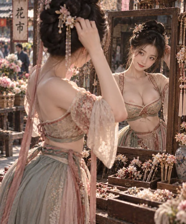
Case 28067
半臂宫衣花市挑簪细腰美态
Half-sleeved palace dress; clear shoulder lines; fabric naturally supported by the body shape; large area of skin exposed on the chest, slender waist is evident; clear waist-to-hip ratio; picking hairpins at a flower market; bowing head to
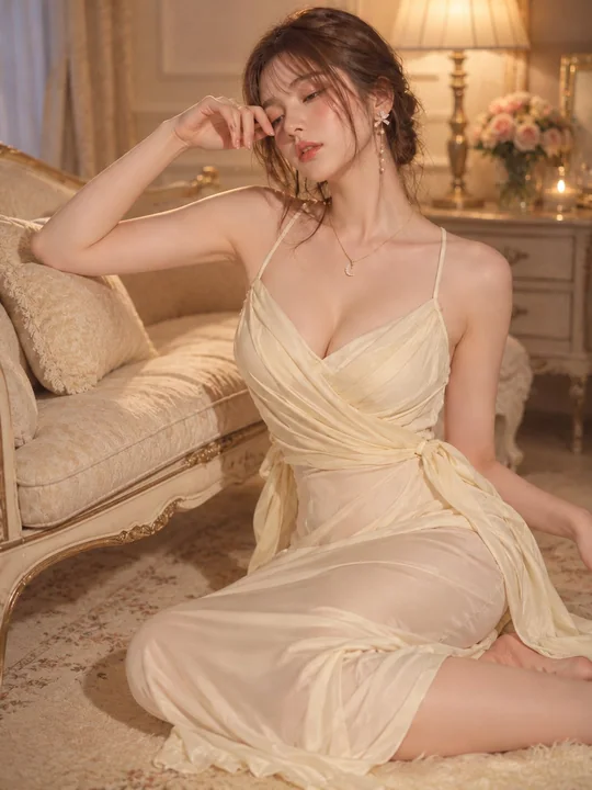
Case 28063
象牙色连衣裙与柔和灯光人像
Theme: Ivory dress and soft lighting Subject: Adult female in her 20s. Sitting on the rug to the right side of a classical sofa, torso slightly facing the front, legs folded towards the right side of the frame. The head is tilted down to t

Case 17
未来的一瞥
[主体]在雨夜中穿过被雨水浸湿的街道,画面充满电影感,阴郁的霓虹灯照亮了场景,水面上倒映着舞动的光影,背景是朦胧的城市天际线。主体显得栩栩如生,仿佛置身于孤独与电流交织之间。