Case 27344
手工纸艺空间构筑极简微缩场景海报
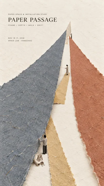
Prompt
Theme:
Main palette:
Spatial structure:
Micro scene:
Title:
Event details:
Aspect ratio: 9:16

Create a refined vertical editorial poster using tactile handmade paper, large color fields, strong spatial construction, generous negative space, and a very small micro scene.

Keep the composition minimal, but give it one clear spatial mechanism. The poster should not rely on decoration. Its visual interest should come from how the paper behaves in space.

Use one or two dominant handmade paper forms and let them create depth through a simple physical relationship such as converging toward a vanishing point, lifting away from the background, forming a soft boundary, hanging vertically, bending, overlapping, or creating a hidden space.

The paper must remain clearly handmade. Show natural fibers, pulp texture, subtle pigment absorption, slight pressure marks, irregular deckled edges, and a matte dry surface.

Use perspective, scale change, paper thickness, underside visibility, soft shadows, gentle curvature, and overlap only when they support the spatial idea.

The spatial construction should feel physically believable. Avoid forms that look like digital 3D objects, smooth vector graphics, or abstract CGI sculptures.

Add one very small micro scene that helps explain the main structure. Include two or three adult figures naturally interacting with the paper installation, such as lifting, measuring, aligning, supporting, observing, or adjusting it.

Keep the figures tiny, modern, understated, and secondary. The entire scene should occupy only about 2% to 4% of the poster.

Use only a few necessary tools or props. Every object should support the physical logic of the scene.

Preserve large areas of warm ivory negative space. The empty space should create calm, scale, and contrast around the main paper form.

Typography should remain restrained and editorial. Use a refined serif for the title and small uppercase sans serif for supporting information. Keep the title relatively small and place it in a quiet area of negative space.

The visual reading order should be:

large paper structure first, spatial depth or physical interaction second, material texture third, micro scene fourth, title and event details last.

The final result should feel minimal, tactile, spatial, intelligent, contemporary, and refined.

From a distance, the poster should read as a strong and simple composition.

Up close, it should reveal perspective, curvature, edges, fibers, shadows, tiny figures, tools, and the physical logic behind the installation.

主题:
主色调:
空间结构:
微缩场景:
标题:
活动详情:
纵横比:9:16

制作一张精致的垂直编辑海报,使用具有触感的手工纸、大面积色块、强大的空间构筑、充足的留白以及一个非常小的微缩场景。

保持构图极简,但赋予其一个清晰的空间机制。海报不应依赖装饰。其视觉趣味应源于纸张在空间中的表现。

使用一到两个主导的手工纸形态,让它们通过简单的物理关系创造深度,例如向消失点汇合、从背景中抬起、形成柔软的边界、垂直悬挂、弯曲、重叠或创造一个隐藏空间。

纸张必须保持清晰的手工感。展示天然纤维、纸浆纹理、细微的颜料吸收、轻微的压力痕迹、不规则的毛边和哑光干燥表面。

仅在支持空间创意时,才使用透视、比例变化、纸张厚度、底部可见性、柔和阴影、温和曲线和重叠。

空间构筑应在物理上具有真实感。避免看起来像数字3D物体、光滑矢量图形或抽象CGI雕塑的形式。

添加一个非常小的微缩场景,以帮助解释主体结构。包括两到三个成年人物,自然地与纸张装置互动,如抬起、测量、对齐、支撑、观察或调整它。

保持人物极小、现代、低调且处于次要地位。整个场景应仅占海报的2%到4%左右。

仅使用少量必要的工具或道具。每个物体都应支持场景的物理逻辑。

保留大面积的暖象牙色留白。空白空间应在主体纸张形态周围营造出沉静、比例感和对比。

排版应保持克制且具有编辑感。标题使用精致的衬线体,辅助信息使用小写大写无衬线体。保持标题相对较小,并将其放置在留白的安静区域。

视觉阅读顺序应为:

首先是大面积纸张结构,其次是空间深度或物理互动,第三是材质纹理,第四是微缩场景,最后是标题和活动详情。

最终结果应给人以极简、触感、空间感、智能、当代且精致的感觉。

从远处看,海报应呈现为强烈而简单的构图。

近看,它应揭示透视、曲线、边缘、纤维、阴影、微小人物、工具以及装置背后的物理逻辑。
更多提示词
Case 1
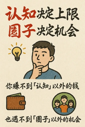
手绘风格的信息图表卡片
创作一张手绘风格的信息图卡片,比例为9:16竖版。卡片主题鲜明,背景为带有纸质肌理的米色或米白色,整体设计体现质朴、亲切的手绘美感。 卡片上方以红黑相间、对比鲜明的大号毛笔草书字体突出标题,吸引视觉焦点。文字内容均采用中文草书,整体布局分为2至4个清晰的小节,每节以简短、精炼的中文短语表达核心要点。字体保持草书流畅的韵律感,既清晰可读又富有艺术气息。 卡片中点缀简单、有趣的手绘插画或图标,例如人物或象征符号,以增强视觉吸引力,引发读者思考与共鸣。 整体布局注意视觉平衡,预留足
illustrationtypographyportraitpaper-craftinfographic
Case 10796
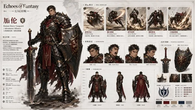
游戏角色设定档案总览
请根据【主题 / 世界观 / 角色设定】,创作一张高完成度、高统一性、适合系列化发布的「角色设定档案板 / Character Archive Board」。 这不是普通角色插画,也不是单张立绘海报,而是一张结合“主立绘展示 + 技能动作展示 + 表情设定 + 三视图说明 + 武器装备展示 + 色板说明 + 品牌标题系统”的官方角色设定总览图。整体画面应像游戏设定集、角色资料页、项目提案板或IP视觉开发文档中的标准展示页,既有角色魅力,又有清晰的信息组织与设定说明感。 【
三视图角色设定游戏原画