Case 28159
手绘水彩极简旅行社论海报
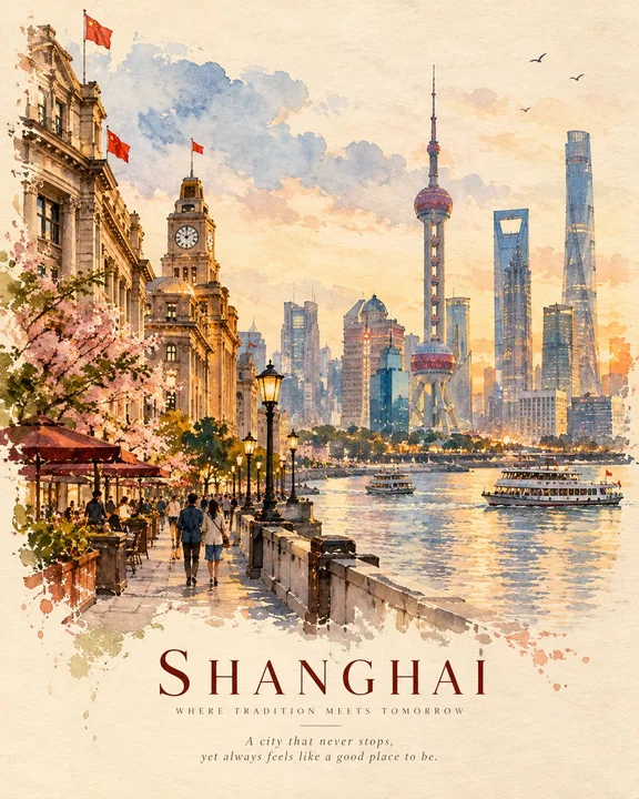
Prompt
Create a premium 4:5 vertical travel-editorial artwork for [COUNTRY / CITY / LOCATION / SUBJECT].

PURE GENERATION.
Invent the complete artwork from the written destination or subject alone. The written destination is the only input. Create every visual element from your own knowledge and imagination.

MASTER STYLE LOCK:
Hand-painted watercolor on warm cream textured paper. Minimalist travel-editorial poster. Transparent watercolor blended with soft gouache. Soft imperfect brushwork, visible paper grain, organic painted edges, muted natural colors, generous negative space, quiet nostalgic atmosphere, sophisticated handcrafted art-book quality. Flat illustrated artwork with painterly depth. No 3D rendering, no glossy finish, no cartoon style, no digital photorealism.

DESTINATION INTERPRETATION:
Automatically identify the strongest visual identity of [COUNTRY / CITY / LOCATION / SUBJECT]. Select the most recognizable landmark, architecture, landscape, street character, transportation, vegetation, local objects, or cultural details that naturally belong to the destination.

Create ONE unified scene rather than a collection of separate elements.

COMPOSITION:
Use an elegant vertical editorial composition with one dominant focal point and several smaller supporting details. Establish clear foreground, middle ground, and background layers using watercolor washes and simplified shapes.

Leave generous warm cream space around important forms. Keep the silhouette clean and immediately recognizable. Avoid overcrowding.

LOCAL STORY:
Show an authentic everyday moment connected to the destination. Include subtle human activity only when it strengthens the story: walking, cycling, sitting, shopping, traveling, eating, working, or simply enjoying the surroundings.

Favor ordinary local atmosphere over generic tourism imagery.

LIGHT & ATMOSPHERE:
Automatically choose lighting that suits the destination and scene: soft morning light, warm afternoon glow, misty weather, gentle sunset, or quiet evening illumination.

Use atmospheric watercolor washes to create depth while maintaining a calm, delicate feeling.

COLOR LANGUAGE:
Build the palette naturally from [COUNTRY / CITY / LOCATION / SUBJECT]. Use warm cream, muted ochre, terracotta, dusty blue, soft green, faded red, warm grey, and subtle golden tones where appropriate.

Keep the colors slightly desaturated, harmonious, and naturally layered.

TYPOGRAPHY:
At the bottom of the artwork, add three restrained editorial text elements:

[LOCATION NAME]
[SHORT DESTINATION-INSPIRED SUBTITLE]
[SHORT WARM POETIC SENTENCE]

Use elegant minimal typography with generous spacing. Keep it secondary to the artwork and ensure all wording is clean and correctly spelled.

FINAL AESTHETIC:
Premium handmade watercolor travel poster × contemporary editorial illustration × nostalgic travel memory × quiet everyday life × sophisticated art-book design.

The finished artwork should feel like a beautifully remembered place painted by hand: atmospheric, personal, refined, understated, and unmistakably connected to [COUNTRY / CITY / LOCATION / SUBJECT].

AVOID:
Any editing workflow, source material, references, existing compositions, copied imagery, collage construction, unrelated landmarks, generic scenery, excessive detail, oversaturated colors, harsh outlines, glossy digital effects, CGI, 3D objects, cartoon characters, clutter, excessive typography, logos, watermarks, interface elements.

FORMAT:
4:5 vertical portrait composition, warm cream paper, handcrafted watercolor texture, generous negative space, premium print-quality finish.

为 [国家 / 城市 / 地点 / 主体] 创作一件优质的 4:5 垂直旅行社论艺术作品。

纯粹生成。
仅根据书面目的地或主体构思完整的艺术作品。书面目的地是唯一的输入。根据你自己的知识和想象力创造每一个视觉元素。

大师风格锁定:
暖乳白色纹理纸上的手绘水彩。极简旅行社论海报。透明水彩与柔和的水粉融合。柔和且不完美的笔触、可见的纸张纹理、有机的手绘边缘、柔和的自然色调、大面积的留白、宁静的怀旧氛围、精致的手工艺术书质感。具有绘画深度的平面插画艺术品。无 3D 渲染、无光泽饰面、无卡通风格、无数字写实摄影。

目的地解读:
自动识别 [国家 / 城市 / 地点 / 主体] 最强烈的视觉标识。选择最具有辨识度的地标、建筑、景观、街道特征、交通工具、植被、当地物件或自然属于该目的地的文化细节。

创作一个统一的场景,而不是一组零散元素的集合。

构图:
使用优雅的垂直社论构图,具有一个主焦点和几个较小的辅助细节。利用水彩晕染和简化的形状建立清晰的前景、中景和背景层。

在重要形状周围留出充足的暖乳白色空间。保持轮廓简洁且易于识别。避免过度拥挤。

当地故事:
展示与目的地相关的真实日常瞬间。仅在增强故事感时加入细微的人物活动:行走、骑行、坐着、购物、旅行、进食、工作或仅仅是享受周围环境。

偏向普通的当地氛围,而非通俗的旅游意象。

光影与氛围:
自动选择适合目的地和场景的光影:柔和的晨光、温暖的午后光辉、薄雾天气、温柔的日落或宁静的傍晚照明。

使用极具氛围感的水彩晕染创造深度,同时保持平静、细腻的感觉。

色彩语言:
自然地根据 [国家 / 城市 / 地点 / 主体] 构建调色板。在合适的地方使用暖乳白、柔和的赭石、红陶色、灰蓝色、柔和的绿色、褪色的红色、暖灰色和微妙的金调。

保持色彩略微降低饱和度、和谐且自然分层。

排版:
在艺术作品底部,添加三个克制的社论文本元素:

[地点名称]
[简短的目的地灵感副标题]
[简短的温暖诗意句子]

使用优雅的极简排版和宽裕的间距。使其仅次于艺术作品,并确保所有措辞简洁且拼写正确。

最终美学:
优质手工水彩旅行海报 × 当代社论插画 × 怀旧旅行记忆 × 宁静的日常生活 × 精致的艺术书设计。

最终的艺术作品应该感觉像是一个被亲手绘制的美丽记忆之地:富有氛围感、个性化、精致、低调,且与 [国家 / 城市 / 地点 / 主体] 有着明确的联系。

避免:
任何编辑工作流、素材来源、参考资料、现有构图、复制的图像、拼贴构造、不相关的地标、通用的风景、过多的细节、过度饱和的颜色、生硬的轮廓、光泽的数字效果、CGI、3D 物体、卡通人物、杂乱、过多的排版、徽标、水印、界面元素。

格式:
4:5 垂直肖像构图,暖乳白色纸张,手工水彩纹理,大面积留白,优质印刷级质量效果。
Autres prompts
Case 2
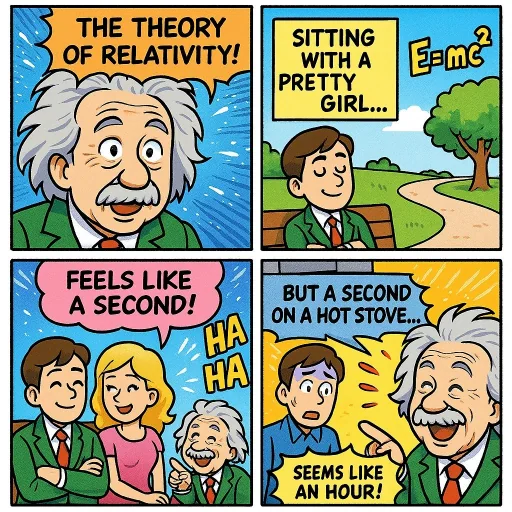
Bandes dessinées (Relativité)
Créez une page colorée de manga décrivant la théorie de la relativité. Ajoutez un peu d'humour.
creative
Case 27377
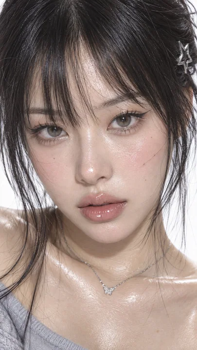
千禧年日系杂志风Y2K清冷感美妆特写
9:16 vertical, ultra-realistic extreme close-up beauty portrait, early 2000s Japanese fashion magazine editorial, Y2K Asian beauty photobook aesthetic, clearly adult East Asian woman in her mid-20s, delicate small oval face, warm ivory skin
Case 11
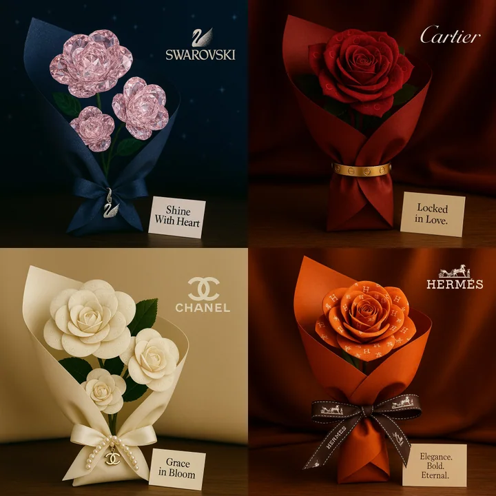
Discours sur l'amour pour la marque
Un bouquet au format carré romantique inspiré par [Nom de la marque]. Les roses sont conçues à partir de motifs visuels ou de textures reflétant l'identité de la marque. Le bouquet est enveloppé dans un matériau luxueux évoquant le style em