Case 27049
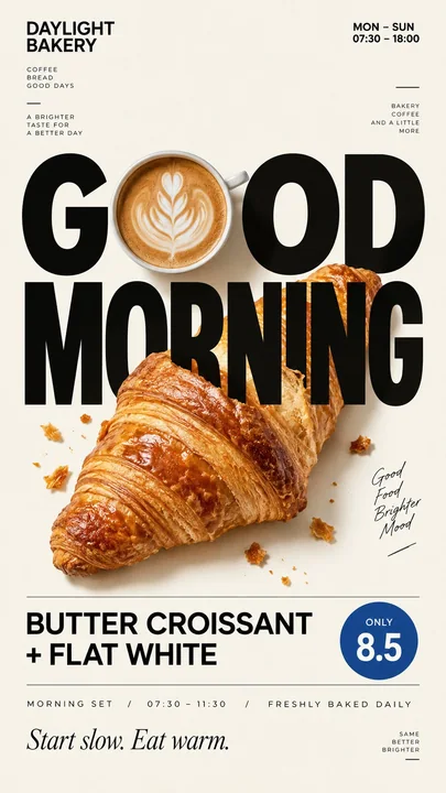
现代简约社论风格美食海报设计
Prompt
Brand: [BRAND NAME]
Food / Drink: [PRODUCT]
Headline: [2–4 WORD HEADLINE]
Accent Color: [COLOR]
Visual Interaction: [food replaces a letter / passes through type / refracts letters / becomes a divider / reveals hidden text]
Supporting Info: [PRICE / HOURS / INGREDIENTS / ADDRESS]
Aspect Ratio: 9:16

Create a premium editorial food poster for a modern café, bakery, or restaurant brand.

Use a warm cream or ivory background, generous negative space, oversized typography, photorealistic food photography, and a clean European editorial layout.

The key idea is that the food must actively interact with the typography rather than simply sit beside it.

Use the selected visual interaction to create one clear visual hook. For example, a coffee cup can replace a letter, a croissant can overlap the headline, transparent glass can physically refract letters behind it, melted cheese can become part of the layout, or a missing food slice can reveal hidden text underneath.

Keep the main headline large and instantly readable at thumbnail size. Combine a bold Grotesk Sans Serif with a refined Editorial Serif, using no more than 2–3 type styles.

Build clear hierarchy with: large headline, medium product name, small brand information, price, ingredients, opening hours, or address.

Use only cream, black, natural food colors, and one accent color.

Food should look highly realistic with natural texture, believable shadows, accurate materials, and appetizing detail. Avoid CGI, plastic surfaces, excessive gloss, fake textures, or over-stylized commercial food photography.

Keep the composition clean, asymmetric, refined, and brand-ready. Every text element should feel intentional and meaningful, with no Lorem Ipsum or random filler copy.

The final result should feel like a real independent café campaign designed by a strong editorial design studio, with one instantly understandable food-and-typography interaction as the visual hook.

品牌:[品牌名称]
食物 / 饮料:[产品]
标题:[2–4 个词的标题]
强调色:[颜色]
视觉交互:[食物替代字母 / 穿过文字 / 折射字母 / 成为分隔符 / 揭示隐藏文本]
辅助信息:[价格 / 营业时间 / 成分 / 地址]
纵横比:9:16

为现代咖啡馆、面包店或餐厅品牌制作一张高端社论风美食海报。

使用温暖的奶油色或象牙色背景、大量的留白、超大号排版、写实的美食摄影以及整洁的欧洲社论版式。

核心创意是食物必须与排版产生积极的互动,而不仅仅是并列。

使用所选的视觉交互来创建一个清晰的视觉挂钩。例如,一个咖啡杯可以替代一个字母,一个牛角面包可以重叠在标题上,透明玻璃可以物理折射其后的字母,融化的奶酪可以成为布局的一部分,或者缺失的一块食物可以揭示下方的隐藏文本。

保持主标题巨大且在缩略图大小下也能立即辨识。将粗体的 Grotesk 无衬线体与精致的社论衬线体结合,使用不超过 2–3 种字体风格。

建立清晰的层级结构:大号标题、中号产品名称、小号品牌信息、价格、成分、营业时间或地址。

仅使用奶油色、黑色、自然的食物颜色和一种强调色。

食物应看起来高度写实,具有自然的纹理、可信的阴影、准确的材质和诱人的细节。避免 CGI、塑料感表面、过度的光泽、虚假纹理或过度风格化的商业美食摄影。

保持构图整洁、不对称、精致且符合品牌标准。每个文字元素都应具有意图和意义,不使用 Lorem Ipsum 或随机的填充副本。

最终结果应感觉像是由强大的社论设计工作室设计的真实独立咖啡馆活动,以一种能立即理解的食物与排版交互作为视觉挂钩。
他のプロンプト
Case 12
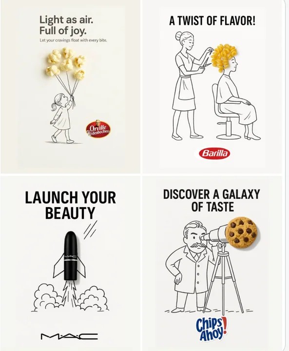
クリエイティブ広告
シンプルでクリエイティブな広告。清潔な白い背景上に配置されています。 現実の[現物]は、ゆるく遊び心のある黒インクのスケッチに統合されており、手描きの自由な線が使われています。[スケッチコンセプト]は、オブジェクトとユニークで想像力豊かな方法で相互作用しています。トップまたは中央に太い黒い[広告コピー]テキストを配置し、下部には明確に[ブランドロゴ]を配置してください。視覚的には、清潔で楽しい、高コントラストで、概念的にスマートなデザインとします。
minimalist品牌Logobranding

Case 20272
温馨亲子撑伞中文识字卡无字背景图
插画扁平风识字卡亲子感无字图