Case 26469
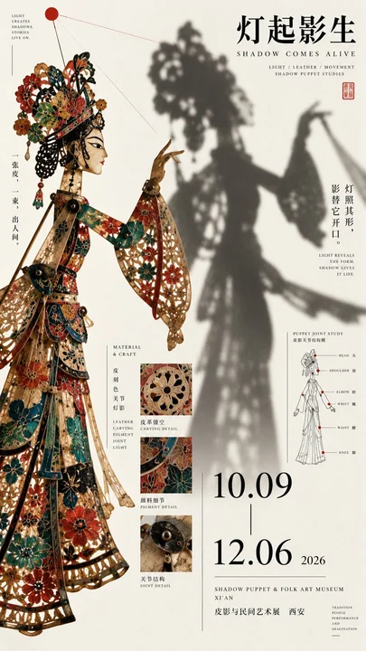
东方文化展览海报非对称构图提示词
Prompt
[Theme]:
[Chinese Title]:
[English Title]:
[Left Core Content]:
[Right Core Content]:
[Left-Right Relationship]: Entity × Projection / Subject × Text / Raw Material × Result / Chiaroscuro / Dense × White Space / Other
[Cross-border Elements]: Subject Outline / Shadow / Lines / Texture / Title / Other
[Main Color Tone]:
[Secondary Color]:
[Date / Venue]:
[Aspect Ratio]: 9:16

Generate a high-aesthetic, high-information density Oriental culture exhibition poster, using "left-right composition / asymmetric dual-zone composition."

The left and right should not be split evenly 50/50, but establish a clear visual hierarchy based on the theme, such as 40/60, 45/55, 35/65. Both sides undertake different tasks, achieving balance through visual weight rather than equal area.

The left-right relationship can be flexibly selected according to the theme:

Entity × Projection: Place real people or artifacts on one side, and place shadows, light, movement trajectories, or other visual results generated by them on the other side, creating a causal relationship between left and right.

Subject × Text: Use a large subject to anchor the frame on one side, and use large titles, small text, dates, archive information, and research diagrams to establish reading weight on the other side.

Raw Material × Result: One side shows the original state of ore, woodblock, material, or craft, while the other side shows pigments, imprints, finished products, or application results, letting the composition itself explain the process of change.

Dense × White Space: Use artifacts, archive fragments, patterns, and research information to establish a high-density visual on one side, and maintain larger white space on the other side, placing only a title or a small number of strong graphics, creating a sense of design through the contrast between dense and sparse.

Chiaroscuro: Allow one side to use bright paper surfaces like bone white or light gray, and the other side to use strong color gamuts like ink black, deep red, or deep cyan, forming a clear visual collision.

The left and right cannot be completely fragmented. Let subjects, shadows, branches, text, brushstrokes, patterns, or fine lines appropriately cross the midline to reconnect both sides as a whole. Boundaries can be broken, but do not turn it into a messy collage.

Typography is redesigned according to each image, using full horizontal titles, staggered large characters, medium titles, cross-border text, or partial color inversion. Do not fixedly use four-character vertical arrangements, and do not repeat the "two-character horizontal + two-character vertical" template.

Information density refers to mature museum posters, Japanese Editorial Design, and art catalogs. Can add English subtitles, materials, techniques, dates, venues, curatorial short sentences, and a small amount of research content related to the theme, such as structural line drawings, partial macros, material sections, production processes, or pattern research.

Research content only serves as the second layer of reading information, concentrated in 2–3 areas, do not make it into a PPT, encyclopedia page, or regular information card.

Color is controlled within 3–5 main colors, establishing a memory point with one clear main color, and then matching with basic colors such as black, bone white, and dark gray. Keep color blocks clean, materials real, and contrast clear.

The first sight sees the strongest subject and the left-right visual contrast; the second sight reads the title; the third sight discovers the cross-border or causal relationship between the two sides; finally read the material, structure, craft, and exhibition information.

Core Principle: Left and right do not need to be equal, visual weight needs to be balanced. One side is responsible for catching the eye, the other side is responsible for carrying the reading. Establish the boundary first, then actively break it.

Overall Requirements: High-definition, clear, clean paper surface, sharp subject, hierarchical Typography, small characters and fine lines as clear as possible, information-rich but orderly, with the completion level of mature cultural exhibition posters and art publications.

【主题】:
【中文标题】:
【英文标题】:
【左侧核心内容】:
【右侧核心内容】:
【左右关系】:实体 × 投影 / 主体 × 文字 / 原料 × 结果 / 明暗对照 / 密集 × 留白 / 其他
【跨界元素】:主体轮廓 / 影子 / 线条 / 材质 / 标题 / 其他
【主色调】:
【辅助色】:
【日期 / 场馆】:
【画面比例】:9:16

生成一张高审美、高信息密度的东方文化展览海报,采用「左右构图 / 非对称双区构图」。

左右不要 50 / 50 平均切开,而是根据主题建立明显的视觉主次,例如 40 / 60、45 / 55、35 / 65。两侧承担不同任务,通过视觉重量而不是面积相等来取得平衡。

可以根据主题灵活选择左右关系:

实体 × 投影:一侧放真实人物或器物,另一侧放由其产生的影子、光线、运动轨迹或其他视觉结果,让左右形成因果关系。

主体 × 文字:一侧用大型主体压住画面,另一侧用大标题、小字、日期、档案信息和研究图建立阅读重量。

原料 × 结果:一侧表现矿石、木版、材料或工艺原始状态,另一侧表现颜料、印迹、成品或应用结果,让构图本身讲清楚变化过程。

密集 × 留白:一侧使用器物、档案碎片、纹样和研究信息建立高密度视觉,另一侧保持更大留白,只放标题或少量强图形,通过密疏反差建立设计感。

明暗对照:允许一侧使用骨白、浅灰等明亮纸面,另一侧使用墨黑、深红、深青等强色域,形成明确视觉碰撞。

左右之间不能完全割裂。让主体、影子、枝条、文字、笔触、纹样或细线适度跨过中线,使两侧重新连接成一个整体。边界可以被打破,但不要变成杂乱拼贴。

Typography 根据每张图重新设计,可以使用完整横排标题、错位大字、中等标题、跨界文字或局部反色。不要固定使用四字纵排,也不要重复“两字横排 + 两字竖排”的模板。

信息密度参考成熟博物馆海报、日系 Editorial Design 和艺术图录。可加入英文副标题、材质、工艺、日期、场馆、策展短句,以及少量与主题有关的研究内容,例如结构线稿、局部微距、材料剖面、制作过程或纹样研究。

研究内容只作为第二层阅读信息,集中在 2–3 个区域,不要做成 PPT、百科页面或规则信息卡。

色彩控制在 3–5 个主要颜色,以一个明确主色建立记忆点,再搭配黑、骨白、深灰等基础色。保持色块干净、材质真实、对比明确。

第一眼看到最强主体与左右视觉反差;第二眼读到标题;第三眼发现左右之间的跨界或因果关系;最后再阅读材质、结构、工艺与展览信息。

核心原则:左右不需要相等,视觉重量需要平衡。一侧负责抓住视线,另一侧负责承接阅读。边界先建立,再主动打破。

整体要求:高清、清晰、纸面干净、主体锐利、Typography 有层级、小字与细线尽可能清楚、信息丰富但井然有序,具有成熟文化展览海报和艺术出版物完成度。
Autres prompts
Case 12752
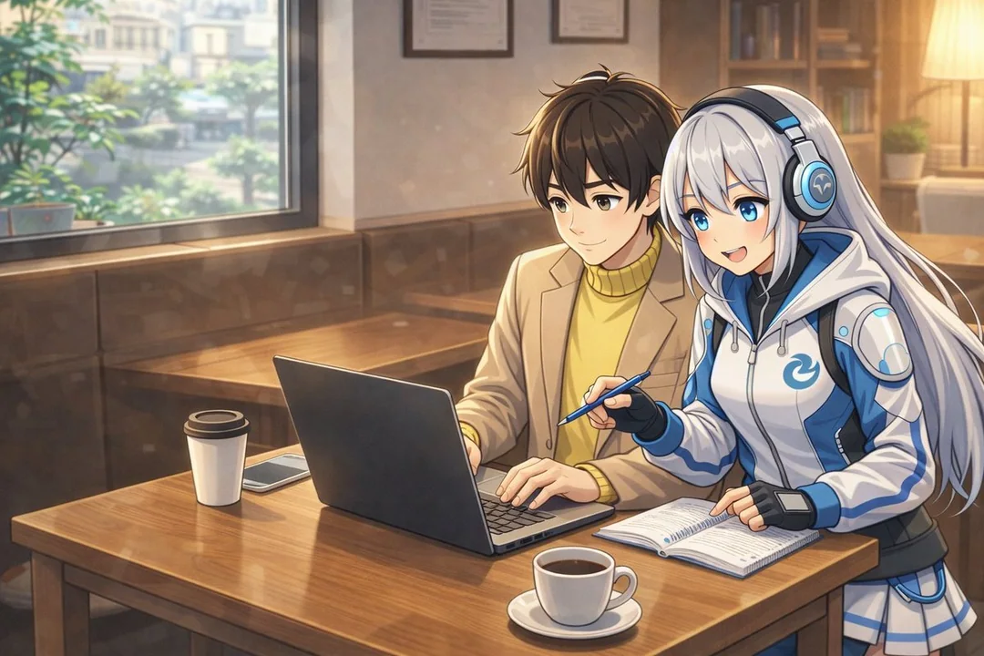
La reconstruction artistique par l’IA, surpassant le bleu d’origine, et des performances visuelles époustouflantes
Quand j’ai donné à Chappy l’invite « Nano Banana l’a dessiné comme ça. Comment le dessinerais-tu ? » dans l’espoir d’obtenir une nouvelle interprétation, il a généré quelque chose d’assez bon, sans rien envier à Nano Banana. Quand j’ai dit
AI生成视觉艺术风格重塑创意演绎艺术碰撞
Case 6
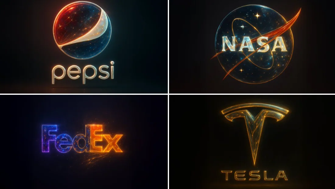
Style abstrait synthétique doré
{ "base_image": "image téléchargée", "style_transfer": { "visual_characteristics": { "head_and_face": { "material": "résine translucide avec des étoiles intégrées et des circuits neuronaux lumineu