Case 27480
纸艺纤维文化海报微缩场景设计
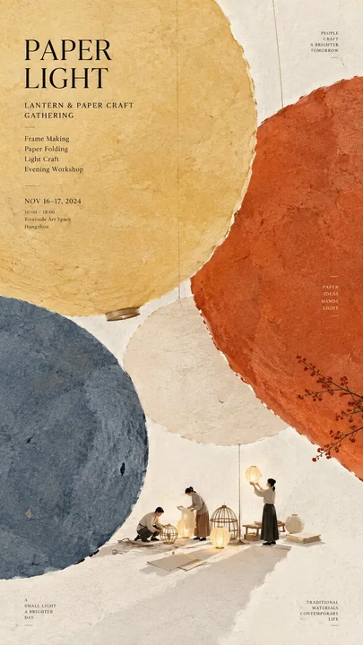
Prompt
Theme: {paper craft, cultural activity, or workshop}
Main palette: {2 to 4 colors}
Large paper structure: {circles, woven bands, marbled fields, stitched sheets, folds, cutouts, etc.}
Micro scene: {a tiny workshop or cultural activity}
Title: {event title}
Event details: {optional date, venue, activity}
Aspect ratio: 9:16

Create a refined vertical cultural poster using paper fiber, large color fields, and micro scenes as the core visual language.

Build the composition around a few large handmade paper forms using the selected palette. The paper should feel tactile and physical, with visible natural fibers, pulp texture, pigment absorption, subtle pressure marks, irregular edges, and gentle tonal variation. Keep the material matte, clean, sophisticated, and contemporary.

Let the large paper forms define the composition before adding any text. They may float, overlap, weave, fold, flow, connect, open, or frame negative space depending on the selected structure. Avoid regular grids and generic poster layouts. From a distance, the image should read as a strong arrangement of large color fields.

Inside or around the large paper composition, add one very small micro scene related to the theme. Include two or three adult figures naturally performing the activity, with only a few relevant tools or objects. The entire scene should occupy roughly 3% to 5% of the image, so it becomes a detail discovered after the main composition.

Use generous warm ivory negative space to keep the poster breathable. Add only one small accent color when needed.

Typography should remain restrained and secondary. Use a refined editorial serif for the main title and small uppercase sans serif for supporting information. Keep the title relatively small and place it in a quiet area of negative space. Use meaningful event information only.

The visual reading order should be:

large paper color fields first, material texture second, micro scene third, title and event information last.

The final result should feel tactile, editorial, artistic, contemporary, and carefully crafted. From a distance it should be visually simple and strong. Up close it should reveal paper fibers, subtle material details, tiny people, tools, and narrative.

主题:{纸艺、文化活动或工作坊}
主色调:{2到4种颜色}
大型纸张结构:{圆圈、编织带、大理石纹场域、缝制纸张、折痕、剪纸等}
微观场景:{微型工作坊或文化活动}
标题:{活动标题}
活动详情:{可选日期、地点、活动}
宽高比:9:16

以纸张纤维、大色块和微观场景为核心视觉语言,创作一张精致的竖版文化海报。

围绕选定色调的几个大型手工纸张形状构建构图。纸张应具有触感和实体感,带有可见的天然纤维、纸浆质感、颜料吸收、细微的压痕、不规则边缘和柔和的色调变化。保持材料哑光、整洁、精致且具有现代感。

在添加任何文字之前,让大型纸张形状定义构图。根据所选结构,它们可以漂浮、重叠、交织、折叠、流动、连接、开启或框架负空间。避免常规网格和通用的海报布局。从远处看,图像应呈现为大色块的强力排列。

在大型纸张构图内部或周围,添加一个与主题相关的极小微观场景。包括两到三名成年人物自然地进行活动,仅带有少量相关的工具或物体。整个场景应占据图像的大约3%到5%,使其成为在主构图之后发现的细节。

使用大量的暖象牙色负空间以保持海报的通透感。必要时仅添加一种小点缀色。

排版应保持克制和次要。主标题使用精致的编辑衬线体,辅助信息使用小型大写无衬线体。标题保持相对较小,并放置在负空间的安静区域。仅使用有意义的活动信息。

视觉阅读顺序应为:

首先是大面积纸张色块,其次是材质纹理,第三是微观场景,最后是标题和活动信息。

最终效果应具有触感、社论感、艺术感、现代感且制作精良。从远处看,它应该视觉简洁而有力。近距离看,它应揭示纸张纤维、细微的材质细节、微小的人物、工具和叙事。更多提示词
Case 1954
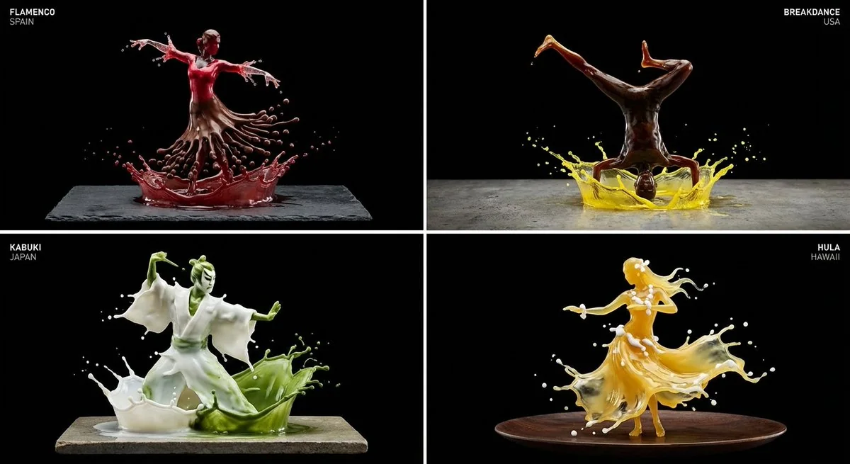
液态芭蕾与弗拉明戈
在2x2网格中展示来自世界各地的4种随机不同舞蹈风格,每个格子中都要包含国家和舞蹈名称<instructions> 输入变量:[舞蹈风格](例如,芭蕾、霹雳舞、探戈) 阶段1:材料与黏度逻辑(AI推理) 选择“身体材料”:选择一种与相关文化有关的液体。 逻辑:如果是芭蕾->白色牛奶/奶油(顺滑、不透明)。 逻辑:如果是弗拉明戈->红葡萄酒/桑格利亚(半透明、鲜艳)。 逻辑:如果是霹雳舞->黑咖啡/可乐(高对比、粗犷)。 选择“强调材料”:一种用于对比的次级液体(如示例中的黄色
舞蹈微距雕塑液态飞溅
Case 1
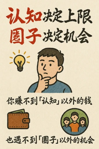
手绘风格的信息图表卡片
创作一张手绘风格的信息图卡片,比例为9:16竖版。卡片主题鲜明,背景为带有纸质肌理的米色或米白色,整体设计体现质朴、亲切的手绘美感。 卡片上方以红黑相间、对比鲜明的大号毛笔草书字体突出标题,吸引视觉焦点。文字内容均采用中文草书,整体布局分为2至4个清晰的小节,每节以简短、精炼的中文短语表达核心要点。字体保持草书流畅的韵律感,既清晰可读又富有艺术气息。 卡片中点缀简单、有趣的手绘插画或图标,例如人物或象征符号,以增强视觉吸引力,引发读者思考与共鸣。 整体布局注意视觉平衡,预留足
illustrationtypographyportrait